How do I style contact form? This is a common question on the support forum. Contact Form 7 doesn’t provide any customization for styling. Editing CSS style sheets is the best method to style contact forms. In this article, I’ll show you some important steps for styling your contact forms. If you know about CSS, my explanation is simple. If you are not familiar with CSS, please learn CSS first with these informative websites:
- Learning CSS – W3C
- CSS Tutorial – W3Schools
- Learn CSS | MDN – Mozilla Developer Network
- CSS Basics
Which style sheet should I edit?
Any style sheet is okay, but I recommend editing your theme’s main style sheet. It’s better not to edit style sheets in the plugin because your changes will be overwritten when the plugin is updated. Themes can be updated, but they are generally updated less frequently than plugins. If your theme is updated often, you might make a child theme and manage the style sheet in the child theme.
You can also use Additional CSS, and it has several advantages over modifying theme’s stylesheets directly.
Styling contact form fields
Let’s see how we can style individual fields in a contact form. There are several types of input fields. The most common field is a single-line text input field so let’s add a style rule for it:
input[type="text"]
{
    background-color: #fff;
    color: #000;
    width: 50%;
}
This selector matches all input elements whose type attribute has exactly the value text (i.e. single-line text input fields). Also, this style rule has three properties specifying white as background color, black as foreground (text) color, and 50% as width of field.
You may want to apply this style rule to other types of fields. Let’s add selectors for an email address input field and a multi-line text input area:
input[type="text"],
input[type="email"],
textarea
{
    background-color: #fff;
    color: #000;
    width: 50%;
}
Now this style is applied to every part of your site. You may want to limit it to contact forms. Contact Form 7’s form has a wrapper element that has the wpcf7 class. You can limit the scope of target by adding ancestor selectors:
.wpcf7 input[type="text"],
.wpcf7 input[type="email"],
.wpcf7 textarea
{
    background-color: #fff;
    color: #000;
    width: 50%;
}
See also:
- Why does my email address input field look different than other text input fields?
- Custom layout for checkboxes and radio buttons
Styling specific fields
You might want to style only specific fields. First, add an id or class option to the form-tags of the fields that you want to style:
[text text-123 id:very-special-field]
Then add style rules using the id or class:
#very-special-field
{
    color: #f00;
    border: 1px solid #f00;
}
Styling whole of contact form
As I mentioned earlier, the top-level element of contact form has the wpcf7 class. To style the whole contact form, add style rules for the class selector:
.wpcf7
{
    background-color: #f7f7f7;
    border: 2px solid #0f0;
}
This style rule gives your contact forms a light gray background and green border.
See also: Can I add id and class attributes to a form element?
Styling response messages
The response message at the bottom of a contact form by default has the wpcf7-response-output class, so you can apply a style rule to this class to style the response message.
To decide on the style based on the status of the contact form, refer to the form element’s class attribute. It should have a class that reflects the current status. Possible values are: init, sent, failed, aborted, spam, invalid, or unaccepted.
For an example of styling, see the following default style rules that Contact Form 7 5.2.2 applies to a response message:
.wpcf7 form .wpcf7-response-output {
    margin: 2em 0.5em 1em;
    padding: 0.2em 1em;
    border: 2px solid #00a0d2; /* Blue */
}

.wpcf7 form.init .wpcf7-response-output {
    display: none;
}

.wpcf7 form.sent .wpcf7-response-output {
    border-color: #46b450; /* Green */
}

.wpcf7 form.failed .wpcf7-response-output,
.wpcf7 form.aborted .wpcf7-response-output {
    border-color: #dc3232; /* Red */
}

.wpcf7 form.spam .wpcf7-response-output {
    border-color: #f56e28; /* Orange */
}

.wpcf7 form.invalid .wpcf7-response-output,
.wpcf7 form.unaccepted .wpcf7-response-output {
    border-color: #ffb900; /* Yellow */
}
See also: Locating response message box anywhere
Styling validation error messages
When a field has an invalid value, a validation error message appears under the field. As the element of a validation error message has the wpcf7-not-valid-tip class, you can use the class to style validation error messages.
Contact Form 7 5.2.2 applies the following style rule by default:
.wpcf7-not-valid-tip {
    color: #dc3232;
    font-size: 1em;
    font-weight: normal;
    display: block;
}
See also: Customizing validation error messages
Just another contact form plugin for WordPress. Simple but flexible.
Привет всем читателям моего блога. Сегодня я хочу поделиться о том, как происходит настройка внешнего вида contact form 7 на wordpress. Те, кто знаком с движком wordpress знают, что этот плагин надежный рабочий инструмент, с помощью которого можно внедрить на сайт форму обратной связи.
Плагин легко устанавливается и настраивается, но у него есть один небольшой недостаток – это его внешний вид. Он не уродлив, но его дизайн несколько простоват. Поэтому нам понадобится еще и настройка внешнего вида contact form 7, чтобы контактная форма выглядела привлекательней и современней.
Изменить внешний вид contact form 7 можно двумя способами. Первый – это поставить плагин contact form 7 skins. Это конструктор контактной формы, предлагающий 7 способов оформления внешнего вида плагина. Второй способ – это внедрить в contact form 7 готовые стили css.
Я решил идти вторым путем, поскольку не хочется устанавливать дополнительный плагин ради изменения внешнего вида формы обратной связи. Даже если вы не знаете html и css – не проблема, я предлагаю использовать уже готовые стили и код написанный другими.
Вот шаги, которые нам необходимо предпринять:
- создать шаблон страницы контактов
- скачать готовые стили css и html код
- установить плагин contact form 7
- создание кастомных полей с помощью плагина ACF
- убираем через фильтр лишние теги <p>, <br>, <span>
- настраиваем уведомление при отправке формы
Создаем шаблон страницы «Контакты»
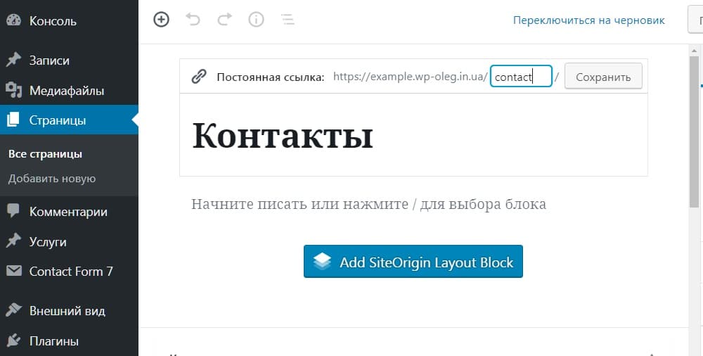
Итак, идем в админку wordpress и создаем страницу Контакты. После смотрим на образовавшийся url и видим, что у него есть слаг contact. У меня стоит плагин cyr to lat для транслитерации кириллических символов в транслит и он сгенерировал именно такой слаг. Однако если вам он не нравится, можете сделать себе любой другой.
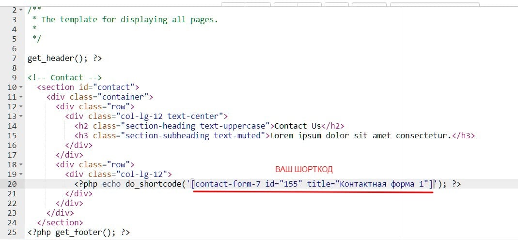
Далее идем в папку с вашей темой по пути wp-content > themes > vasha-tema и переименовываем файл шаблона page.php в page-contact.php. После того, как вы его переименовали, откройте этот файл в любом редакторе кода и удалите код, отвечающий за вывод содержимого страницы. Он находится между хуками, которые подключают область хедера и футера <?php get_header(); ?> и <?php get_footer(); ?>. Также удалите функцию <?php get_sidebar(); ?> поскольку эта страница будет на всю ширину экрана без боковой колонки. В итоге у вас должен остаться только такой код.
<?php
/**
 * The template for displaying all pages.
 *
 */
get_header(); ?>

<! - - Сюда вставим html код формы, шорткод contact form 7 и готовые стили css - - >

<?php get_footer(); ?>
Теперь вордпрес видит, что данный шаблон страницы относится только к странице контакты, и ни с какой другой страницей он работать не будет. Но если вам понадобиться подключить этот шаблон страницы также к другим страницам вордпресс, то вместо текста The template for displaying all pages, напишите Template name: Контакты. В админке выберите этот шаблон и сохраните. Тогда он будет работать и с другими страницами темы.
Contact form 7 готовые стили css
После того как мы создали шаблон страницы контакты, нам нужно самим написать или где-то скачать для плагина contact form 7 готовые стили css и html код формы. Я предлагаю взять код с бесплатного шаблона одностраничного сайта под названием Agenсy. Вот ссылка для скачивания https://startbootstrap.com/themes/agency/

Важно: чтобы данный код сработал, к вашей теме сайта должна быть подключена библиотека bootstrap. Большинство тем wordpress сделано с помощью сетки бутстрап, поэтому, вполне вероятно, что она у вас уже установлена. Если же ее нет, то возьмите минифицированный файл со стилями bootstrap.min.css в папке vendor шаблона agensy. Или скачайте его на официальном сайте. Загрузите его в папку со стилями вашей темы и подключите в файле functions.php. Заодно подключите файл с собственными стилями формы обратной связи custom.css с помощью этого кода.
/**
 * Enqueue bootstrap and custom styles in your theme.
 */

function your_theme_enqueue_bootstrap()  {

wp_register_style( 'bootstrap', get_template_directory_uri() . '/css/bootstrap.min.css', array(), '1', 'all' );
wp_register_style( 'custom-theme', get_template_directory_uri() . '/css/custom.css', array(), '1', 'all' );
   wp_enqueue_style( 'bootstrap' );
   wp_enqueue_style( 'custom-theme' );
}

add_action( 'wp_enqueue_scripts', 'your_theme_enqueue_bootstrap' );
Проследите за тем, чтобы путь к файлу bootstrap.min.css был указан верно, в противном случае в contact form 7 готовые стили css работать не будут. Так же после подключения файла со стилями убедитесь, что стили с файла бутстрап не переопределили стили вашей темы.
Посмотрите на внешний вид темы, если все выглядит как и было до подключения файла с бутстрап, значит все оk. Иначе нужно файл со стилями подключить выше в коде, над подключением собственных стилей вашей темы. Приоритет отдается файлам со стилями css, которые подключены ниже в файле functions.php/. Те, которые подключены ниже перебивают все другие.
Также если вы захотите чтобы у вас был такой же шрифт как в шаблоне формы, то подключите его в файле functions.php с помощью этой функции:
/**
 * Enqueue own fonts.
 */

wp_enqueue_style('google-fonts', 'https://fonts.googleapis.com/css?family=Montserrat:400,700|Kaushan+Script|Droid+Serif:400,700,400italic,700italic|Roboto+Slab:400,100,300,700&subset=cyrillic');
Далее скачайте шаблон и скопируйте код со строки 407 по 450. Код на странице index.html хорошо прокомментирован, и нужную секцию можно увидеть без труда. Начинается она с комментария <! — Contact — >. Вставьте этот html код верстки в файл шаблона page-contact.php. Здесь мы видим заголовок с подзаголовком:
<h2 class="section-heading text-uppercase">Contact Us</h2>

<h3 class="section-subheading text-muted">Lorem ipsum dolor sit amet consectetur.</h3>
Далее идет код самой формы. Обертка контактной формы это теги <div class=”row”></div><div class=”col-lg-12”></div>. Эти теги с классами, растягивающими контактную форму на всю ширину страницы. Оставшийся код, начиная с тега <form id=»contactForm» name=»sentMessage» novalidate=»novalidate»> и заканчивая закрывающим тегом </form>, нужно вырезать. Вставьте его пока в блокнот, чтобы он не потерялся. На данный момент у нас остается такой код в файле шаблона.
<?php
/**
 * The template for displaying all pages.
 *
 */

get_header(); ?>

<!-- Contact -->
  <section id="contact">
    <div class="container">
      <div class="row">
        <div class="col-lg-12 text-center">
          <h2 class="section-heading text-uppercase">Contact Us</h2>
          <h3 class="section-subheading text-muted">Lorem ipsum dolor sit amet consectetur.</h3>
        </div>
      </div>
      <div class="row">
        <div class="col-lg-12">
          <! - - Сюда вставим шорткод contact form 7 и готовые стили css - - >
        </div>
      </div>
    </div>
  </section>
<?php get_footer(); ?>
Установка плагина contact form 7 и создание своих полей
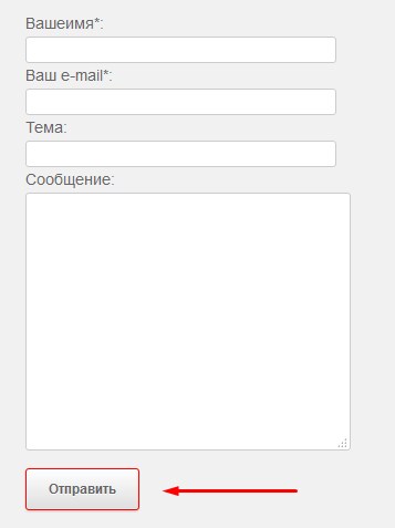
Далее нас ждет установка плагина contact form7 с репозитория вордпресс. Устанавливаем, активируем его и видим, что он сразу же сгенерировал нам контактную форму, сделанную им же по умолчанию. Нам нужно изменить ее или создать новую, здесь нет разницы.
Из верстки контактной формы видно, что в ней есть три поля input для ввода имени пользователя, телефона, email, поле textarea для текста и кнопка «Отправить». Следовательно, нам нужно создать такие же поля, только в настройке формы contact form 7. В верстке есть тег <p class=»help-block text-danger»></p> под каждым полем и тег <div id=»success»></div>. Они не нужны, их необходимо удалить.
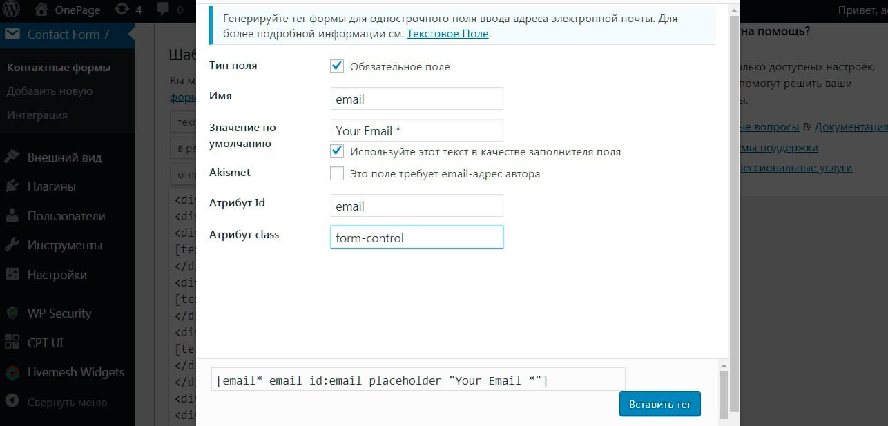
Важно. При создании полей в contact form 7 обратите внимание на css классы в тегах input, идентификаторы id и атрибуты полей которые есть в верстке шаблона. Вы должны их перенести и прописать в соответствующих полях при настройке формы:
- класс css = “form-control” во всех тегах input
- идентификатор id= “ ” в каждом поле свой – name, phone, email, message
- type =”” тип поля у каждого тега input свой (типы полей задаются кликом по соответствующей кнопке при выборе поля. Если вам нужно поле ввода для email адреса выбирайте кнопку email. Если вы зададите для всех инпутов поле text, то форма работать будет, но не будет происходить валидация полей. Так если пользователь введет текст вместо цифр в поле phone, то это не будет считаться ошибкой. В противном случае появится уведомление, о том что введен некорректный телефонный номер). В общем, выбирайте правильные поля для каждого поля ввода.
- placeholder – скопируйте содержимое placeholder в верстке и вставьте это содержимое в соответствующее поле. Образец заполнения на рисунке ниже.
Удаляйте все теги <label> для полей, которые генерирует форма по умолчанию. Делаем три поля с инпутами, одно поле для ввода сообщения и кнопку. Обертку для кнопки тег <button> я удалил и переопределил классы дефолтного тега формы <инпут type= submit>, назначив ему css классы кнопки <button>. Кнопка будет иметь такой же вид, но тег будет не <button>, а <input type= “submit”>. Вот классы кнопки:
#sendMessageButton {
    font-weight: 700;
    display: inline-block;
    font-size:18px;
	padding: 20px 40px;
    color: #fff;
    text-align: center;
    background-color: #fed136;
    border: 1px solid #fed136;
    line-height: 1.5;
    border-radius: .25rem;
Вставьте их в кастомайзер, во вкладку «Дополнительные стили css» или в файл со стилями вашей темы.
На рисунке ниже показаны отредактированные теги верстки с готовыми полями. Ниже я приложу архив с весткой формы и вы можете скопировать эти теги и вставить во вкладку «Шаблон формы» во время настройки контактной формы.
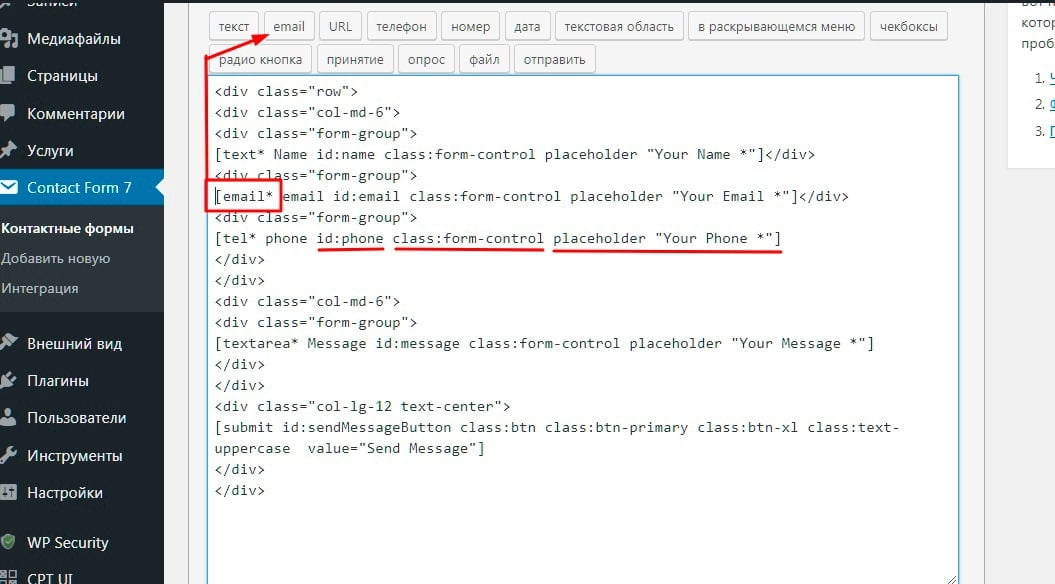
Из этого скриншота видно, что все поля формы контактной формы находятся в теге div с классом row <div class=”row”>. Он разделен на две части дивами с колонками по шесть штук в каждом. Кто знает бутстрап, тот поймет, что такая верстка содержит в себе главный ряд (12 колонок), который разделен на две части, в каждой из которых по 6 колонок <div class=”col-md-6”> Tакая разметка делит поля контактной формы на две части. В левой части находятся три поля с инпутами, а в правой textarea. Кнопка это тег input тип submit. Она находится в отдельном ряду и выровнена по центру. Ну и у каждого поля естественно свои классы. Вот и вся хитрость.
Вставляем шорткод контактной формы
Далее нам нужно вставить шорткод уже готовой контактной формы в файл шаблона для ее вывода во фронтэнде. Для этого используется специальная функция <?php echo do_shortcode(); ?> для вставки любых зарегистрированных шорткодов.
После того как я вставил код с шорткодом в шаблон контактной страницы, у меня появилась вполне рабочая контактная форма, но ее внешний вид еще не соответствовал образцу, потому, что не было фоновой фотографии и стили нужно профиксить.
На фоне формы есть фоновое изображение и цвет. Оно прикрепляется через свойство background-image к тегу section. Хотелось бы изменять фон прямо в консоли водпресс, а не в файле со стилями. Так же я хочу, чтобы заголовки h2 и h3 можно было изменять в настройках страницы, а не в файле шаблона. В общем, не должно быть никакого хардкода.
Заключительные настроки нужно сделать с помощью custom fields, то есть произвольных полей записи. Плагин ACF (advanced custom fields) подойдет для этого лучше всего. С его помощью я сделаю кастомные поля для вывода заголовков и фоновой картинки.
Создание кастомных полей с помощью плагина Acf
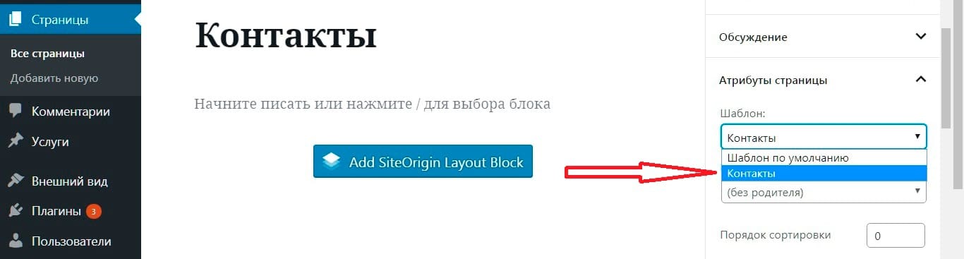
Устанавливаем и активируем плагин ACF. Находим вкладку «Группы полей» и создаем группу для страницы «Контакты». Даем ей какое-нибудь название, например «Контакты». В настройках для отображения данной группы полей я указал, что ее необходимо показывать на странице шаблона «Контакты».
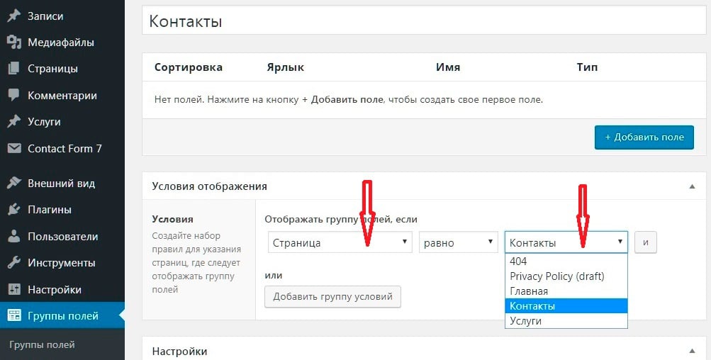
Здесь я сделал три поля:
- Ярлык 1-го поля Заголовок, имя поля – (его slug) header, тип поля – текст
- Ярлык 2-го Текст, имя поля – text, тип поля – текст
- Ярлык 3-го Изображение, имя поля – image, тип поля – изображение.
Теперь переходим на страницу Контакты и заполняем созданные поля. В заголовок h2 вставляем текст «Contact Us». В подзаголовок h3 вставляем «рыбный» текст Lorem ipsum dolor sit amet consectetur. И фоновое изображение map-image.png находится в папке шаблона Agency. Загружаем его в медиа библиотеку и вставляем в третье поле.
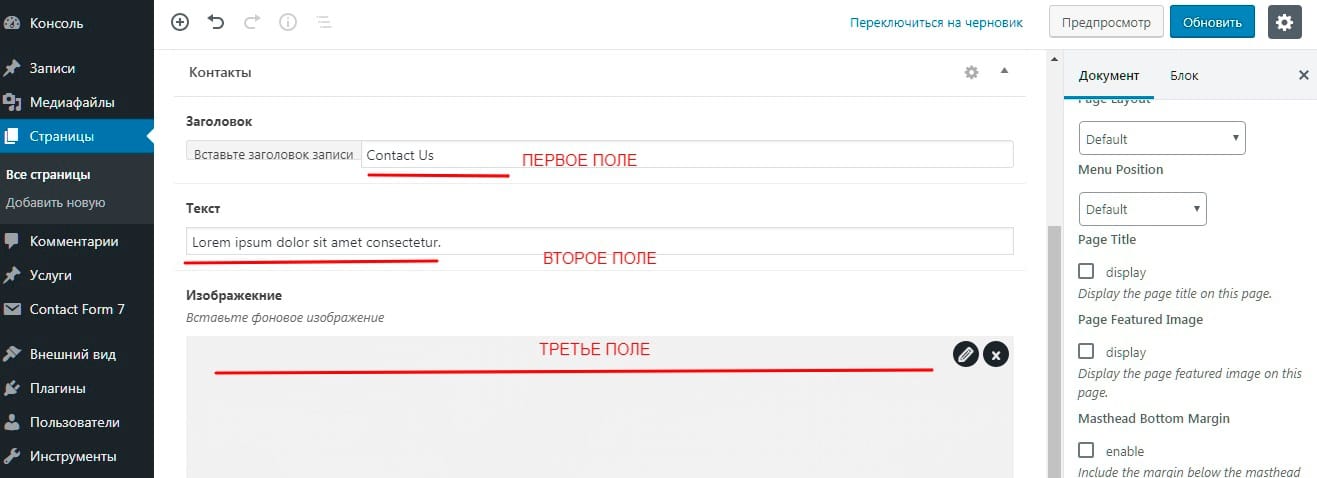
Теперь содержание этих полей нужно вывести на экран. Сделаем это с помощью специальной php функции для вывода кастомных полей <?php get_post_meta(); ?>.
На примере для заголовка h2 вы можете увидеть, что я вставил функцию get_post_meta(); в переменную $fields и обратился к ее параметрам id и key. ID поста – 149 (номер id можно увидеть в строке браузера в админке), key – это название поля, которое нужно получить. Его слаг в данном случае это header и параметр true возвращает значение метаполя.
<h2 class="section-heading text-uppercase">

<?php $fields = get_post_meta( '149', 'header', true ); echo $fields; ?>

</h2>

<h3 class="section-subheading text-muted">

<?php $field = get_post_meta( '149', 'text', true ); echo $field; ?>

</h3>
Настраиваем динамический фон
Фоновое изображение я вставил благодаря функции <?php get_field(); ?> Сначала я присвоил переменной $image значение функции get_field(‘bg_img’); со слагом поля bg_img и с помощью css класса background-image вывел ее, обратившись к значению массива [url] таким образом:
<?php $image = get_field('bg_img'); ?>

<section id="contact" style="background-image: url(<?php echo $image['url']; ?>);">
</section>
Вот что у меня вышло.

Перейдите по этой ссылке и посмотрите реальный пример https://example.wp-oleg.in.ua/contact/ Согласитесь, что примененные к contact form 7 готовые стили css придают ей гораздо лучший вид, чем у дефолтной формы. Также здесь вы можете скачать файл шаблона page-contact.php контактной формы с css стилями и готовым кодом.
Убираем лишние генерируемые теги <p>,<br>, <span> в contact form 7
Плагин контакт форм 7 генерирует свои теги <span>, <p>, <br>. Если ваша форма не соответствует образцу показанному в шаблоне сайта, то выясните это просмотрев код формы в браузере с помощью инструментов для разработчика dev tools. Возможно, вы увидите эти лишние теги. Их можно убрать с помощью фильтра. В сети есть много решений этого вопроса стоит только загуглить «как убрать лишние генерируемые теги <p> и <br> в contact form 7» или «how to remove tag span contact form 7». Один из вариантов убрать лишние теги с contact form это, вставить этот код в файл functions.php. Он убирает теги <p>, <br> и <span>
/**
 * Remove tag <p> и <br>.
 */

define('WPCF7_AUTOP', false );

/**
 * Remove tag <span>.
 */

add_filter('wpcf7_form_elements', function($content) {

$content = preg_replace('/<(span).*?class="s*(?:.*s)?wpcf7-form-control-wrap(?:s[^"]+)?s*"[^>]*>(.*)</1>/i', '2', $content);

return $content;

});
Настройки уведомления при отправке формы
Так же в настройках уведомления при отправке формы, рекомендую использовать почтовый тег [Name]. Он будет выводить значение текстового поля Name вместе с уведомлением. Вставьте его в начало каждого поля. Например, так:
[Name], спасибо за Ваше сообщение. Оно успешно отправлено.
При удачной отправке письма, пользователь увидит свое имя и обращение к нему, например: «Вася, спасибо за Ваше сообщение. Оно успешно отправлено». Безусловно Васе будет приятно :-). Таким же образом вы можете отредактировать другие поля в настройках отправки формы, использовав другие почтовые теги, которые сгенерировала вам форма. Это теги [Email], [Phone], [Messege] и т.д.
Заключение
Надеюсь что у меня получилось помочь вам понять, как в contact form7 происходит настройка внешнего вида формы обратной связи. Буду рад если оставите свой комментарий или сделайте репост этой статьи. Пока.

Популярный плагин Contact form 7 не отличается особой красотой своей стандартной формы, по этому для многих пользователей встает вопрос, как изменить внешний вид. Именно этим мы сейчас и займемся, я попытаюсь дать вам универсальный вариант, который подойдет для любого сайта.
Ранее я уже рассказывал о том как установить и настроить Contact Form 7, сейчас не будем об этом говорить, а сразу перейдем к необходимым изменениям дизайна.
Для начала нам нужен доступ к админке и файлу style.css, его можно найти во вкладке «Внешний вид»/»Редактор». По умолчанию, именно нужный файл вам и откроется. Рекомендую открыть несколько вкладок в браузере:
- Вкладка Contact Form 7 для правки формы.
- Страницу на сайте с формой обратной связи.
- Редактор с открытым файлом CSS.
Вкладки открыты приступим к внесению изменений, для начала немного подправим нашу форму.
- Добавляем классы к форме Contact Form 7.
- Стилизация формы Contact Form 7, работа с файлом style.css
Добавляем классы к форме Contact Form 7.
Когда мы откроем форму для правки мы увидим примерно следующую картину:


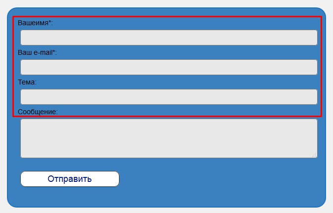
Такая форма обратной связи будет выглядеть примерно так:

Скучно, не пропорционально, скажем прямо не красиво.
Для изменения внешнего вида формы нужно немного поработать со стилями, но для начала добавим несколько классов в шаблон формы. Для этого открываем форму для правки (как на картинке выше) и дописываем следующие классы:

Писать мало, поэтому ошибок наделать трудно. В сети вы наверное находили советы без применения и добавления классов. Все дело в том что без добавления классов может возникнуть несколько проблем. К примеру вы захотите добавить сразу несколько форм на сайт, все они примут идентичный вид, а это не всегда удобно, по этому стоит использовать именно предложенный мной вариант.
Классы добавлены, пока ничего не изменилось, следующим шагом будет определение id формы.
Определяем ID формы на странице.
Для начала нужно понять что одна и та же форма будет иметь разные id на разных страницах сайта, так устроен плагин, он добавляет дополнительный параметр при каждом вызове формы. Сейчас разберем поподробнее.
Для правки формы нужно ее добавить на страницу или в запись, в необходимом месте, то-есть вставить шорткод. После этого переходим на эту страницу и кликаем по форме правой кнопкой мыши и выбираем пункт «Просмотреть код» это для браузера Chrome, если у вас другой, то там примерно такой же текст.

В открывшемся коде ищем начало нашей формы, выглядит это так:

Именно это и будет id формы. Возвращаясь назад, покажу какой id имеет эта же форма на другой странице.

Как видим, идентификатор отличается всего несколькими цифрами. По этому для начала нужно определиться на какой странице будет расположена форма, а уж затем приступать к правке стилей.
Ну что, очередной шаг сделан, мы определили id, прописали наши классы, теперь приступим непосредственно к изменению внешнего вида.
Стилизация формы Contact Form 7, работа с файлом style.css
Забегая вперед скажу что предложенный мной вариант навряд покажется вам идеальным. Дело в том что каждый кто читает эти строки хочет видеть свою форму именно такой какой он ее представляет. Я не телепат, и не смогу угодить всем, но постараюсь дать вам наводку где и в каком месте искать информацию и что изменять. Так что простите сразу за возможное разочарование, панацеи нет, придется и вам немного поработать.
Изменяем цвет фона, отступы, шрифт формы.
После проделанной работы переходим к стилям. Сперва изменим (если это нужно) фоновый цвет формы, подгоним наши отступы, подберем необходимый шрифт и цвет текста. Все эти настройки будем проводить заранее зная ID. Как его узнать, мы рассматривали выше.
Сперва обратимся к файлу style.css, добавим первые правила для ID формы (добавлять нужно в самом низу файла), в моем случае это wpcf7-f172-p34-o1, вам же нужно подставить ваш идентификатор:
#wpcf7-f172-p34-o1 { margin: 5px; padding: 10px; background: #B3AFAF; font-family: Georgia, "Times New Roman", Times, serif; color: #000; }
Теперь разберем все подробнее:
- Вначале займемся отступами. Внешние отступы (от края до начала формы) — margin: 5px, внутренние отступы (от начала формы до внутренних элементов) —padding: 10px.
- Заливка формы или ее фон определяется свойством background: #B3AFAF, цвет можете подбирать какой угодно, просто заменив значение.
- Определяемся с семейством шрифта, если менять не хотите можно не прописывать это правило (font-family: Georgia, «Times New Roman», Times, serif).
- Цвет текста определяет свойство color, которое сейчас стоит в черном цвете (color: #000).
С данными параметрами можете экспериментировать сами, подбирать отступы, цвета и шрифты. Для этого нужно лишь изменить значение, сохранить новый вариант, обновить страницу и посмотреть изменения. Не бойтесь экспериментов, тут вы не сможете поломать ничего, в крайнем случае стили просто не сработают и вы легко все исправите как было.
Определяем отступы между полями, изменяем рамку.
Переходим к нашим полям, добавим отступов:
#wpcf7-f172-p34-o1 p{ margin:5px; }
Это отступы по краям полей, что бы текст и блоки не сливались в одно целое.
Следующим этапом будут рамки, я дам свой вариант, а вы сможете найти в сети множество вариантов которые вам понравятся и заменить их.
#wpcf7-f172-p34-o1 input,textarea { border: 3px double #000; }
О рамках немного подробнее. Значение в 3px это ширина рамки, double двойное использование (если не нужно, можно удалить это слово), #000 цвет рамки так же можете подобрать свой.
Можете сохранить изменения и посмотреть на то что у вас получилось. Далее перейдем непосредственно к полям и изменению их размеров и расположения.
Меняем ширину полей и их расположение.
Ранее мы немного изменили нашу форму и добавили классы, именно сейчас это и пригодится. По умолчанию ширина всех полей одинакова и это не очень красиво и удобно. Сейчас мы это исправим. Добавляем к нашему файлу стилей следующие правила:
.name-cf { float:left; padding: 2px; } .name-cf input { width: 270px; } .thems-cf input { width: 100%; } .clear-cf { clear: both; } .text-cf textarea { width: 100%; }
Теперь разберем все поподробнее:
- Первый класс к которому мы обратимся name-cf он принадлежит полям с именем и емейлом. Для них задаем отступ в 2px (padding: 2px) и обтекание (float:left), что бы выровнять два поля в один ряд.
- Далее подправим ширину полей задав им оптимальный (для моего шаблона) размер в 270px (.name-cf input { width: 270px; }). Если у вас поля все еще в одну строчку или же слишком маленький размер, подберите свой вариант.
- Поле с названием темы сделаем на всю ширину формы, так как текста там может быть больше (.thems-cf input { width: 100%;}). Если вы хотите свое, точное значение укажите его в пикселях.
- Следующий блок который мы добавили к форме предназначен для отмены обтекания (.thems-cf input {width: 100%; }).
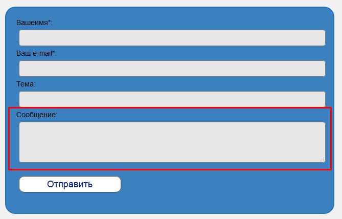
- Так же как и в предыдущем случае, поле с текстом сообщения делаем на всю ширину (text-cf textarea {width: 100%;}).
Можно обновить файл стилей и посмотреть на изменения, если нужно, подогнать размеры под ваши нужды.
Выравниваем кнопку «Отправить» по центру, изменяем фон и ширину.
Переходим к нашей кнопке, выровняем по центру и добавим фон:
.submit-cf { width: 200px; /*ширина блока*/ height: 25px; /*высота*/ margin: 0 auto; /* Отступ слева и справа */ } .submit-cf input { width: 200px; background:#96B195; }
Традиционно объясняю что к чему:
- Первым правилом мы определяем ширину и высоту блока в котором будет размещена кнопка и ставим ее по центру формы.
- Вторым правилом задаем цвет фона кнопки (background:#96B195, если не указать будет такого же цвета как и все остальные поля), устанавливаем ширину кнопки (width: 200px, желательно что бы была такого же размера, как ширина блока, что бы кнопка не двигалась в стороны).
Сохраняем наши настройки и смотрим что у нас получилось:

Соглашусь далеко не шик, но зато адекватно смотрится в целом, ниже форма по умолчанию, думаю эффект очевиден. В любом случае мы научились изменять внешний вид формы Contact Form 7.
Надеюсь для вас статья была полезной, если же что-то не так или возникли проблемы оставьте свой комментарий и я постараюсь ответить (подправить).
Приветствую Вас, дорогой читатель моего блога.
Сегодня я покажу вам как очень быстро и просто изменить внешний вид contact form 7, что бы она стала более привлекательной.
Изначально Сontact Form7 выглядит достаточно невзрачно. К счастью это поправимо! Для изменения внешнего вида этой формы мы с вами можем воспользоваться либо специальным плагином, либо прописать в файл style.css нашей темы несколько своих стилей.

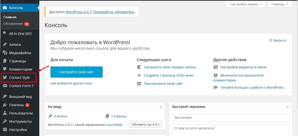
Обзор плагина Сontact Form7 Style

Итак, начнем с плагина. Устанавливать мы будем плагин Сontact Form7 Style. Переходим в консоль нашего сайта, далее выбираем здесь Плагины -> Добавить новый. В поле поиска вводим название плагина и нажимаем Enter , далее кнопка установить, а затем активируем плагин.
Теперь в боковом меню нашей панели управления сайтом появился отдельный пункт Contact Style.
Данный плагин изначально содержит в себе несколько готовых шаблонов которые можно сразу использовать на своем сайте.
Для того чтобы применить какой то стиль оформления, вы нажимаете либо на ссылку с названием этого стиля, либо на кнопку изменить. Открывается окно настроек данного стиля. Из настроек здесь мы можем выбрать к какой именно форме обратной связи мы хотим применить этот стиль.
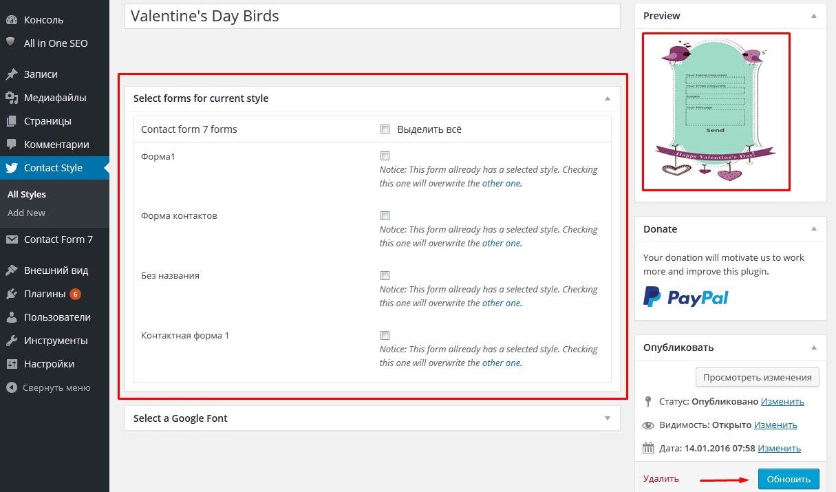
После того, как вы все выставили нажимаем на кнопку «Обновить».
Меняем внешний вид Contact Form7 при помощи собственного стиля.
Для этого переходим в пункт Сontact Form7 Style ->Add new. Сразу же вводим название нашего стиля.
И переходим к заданию стилей.
Стили для формы
form Background – цвет всей формы.
form widht — это ширина формы. По умолчанию стоит 100%, если вас это не устраивает, вы можете задать ширину в пикселях, например 600.
form box sizing — определяет алгоритм расчета ширины и высоты того ил иного элемента на странице. Рекомендую оставить по умолчанию.
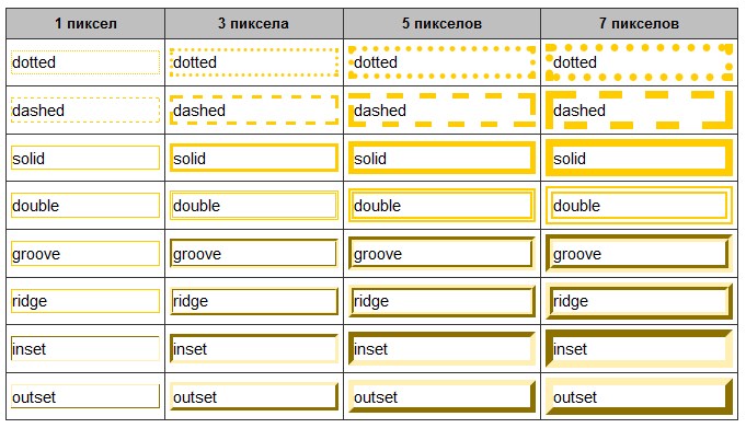
form border widht — толщина границы нашей формы, задаётся в пикселях.
form border style — определяет стиль границы нашей формы.
Здесь возможно несколько вариантов:
- none — граница отсутствует;
- solid — сплошная линия;
- doted — пунктирная граница;
- double — двойная линия;
- groove — эффект вогнутости границы;
- ridge — эффект выпуклости границы;
- inset — эффект вдавленности формы;
- outset — эффект выпуклости формы.
form padding — внутренний отступ, расстояние от границы формы до внутренних элементов формы, т.е. до всех надписей, полей и т.д. Рекомендую устанавливать хотя бы пикселе 20, потому, что изначально элементы прилипают к границе формы, это выглядит не очень красиво.
form margin — это внешний отступ, т.е. это отступ от границ вашей формы до каких-то внешних элементов, который окружают форму.
form border color — цвет границы формы.
form border radius — определяет радиус скругления углов. Задается в пикселях.
form line height — высота строк в форме или междустрочный интервал, задаётся в пикселях.
Стили для полей ввода
input background – цвет фона полей.
input color — цвет текста который будет отображаться внутри полей.
input border color — цвет границы полей ввода.
input font size — размер шрифта.
input line height — высота строки.
input border widht — ширина границы поля ввода.
input border style — стиль границы поля ввода.
input border radius — скругление углов поля ввода.
input font style — стиль текста, отображаемого в полях ввода.
Можно задать:
- default — стиль по умолчанию;
- normal — обычный;
- italic — курсив;
- oblique — жирный.
input font weight — жирность шрифта.
- default — стиль по умолчанию;
- normal — обычный;
- bold — жирный;
- bolder — более жирный;
- lighter — тоньше;
- initial — исходный;
- inherit — это наследование, т.е. будут наследоваться стили родительского элемента. Если к примеру для формы или страницы применен стиль жирный, то и для текса внутри этих полей тоже будет применяться жирный шрифт. Я оставлю здесь «normal».
input width — ширина поля для ввода текста. По умолчанию задается 100%. Если Вам нужно задать в пикселях — ставите в пикселях.
input box sizing — оставляем по умолчанию.
input height — высота полей ввода.
input padding — внутренний отступ от границы поля ввода текста до текста.
input margin — внешний отступ.
Изменяем внешний вид для текстового поля
textarea background color — цвет фона.
textarea height — высота поля для ввода сообщения.
textarea widht — ширина поля
textarea box sizing – алгоритм расчёта ширины и высоты элементов (оставляем стандартные)
textarea border-size — толщина границы
textarea border color – цвет границы
Стили меток
Помимо полей ввода и других элементов на нашей форме также могут содержаться метки, которые позволяют нам выводить какой-то текст рядом с полем ввода. По умолчанию в форме метки не используются, Вы можете их добавлять через генерирование отдельных полей. В плагине Сontact Form 7 Style можно изменять стили для этих меток.
Прямо под блоком, где мы задавали стили для поля Textarea есть блок стилей для меток. Здесь мы можем изменит стиль шрифта, его толщину, его размер, а также высоту строки, и цвет.
Стили для кнопки отправки сообщения.
submit button width — ширина кнопки.
submit button box sizing — оставляем по умолчанию.
submit button height — высота кнопки.
submit button border radius — скругленные углы.
submit button font size — размер шрифта текста на кнопке.
submit button line height — высота строки на нашей кнопке (междустрочный интервал).
submit button border width — толщина границы кнопки.
submit button border style — стиль границы.
submit button color — цвет текста кнопки.
submit button background — цвет фона кнопки.
Вот и все стили, которые мы с Вам задали, помимо это здесь есть еще css-редакторы в котором Вы можете вписать какие-то определенные классы, прописывать для них свойства, и это все будет применяться.
Не забудьте нажать кнопку «Обновить» после того как все стили будут заданы.

Если вы хоть немного разбираетесь в CSS то легко сможете изменить внешний вид формы Contact Form 7 и без плагина. Для этого вам достаточно знать какой класс за что отвечает.
Значения классов для Contact Form 7
.wpcf7-form — контейнер формы, можно также использовать .wpcf7
.wpcf7-form input — поля для ввода имени, темы и т.д., а также кнопка «Отправить»
.wpcf7-form input[type=»text»] – только поля для ввода текста и темы (могут быть и другие в случае если вы добавляли свои поля)
.wpcf7-form input[type=»email»] – поле для ввода email
.wpcf7-form input[type=»submit»] или .wpcf7-submit – кнопка отправки
Для редактирование подписей полей можно использовать .wpcf7-form или .wpcf7
. wpcf7-response-output – вывод уведомлений об отправке сообщения
Для того чтобы применить стиль только для какой то конкретной формы необходимо вычислить её идентификатор и прописать его перед названием класса.
Например:
|
#wpcf7-f159-p29-o1 .wpcf7-form { width:700px; } |
Если у вас остались какие то вопросы, то советую посмотреть видеоинструкцию, которую я для вас подготовила.
На этом пожалуй всё 
Надеюсь что данная статья была для вас полезна. Если вас заинтересовала тема изменения внешнего вида Contact Form 7 без плагина, то обязательно почитайте эту статью. В ней я предлагаю несколько уже готовых стилей оформления Contact Form 7 , которые вы можете использовать для своего сайта просто вставив сss код в файл стилей Вашей темы.
Вот теперь точно всё! Удачной вам стилизации Contact Form 7 !
С уважением Юлия Гусарь
Contact Form 7 (CF7) is one of the most popular plugins available for WordPress. It allows users to quickly create customised forms, anywhere on a WordPress website.
While the forms are easy to create and implement, the fields within them are styled minimally – allowing them to blend in with most websites. The appearance of each CF7 form depends on the CSS styling applied to standard HTML form elements used in your current WordPress theme.
This article shows users, skilled at using HTML and CSS, how to style When you select a CF7 Skins Style the aesthetic design (CSS code) is automatically created and applied to your form. Contact Form 7 forms to their particular requirements.
Style Contact Form 7
Tl:dr (too long; didn’t read) version
- The Form Process
- Use Dev Tools to examine your CF7 form
- Examine CSS in your current WordPress theme
- Target CSS changes to CF7 forms only
- Use CSS to change the appearance of your CF7 form
You will need to be skilled at using HTML and CSS to follow along in this article. If that description does not fit you, you can learn all you need to know about both HTML and CSS at http://www.w3schools.com/ and come back to this article when you’ve done that.
You will also need to be skilled at using Firebug or Chrome Dev Tools to examine the HTML and CSS of your CF7 form in detail to follow along in this article. If that description does not fit you, you can learn about Firebug or Chrome Dev Tools and come back to this article when you’ve done that.
Table of Contents
- Default Contact Form 7 Form
- The Form Process
- HTML
- Standard HTML Form Elements
- HTML code + CF7 Tags in CF7 Form area
- Completed HTML code in CF7 Form
- CSS classes & ids generated by CF7
- Target CF7 classes & ids
- Add CF7 classes & ids
- Use Dev Tools to examine your CF7 form
- CF7 Form Structure
- CSS
- Default CF7 CSS style
- Examine CSS in your current WordPress theme
- Use a Child Theme to make changes to your CF7 forms CSS
- Target CSS changes to CF7 forms only
- You made need higher CSS Specificity
- Add CSS changes on individual CF7 form elements
- Copy current CSS with your Dev Tool
- Add CF7 classes & ids within your CF7 forms
- Use CSS to change the appearance of your CF7 form
- Targeting Specific CF7 Forms

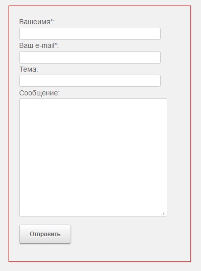
Default Contact Form 7 Form
We use the default CF7 form (normally named “Contact form 1” & installed automatically on every install of the CF7 plugin) as the basis of this article.
The actual look of this default form on your WordPress website will depend on the current WordPress theme used on your website and the CSS styling that theme applies to standard HTML form elements.
In this case our website uses the The7 theme by Dream-Theme and the default Contact Form 7 form appears as follows:
Tip: The appearance of the default CF7 form on your WordPress website will depend on the current WordPress theme used and the CSS styling that theme applies to standard HTML form elements.
You may notice this form has a couple of styling issues:
- The labels don’t really stand out
- The Send button text is a little small.
In this article we’ll be demonstrating how to change the style of this form, using HTML and CSS, to meet particular requirements.

The Form Process
Forms are a common part of many websites and are a very powerful tool for interacting with users. They provide an easy way for visitors to your website to start a conversation with you about their particular requirements.
CF7 forms are based firmly on the more general HTML form process
While the CF7 plugin makes it quick and easy to create forms with little or no knowledge of HTML, Contact Form 7 forms are based firmly on the general HTML form process.
HTML includes a number of elements which are specifically designed for use in forms. The CF7 plugin provides support for most of the commonly used HTML form elements, including some recently added HTML5 elements.
Form appearance depends on the HTML form elements used and the CSS styling applied
The appearance of each CF7 form depends on the HTML form elements used

HTML for CF7 Form
and the CSS styling applied to these elements in your current WordPress theme.

CSS for CF7 Form
In any web form, the HTML provides the form content and layout (structure) of the form while the CSS controls the forms appearance and presentation (style).
HTML + CSS = FORM
HTML – form content and layout (structure)
CSS – form appearance and presentation (style).

HTML
The HTML in each CF7 form is created by the CF7 plugin based on information supplied by you in the Form section on the CF7 interface.

Form section of the CF7 interface
Any HTML elements added by you in the Form section on the CF7 interface are combined with HTML generated by the CF7 plugin.
HTML (supplied by you) + HTML (added by the CF7 plugin) = FORM Content & Layout (structure)
Standard HTML Form Elements
The default Contact Form 7 form uses label elements Label Content as the basis for the form.
While this is probably the simpliest way to create a form, it has a number of shortcomings, which we discuss in further articles – ( see Why we use Fieldset, Legend & Lists in CF7 Skins and Making your form easy to read by using Fieldsets ).
You can in fact use any HTML elements you want in the Form section on the CF7 interface and this is a key part of building CF7 forms that match your functional and appearance requirements.
With practice you can learn how to create increasingly complex CF7 forms by combining your HTML elements with those added automatically by the CF7 plugin.

HTML code + CF7 Tags in CF7 Form area
The box below shows the content of the Form section of the CF7 interface for the default CF7 form.
<label> Your Name (required)
     </label>

<label> Your Email (required)
    [email* your-email] </label>

<label> Subject
     </label>

<label> Your Message
    [textarea your-message] </label>

[submit "Send"]
As you examine this code you should notice that it includes:
- Standard HTML Elements –
Your Name (required) - CF7 Tags –
[email* your-email]
The standard HTML Elements you add in this section are output largely unchanged by the CF7 plugin. CF7 then uses the CF7 Tags to create fully functioning standard HTML form elements which can include a number of additional HTML attributes.
If you are not sure how Contact Form 7 uses CF7 Tags you can read all about them at Contact For 7 Tag Syntax.
Completed HTML code in CF7 Form
The box below shows the complete HTML code generated on the actual website, based on information supplied by you in the Form section on the CF7 interface and the additional HTML code added by the CF7 plugin.
<div id="wpcf7-f235-p1192-o1" class="wpcf7"><form novalidate="novalidate"
  class="wpcf7-form" method="post" action="/example.com/styling-contact-form-7-forms/
  #wpcf7-f235-p1192-o1">
<div style="display: none;">
<input type="hidden" value="8" name="_wpcf7">
<input type="hidden" value="3.4.1" name="_wpcf7_version">
<input type="hidden" value="wpcf7-f235-p1192-o1" name="_wpcf7_unit_tag">
<input type="hidden" value="1cc9dc2c57" name="_wpnonce">
</div>
<p>Your Name (required)<br>
  <span class="wpcf7-form-control-wrap your-name">
  <input type="text" aria-required="true" class="wpcf7-form-control
  wpcf7-text wpcf7-validates-as-required" size="40" value="" name="your-name"></span> </p>
<p>Your Email (required)<br>
  <span class="wpcf7-form-control-wrap your-email">
  <input type="email" aria-required="true" class="wpcf7-form-control
  wpcf7-text wpcf7-email wpcf7-validates-as-required wpcf7-validates-as-email"
  size="40" value="" name="your-email"></span> </p>
<p>Subject<br>
  <span class="wpcf7-form-control-wrap your-subject">
  <input type="text" class="wpcf7-form-control wpcf7-text"
   size="40" value="" name="your-subject"></span> </p>
<p>Your Message<br>
  <span class="wpcf7-form-control-wrap your-message">
  <textarea class="wpcf7-form-control wpcf7-textarea"
   rows="10" cols="40" name="your-message"></textarea></span> </p>
<p><input type="submit" class="wpcf7-form-control wpcf7-submit"
  value="Send"><img class="ajax-loader" src="http://buzztone.com.au/wp-content/plugins
 /contact-form-7/images/ajax-loader.gif" alt="Ajax loader sending..." style="visibility: hidden;"></p>
<div class="wpcf7-response-output wpcf7-display-none"></div>
</form>
</div>
Take a moment to compare these two bits of code and notice where the information from the form section of the CF7 interface has made it into the HTML on the actual website.
Tip: If you unable to understand easily what is going on in the code included in these two boxes, you probably don’t have adequate skills to change the style of CF7 forms, without at least some external support or advice.
In that case you should continue to learn what you need to know about both HTML and CSS at http://www.w3schools.com/ and come back to this article when you’ve done that.

CSS classes & ids generated by CF7
You may notice that Contact Form 7 adds a number of CSS classes & ids to the individual HTML form elements – for example:
- <div> id=”wpcf7-f8-p275-o1″ class=”wpcf7″ > … <div> – for the complete form which is given a unique id
- <span> class=”wpcf7-form-control-wrap your-name”> … </span> – inline element which wraps each text field
These are added, by the plugin author, to allow users skilled at using HTML and CSS, to style their CF7 forms to their particular requirements.
Target CF7 classes & ids
The list of available classes that can be targeted within CF7 forms include:
- .wpcf7
- .wpcf7-form
- .wpcf7-form-control
- .wpcf7 input
- .wpcf7 input[type=”text”]
- .wpcf7 input[type=”email”]
- .wpcf7 input[type=”checkbox”]
- .wpcf7 textarea
- .wpcf7 select
- .wpcf7 select option
- .wpcf7 select option:hover
- .wpcf7 p
It makes sense to target these individual CSS classes available within your CF7 forms.
WordPress theme developers also can use these CSS classes & ids to build support for the CF7 plugin within their theme. As CF7 is one of the most popular plugins in WordPress, it makes sense for theme developers to do this.
Add CF7 classes & ids
You can also give your HTML form elements individual classes & ids within the CF7 tags in the Form section of the CF7 interface. This can be very useful when you have number of elements you want to style the same way.

CF7 tag with ID & Class
At this point you should use Firebug or Chrome Dev Tools to examine the HTML and CSS of your CF7 form in detail.
Use one of these tools to explore all the HTML form elements in your CF7 form and see how each element is being styled in detail by the CSS in your current WordPress theme.
In particular take note of the various style sheets that are contributing to the final style used and how individual style elements are being overwritten (or not) by the CSS hierarchy.
Once you understand how the HTML and CSS is configured in your CF7 form, you can begin to plan the CSS changes you need to change the appearance of the form to suit your requirements.
You will need to be skilled at using Firebug or Chrome Dev Tools to examine the HTML and CSS of your CF7 form in detail to follow along in this article.
If that description does not fit you, you can learn about Firebug or Chrome Dev Tools and come back to this article when you’ve done that..
CF7 Form Structure
We used Firebug to produce the following diagram which shows the overall structure if the default CF7 form we are using in this article.
The diagram shows how each element of the form is created using standard HTML form elements and how those elements are arranged in relation to each other.
With experience, using Firebug or Chrome Dev Tools should give you all the information you need to change the style of your CF7 forms quickly and easily, but it may definitely help you initially to produce a hand drawn paper sketch similar to this diagram.
CSS
Default CF7 CSS style
There is a common misconception that the CF7 plugin controls the appearance of CF7 forms though the plugins CSS style sheets.
In truth the Contact Form 7 plugin uses only very minimal CSS styling to allow CF7 forms to blend in with most websites. For a listing of complete style sheet used by the CF7 plugin see Default CF7 CSS style.
The appearance of CF7 forms on your website will depend largely on the current WordPress theme used and the CSS styling that theme applies to standard HTML form elements.
Examine CSS in your current WordPress theme
The actual look of CF7 forms on your website will depend largely on the current WordPress theme used and the CSS styling that theme applies to standard HTML form elements.
To change the appearance of your CF7 forms to suit your requirements, you will need to:
- Understand what CSS styling is being applied to standard HTML form elements in your CF7 form
- Adjust the CSS used by your current theme for these HTML form elements.
Your current theme may not do a good job of styling forms
For some reason many WordPress themes do not provide CSS styling for standard HTML form elements. We regard this as poor practice and always look closely at how a theme styles standard HTML form elements when selecting themes.
Importantly if your theme neglects to provide appropriate CSS for these standard HTML form elements then the appearance of your form will fall back to that provided by default by the browser – which can be different in different browsers.
Use a Child Theme to make changes to your CF7 forms CSS
The most common and preferred method to makes changes to CF7 form styling is to create a Child Theme.
Make any necessary additions to the CSS in the child themes style.css only, rather than directly in the themes styles.css. That way you don’t lose your changes when you update the theme.
The style.css file of the child theme usually imports all styling from the parent theme by including the following CSS code at the top of the child theme’s style.css file.
/* Import Parent Theme */
@import url('../twentyeleven/style.css');
Any CSS changes that alter the appearance of our CF7 forms are added below this. Due to the CSS loading heirachy, any CSS changes made here will overwrite styles previously set in the parent theme.
Alternatively you could use a custom CSS plugin to make your CSS changes.
Target CSS changes to CF7 forms only
When making CSS changes you want to make sure that your CSS changes don’t inadvertantly effect other elements on your website.
The preferred way to do this is to use CSS inheritance to target the relevant HTML elements within your CF7 forms only.
For CF7 forms we have several ids & classes which can be used to give the necessary targeted inheritance including:
- .wpcf7
- .wpcf7-form
- .wpcf7-form-control
For example we can use the class .wpcf7-form to change the appearance of all HTML input text elements within CF7 forms only:
.wpcf7-form input[type="text"] {
	background: #fff;
	border: 1px solid #bbb;
	color: #4F4F4F;
}
Use CSS inheritance to ensure that your CSS changes don’t inadvertently affect other elements on your website.
You made need higher CSS Specificity
Depending on how your theme styles standard HTML form elements in general, and CF7 form elements in particular, you may need to add extra CSS specificity to get your CSS changes showing.
For example we can use an extra the CF7 class to give higher CSS Specificity:
.wpcf7 .wpcf7-form input[type="text"] {
	background: #fff;
	border: 1px solid #bbb;
	color: #4F4F4F;
}
For WordPress themes with high levels of unnecessary CSS specificity, you may need to target the #id of specfic CF7 forms as explained in Styling a Specific Contact Form 7 Form.
Add CSS changes on individual CF7 form elements
You can add additional CSS styling to any CF7 form elements you want to modify.
The list of common elements that can be targeted within CF7 forms include:
- .wpcf7 input
- .wpcf7 input[type=”text”]
- .wpcf7 input[type=”email”]
- .wpcf7 input[type=”checkbox”]
- .wpcf7 textarea
- .wpcf7 select
- .wpcf7 select option
- .wpcf7 select option:hover
- .wpcf7 p
You can use Firebug or Chrome Dev Tools to explore the full range of ids & classes used by Contact Form 7.
For example to change the background colour of the Send button when the mouse pointer hovers over the button:
.wpcf7 input[type="submit"]:hover {
	background:#4f2a0f;
	cursor:pointer;
	color:#fff;
}
There are some CF7 classes available which you might want to use to target a specific CF7 Tag on all CF7 forms on your site.
- .wpcf7-text
- .wpcf7-email
- .wpcf7-textarea
- .wpcf7-submit
Copy current CSS with your Dev Tool
Often you can copy the CSS currently used on the element from within your Dev Tool

and then add alternative values for the properties you want to change.
Add CF7 classes & ids within your CF7 forms
You can also add id and class attributes to a CF7 form by adding html_id and html_class attributes into a CF7 shortcode. This can be used to target individual forms via the html_id attribute or a number of forms using the html_class attribute.
HTML:
[ contact-form-7 id=”1511″ html_class=”cf7-psForm” title=”Personal Service Form” ]
CSS:
.wpcf7 .cf7-psForm {
    background: none repeat scroll 0 0 #fff;
    border: 1px solid #9ffffe;
    padding: 20px;
}
Use CSS to change the appearance of your CF7 form
Using the techniques described in this article, we can use the following CSS to change the appearance of the default CF7 form.
.wpcf7-form {
	background: #dcc8a5;
	padding: 10px 20px;
	border: 2px solid #f6efdf;
	border-radius: 7px;
	width: 300px;
}

.wpcf7-form p {
	color: #4f2a0f;
	margin-bottom: 5px;
}

.wpcf7-form input,
.wpcf7-form textarea {
	background: #f6efdf;
	padding: 5px 7px;
	margin: 4px 0 8px 0;
	border: 3px solid #ccb58c;
	color: #4f4f4f;
	border-radius: 7px;
}

.wpcf7-form .wpcf7-submit {
	background: #4f2a0f;
	padding: 5px 15px;
	color: #fff;
	min-width: 100px;
}

.wpcf7-form input[type="submit"]:hover {
 	background: #000;
}
Using the changed CSS given above, the default CF7 form now looks as shown below.
As practice you can use Firebug or Chrome Dev Tools to see how we’ve styled this form.
Targeting Specific CF7 Forms
Each CF7 form has a unique id which can be targeted in your CSS changes – see Styling a Specific Contact Form 7 Form for detailed instructions on how to do this.
Contact Form 7 Styling Troubleshooter
If you would like some help from our support staff & are willing to help us by providing information on your use of Contact Form 7 & CF7 Skins, you should complete the following form:
This form is made with CF7 Skins + CF7 Skins Pro + CF7 Skins Ready + CF7 Skins Multi + CF7 Skins Logic
Still have questions?
If you still have questions, after reading and working through the information provided in this article, you should ask your question in the CF7 support forum.
Please include:
- a link to your Contact Form 7 form plus
- all your input in the Form & Mail sections of the CF7 interface.
This helps others to understand your actual problem and offer a possible solution.
Tip: Make sure you create a separate post for your question as per the WordPress Forum Guidelines.
This page is still a Work in Progress
This article was created from questions asked in the CF7 support forum related to this issue. We add more information as we become aware of other issues and solutions.
If you have something you think might help others on this issue, you can use the CF7 form below to contact us.
Please note that anything that looks like a request for support or help will probably be ignored.
This form is made using CF7 Skins – you can use Firebug or Chrome Dev Tools to see how we’ve built it.
Even though contact forms are an essential method for engaging with visitors, most WordPress webmasters struggle to properly style them. In most cases, forms have a default styling, which is provided by the browser. Those forms tend to be sparsely stylized and can differ a lot from your site design. On the other hand, the WordPress theme you’re using could contain CSS code that stylizes the forms, which can help with your stylization problem. But, even a theme-specific style might clash with your website’s brand.
Therefore, it is up to you to properly style Contact Form 7 and make yours stand out from the crowd. And this article is here to help you do that. Within it, we will cover various aspects of creating the code necessary for form stylization. We focused on using a contact form created by the Contact Form 7 plugin as the showcase, but most of what we discuss can be applied to any form. Also, depending on your existing knowledge of CSS, you might need to do some additional reading to understand the code fully.
However, before we show you the CSS way of doing it, we would like to talk about two newbie-friendlier ways of styling a Contact Form 7 form using a plugin: our own Qi Addons for Elementor, and Qi Blocks for Gutenberg plugins.
How to Style Contact Form 7 Forms Using Qi Addons for Elementor
Our very own Qi Addons for Elementor plugin contains a wealth of beautiful, professionally designed widgets, and a Contact Form 7 widget is just one of them, available even in the free version of the plugin. To use them, you need to install the latest version of Elementor and the Qi Addons plugin, and you’re good to go. Elementor is a must; Qi Addons will not work with any other page editor. It will work with the free version of Elementor, though, so the whole package doesn’t need to cost you a penny.
You can see all the widget’s options in action in the video below. If you prefer your tutorials in text form, we will give you a brief overview below.
Qi Addons Contact Form 7 Placement
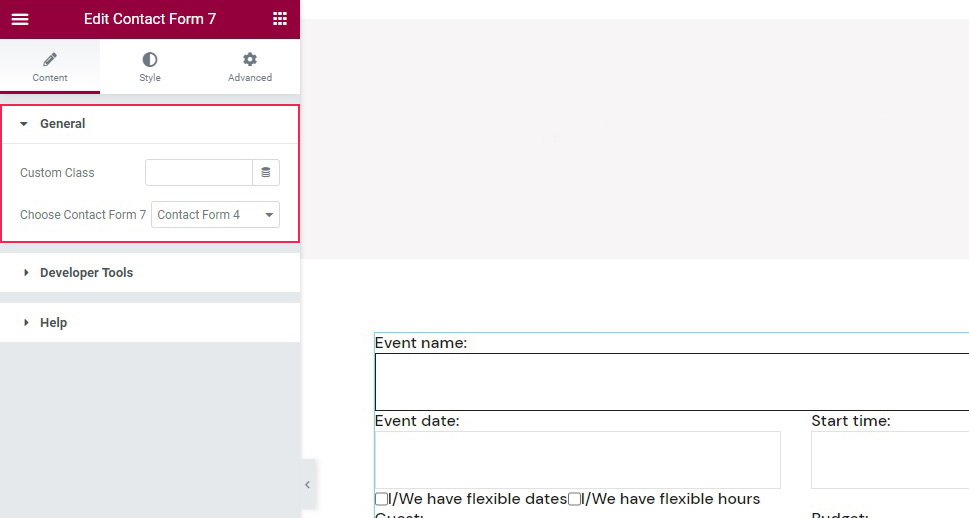
To create a form, simply drag the Qi Addons widget from the left hand side menu to where you want the form on the page.
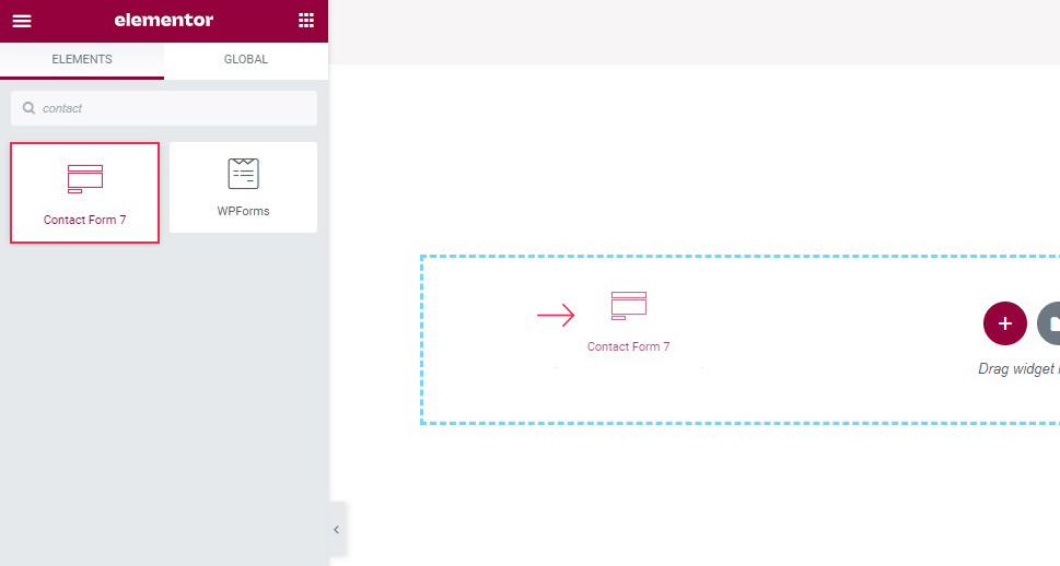
The content field, which should be open by default, lets you choose which of the forms you have saved will feature in the widget.
Qi Addons Contact Form 7 Label and Text Styling
As far as styling goes, you need to switch to the Style tab of the widget. Once there, you will find styling controls organized into several sections. In the Label Style section, you can change the label typography, if you want to use a different style, as well as the label color.
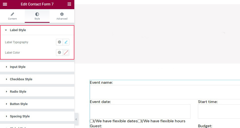
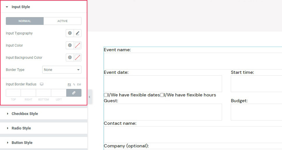
The Input Style sections has controls for input topography, text color, background color, and borders, and a Normal/Active tab which you can use to create different settings for the active and inactive fields, in case you wish to, say, choose a different background color for an active field in the name of accessibility and make it easier for your visitors to see which field they are entering text into.
Qi Addons Contact Form 7 Checkbox, Buttons, and Spacing Styling
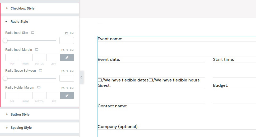
If you are using checkboxes or radio buttons in your form, you will find the controls to style them in the Checkbox Style and Radio Style sections of the Style tab. There, you can tweak their size and margins.
As for the buttons, you can find their styling options in the Button Style section. The buttons can be styled in the same Normal/Active modes, but also in terms of color, background color, size, and style.
As for the Spacing Style, this section holds the controls for the margins of the widget as well as some parts of it.
Qi Addons Contact Form 7 General Styling
The Global Style section of the Style tab merely sets the alignment of the widget, between left, center and right. The Error Style section governs your settings of the error messages in case a visitor gets something wrong when filling out the form. Finally, the Response Style section is used to style the okay message that your visitor should get after filling out and submitting the form.
Now let’s see how you can style your Contact Form 7 forms using another one of our plugins, Qi Blocks for Gutenberg.
How to Style Contact Form 7 Forms Using Qi Blocks for Gutenberg
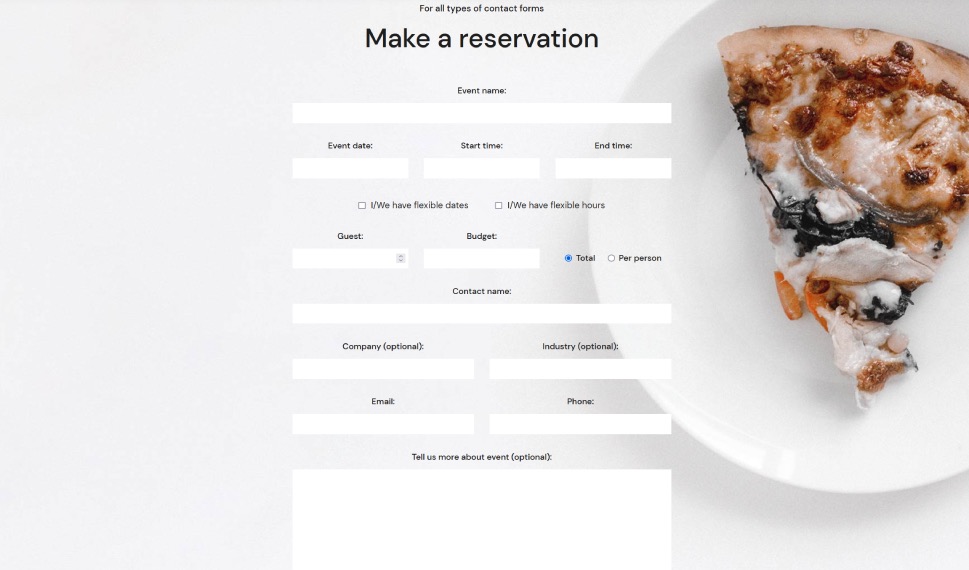
One of the things that make contact forms such a great tool is their versatility. Whether you’re adding them as popups or using them to express some innovative design ideas, they can easily find their place on any type of website and do their job well. And if you like to edit your website using the Gutenberg block editor, then Qi Blocks for Gutenberg should be your go-to choice for styling CF7 forms. The plugin features 81 different blocks, over half of which are available in the free version – including the Contact Form 7 Gutenberg block.
Before getting started, keep in mind that you’ll need to install the Contact Form 7 plugin, as well as Qi Blocks for Gutenberg. The Contact Form 7 Gutenberg block lets you add different forms you’ve created in the Contact Form 7 plugin – we’ve created the one we’re using in this example. We’ve also set up the page using the Advanced Columns and Section Title blocks, both of which are available with the free version of the plugin.
Adding the Contact Form 7 Block
We started by creating a new paragraph below the section title we’ll be using as a title for the contact form. The simplest way to add a new block would be to click on the “+” button on the right edge of the paragraph block and search for the Contact Form 7 block. Once you add the widget, the right-hand side block options menu will automatically open on Content options, where you choose the contact form you want to load with the block.
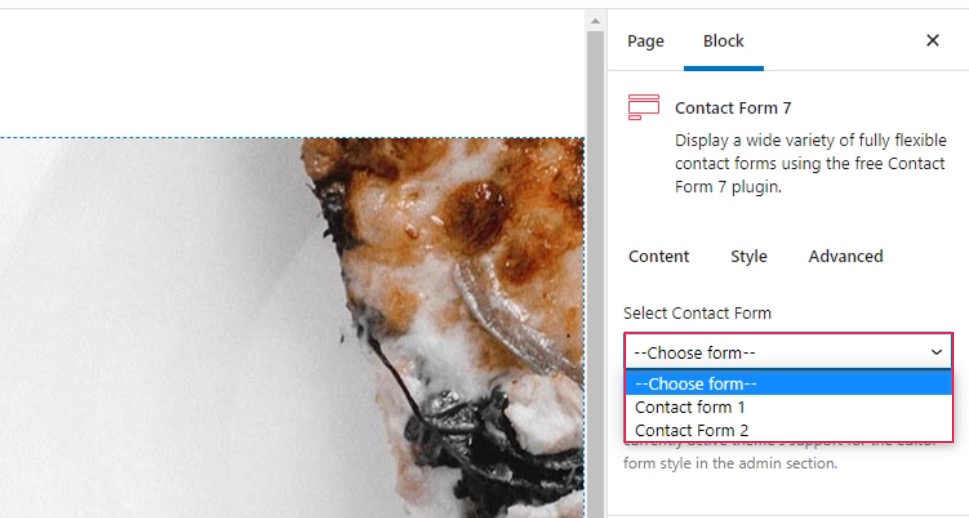
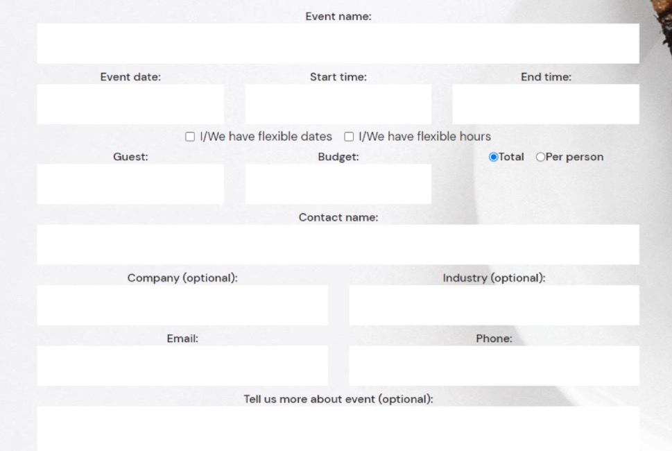
Contact Form 2 is the one we’ve made in the CF7 plugin, and choosing it loaded it in the block without any settings. To style the form, we went to the Style tab in the block options menu.
Styling the Form
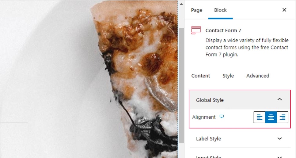
The first two styling options are the Global Style and Label Style options. The first one lets you choose the alignment of the label text, while the second gives you all the typography and color options you need to style the label as you see fit. For our contact form, we only changed the alignment to center in the Global Style options.
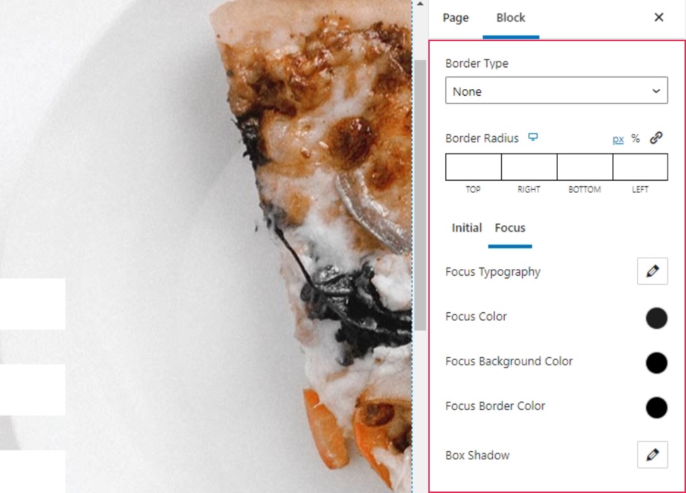
The next set of options, Input Style, lets you set up the border, as well as the style of the input fields and the text. You’ll get to choose typography, colors, and background colors, and you’ll be able to do it for both the initial state of a field and the one when the field is selected.
Our first step was to remove the border by choosing None under Border Type. For the Initial text color, we chose #c4c4c4, and we chose #ffffff as the background color. Under the Focus options, we again changed the text color to #1e1e1e.
Styling the Checkboxes and Radio Buttons
The Checkbox Style and Radio Style options let you style the checkboxes and radio buttons in your form. You can choose their sizes, margins, and spacing, and you can also set up custom typography options for the checkbox.
The one thing you should keep in mind is that the changes when styling the checkboxes and the radio buttons are only properly visible when you preview the page. In our case, the checkboxes and radio buttons were stacked vertically, while in the preview they appeared horizontally. Here’s what you’ll see in the editor.
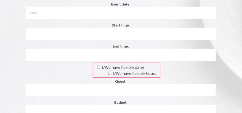
And here’s the preview that shows you what your website visitors will see.
The settings we used for the checkboxes were 7px for the right checkbox input margin, 50px for the checkbox space between, -4px for the top checkbox holder margin and 5px for the top checkbox holder margin. For the Radio Style options, we used 7px for the right radio input margin, 24px for the radio space between, and 28px for the top radio holder margin.
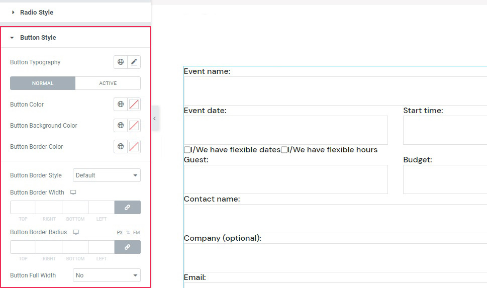
Styling the Buttons and Spacing
Among the Button Style options, you’ll find the options to set the button typography, color, border, and shadows. You’ll also get to style the initial and the hover versions of the button separately.
We set the Initial color for the text to #ffffff, while we used #333333 for the background color. We also set the background color to #000000 on hover.
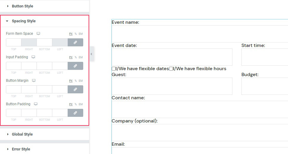
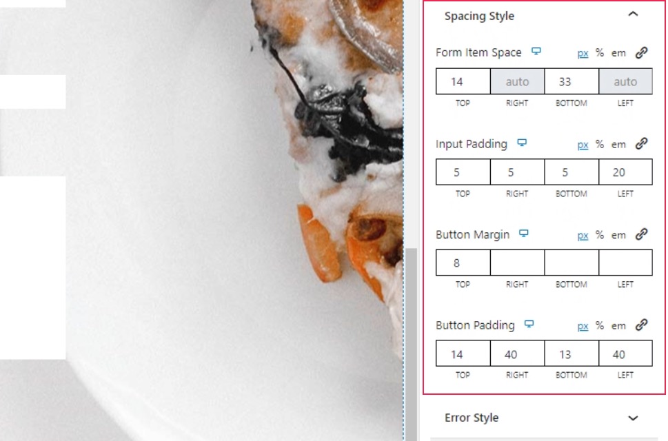
The Spacing Style lets you set all the various spacing, padding, and margins within the elements in the form. To make our form just right, we set 14px for the top and 33px for the bottom under the Form Item space. Under Input Padding, we set 5px everywhere except the final, left, value, which we set to 20px. We set the top Button Margin to 8px, and for the Button Padding, we used the following values: 14px, 40px, 13px, and 40px.
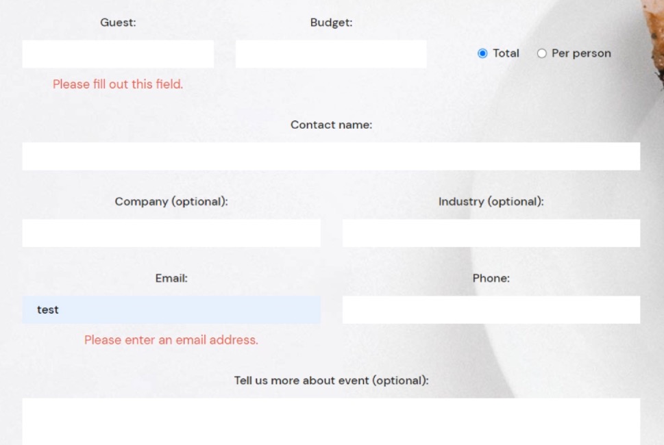
Styling the Error and Response Messages
For the Error Style, you’ll get to choose the alignments of the messages, their typography options, color, and margins. Under the Typography options, we set the font size to 17px and the line height to 26px. We set the Color option to #e54848, and the top Error Margin to 9px.
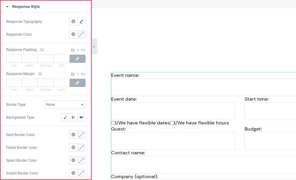
With the Response Style options, you get to style the message that appears after submitting the form. The options you have at your disposal include typography, color, padding and margins, border, and background options.
Under the typography options, we set the font size to 17px and the line height to 26px. We entered the following values under Response Padding: 16px, 25px, 19px, 25px. For the top Response Margin, we set the value at 40px. We choose the Solid border type and set the Border Width at 1px.
The block also lets you choose different border colors for different messages. We picked #61a73a for the sent border color, #f58e32 for the spam sent border, and #f1ce41 for invalid border color. And with that, we’ve finished styling our form.
Of course, there is a way to style your Contact Form 7 forms using CSS, and, to learn that, all you need to do is scroll down to the next section.
Styling Contact Form 7 Forms Using CSS
If, for whatever reason, you don’t use Elementor or don’t want to use our plugin (and we can’t think of a way why you wouldn’t want to), don’t fret. We got you covered. We will also cover how to create styles applicable to all your CF7 forms, as well as how to stylize a specific form using CSS. To follow along with this article, you will need to have the Contact Form 7 plugin installed and have at least one form on your website created with this plugin. Then, you will be able to use that form to apply the methods we discuss below.
Before we begin
In this article, we will cover how to create styles applicable to all your CF7 forms, as well as how to stylize a specific form. To follow along with this article, you will need to have the Contact Form 7 plugin installed and have at least one form on your website created with this plugin. Then, you will be able to use that form to apply the methods we discuss below.
Please note, the CSS you create during this process should be added inside Appearance > Customize > Additional CSS. If you aren’t comfortable with your current CSS skills, you should brush up on them beforehand as some CSS knowledge is necessary for grasping the topics in this article. Once you’ve done that, you can proceed to the main part of the article below.
Creating site-wide form styles
For this article, we created the following CSS, which would apply a specific style to all Contact Form 7 forms on your website.
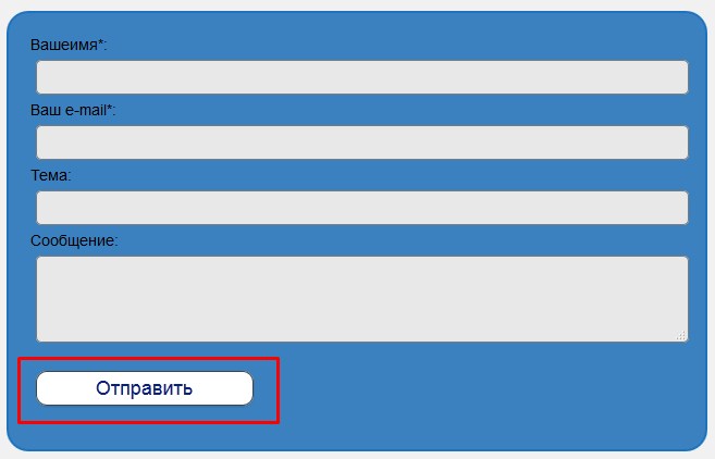
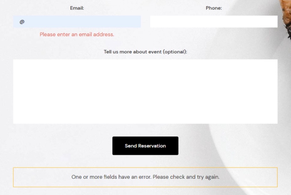
.wpcf7 {
background-color: #6ec1e4;
padding: 30px;
}
.wpcf7 input[type="text"], .wpcf7 input[type="email"], .wpcf7 textarea {
font-size: 16px;
color: #000000e8;
background-color: #E9ECF5;
border: 1px solid #E9ECF5;
border-radius: 10px;
}
.wpcf7 .wpcf7-submit {
background-color: #E9ECF5;
border: 1px solid #E9ECF5;
color: #1f1f1f;
width: 100%;
}
That code would produce the following output.
However, this is merely an example of CSS you can use. So, you shouldn’t rush to copy and paste it to your website without understanding how it was made. Since the CSS for styling forms should be made on a case-by-case basis, you will most likely need to adapt this or create one from scratch to use on your CF7 forms. To help you do that, we will explain why and how we created the code above, going one part at a time.
One of the most important requirements for creating CSS code, in general, is knowing how to inspect an element using your browser’s developer tools. As such, we will cover that step first. There are several ways you can access the developer tools (e.g. using keyboard shortcuts) but the most universally applicable way would be using mouse clicks.
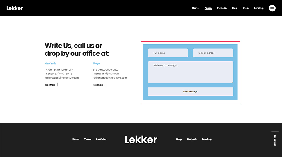
To inspect a certain element, right-click on it and select the Inspect option from the menu that appears. In the case of a Contact Form 7 form, clicking anywhere within the form will work.
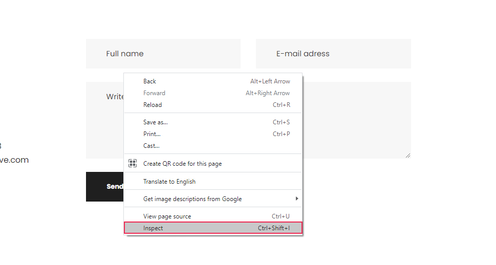
This will open your browser’s developer tools and place you within the Elements tab, where the HTML code of the element you clicked on will be highlighted. We will reference this process many times during the article, so you should get comfortable with inspecting page elements.
Once you’ve opened the developer tools, the first thing you should do is to look for the HTML element that corresponds to the whole form. Since Contact Form 7 forms have a well-known structure, you will be looking for an element that has the following starting HTML code:
<div role="form" class="wpcf7"
Also, when you hover over the HTML, the entire form should be highlighted.
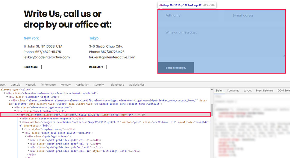
Furthermore, as you can see on the screenshot, the contact form element has a custom class and a unique ID. We will only use the class in this section and will touch on the ID later in the article. For now, we’re using the class because all Contact Form 7 forms share the wpcf7 class and, with it, we can create CSS code that will affect all your site forms in the same way.
.wpcf7 {
// CSS code goes here
}
You might recall that this is how the CSS we created for this article starts. The period used before the class name signifies that this is a CSS class selector. This means that the code that follows it will affect all of the CF7 forms on the website since they all share the same class.
In the code we created, the wpcf7 class is followed by CSS that will give your forms a background color and a padding of 30px on all sides.
.wpcf7 {
background-color: #6ec1e4;
padding: 30px;
}
Now let’s take a look at how corresponding CSS selectors for all the form fields were created.
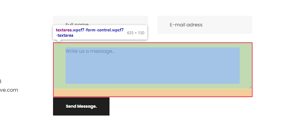
To create the CSS selector for the text field, inspect a text field as described above. In the screenshot below, you can see it is a simple textual input field.
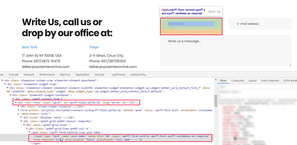
To reference it, you can use the following CSS selector – input[type=”text”]. However, this will select all textual inputs, including the ones that don’t belong to the form. To avoid that, you need to put the class selector for Contact Form 7 forms we previously mentioned before this. Meaning, you can create CSS code for textual form inputs in the following format:
.wpcf7 input[type="text"]{
// CSS rules go here
}
Similarly, you can find the equivalent pseudocode for email fields.
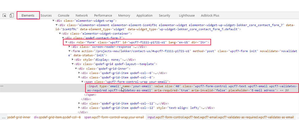
.wpcf7 input[type="email"]{
// CSS rules go here
}
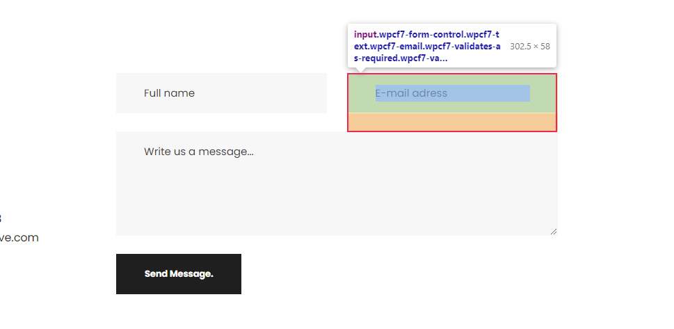
As for the textual areas, they are simply referenced by their HTML element—textarea, preceded by the form class name.
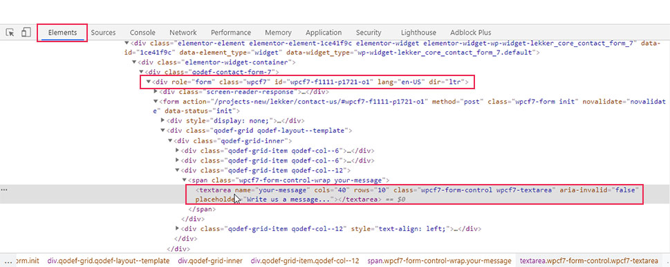
Meaning, if you want to target all CF7 form text areas, you can use the pseudocode given below.
.wpcf7 textarea{
// CSS rules go here
}
In our case, since we wanted to apply the same styles to the text and email fields, as well as the textual area, we used a compound CSS selector. This is done by using all three selectors separated by commas (.wpcf7 input[type=”text”], .wpcf7 input[type=”email”], .wpcf7 textarea). The styles that we added include setting a font size, and color for the text within the fields, as well as background color, border, and border-radius to the fields themselves making them slightly rounded on the edges.
.wpcf7 input[type="text"], .wpcf7 input[type="email"], .wpcf7 textarea {
font-size: 16px;
color: #000000e8;
background-color: #E9ECF5;
border: 1px solid #E9ECF5;
border-radius: 10px;
}
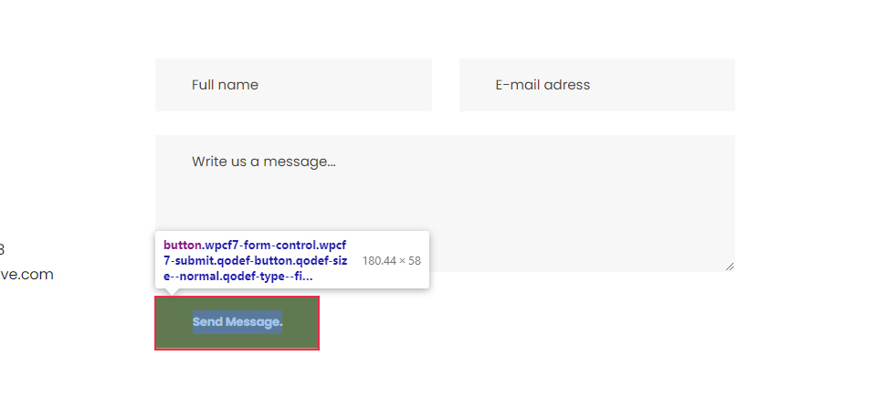
Finally, to figure out the appropriate CSS selector for the Send Message button, you need to inspect it.
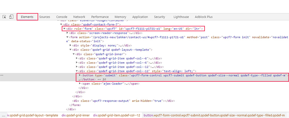
As you can see in the screenshot, this button has a custom class called wpcf7-submit, which is a Contact Form 7 specific class that you can use to reference the button. To make sure your CSS is highly specific, we advise using the form custom class—wpcf7 beforehand, as well. In that case, the pseudocode for targeting all CF7 form submit buttons could look like the following:
.wpcf7 .wpcf7-submit {
// CSS rules go here
}
In terms of the CSS we created for this article, we stylized the button to have a background and border, set the color of its text, and made it stretch across the full width of the form.
.wpcf7 .wpcf7-submit {
background-color: #E9ECF5;
border: 1px solid #E9ECF5;
color: #1f1f1f;
width: 100%;
}
With that being said, there are several other elements that can be used inside a contact form, which we chose to omit from our example. But if you decide to use them, you can create the appropriate CSS selector for all of them the same way we’ve described above.
Creating form-specific styles
In most cases, creating one type of CSS code to stylize your CF7 forms won’t be enough. Forms with different purposes will require different styles to stand out on your pages. As such, you will need to create additional CSS code for specific forms.
In this section, we will explain several tips on how to create form-specific styles. Since the hardest part in creating these styles lies in finding the appropriate CSS selectors that target specific forms or form fields, we will focus on that aspect the most.
The easiest way to create form-specific styles is to use the specific ID every form has instead of the custom class that is shared by all CF7 forms.
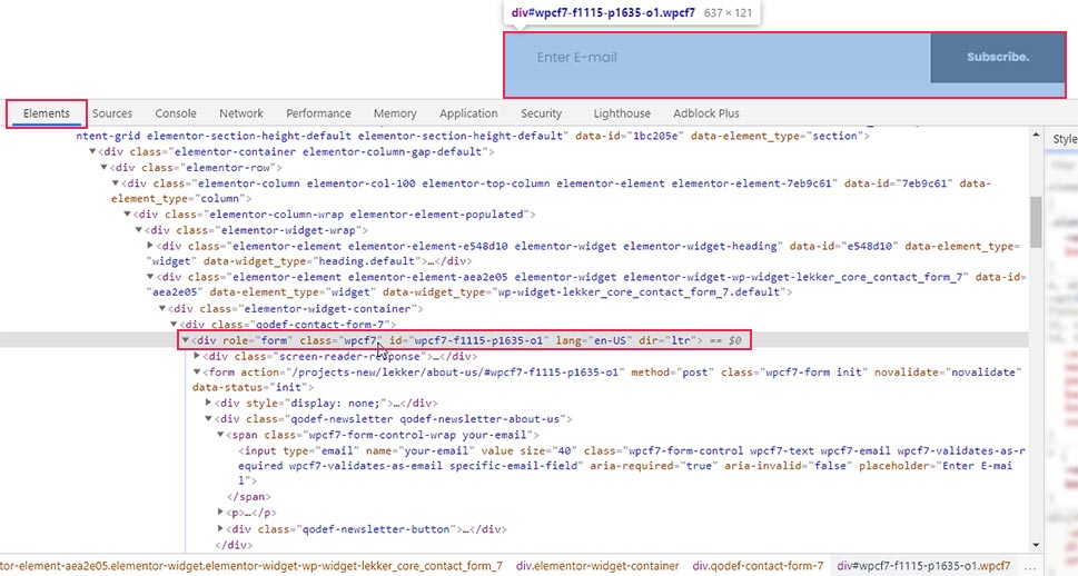
To find out the specific ID of a CF7 form, inspect it and navigate to the HTML element that wraps the form. The element will have the following HTML part:
<div role="form" class="wpcf7" id="form-ID-is-here"
You will find the ID within the quotation marks of the id attribute.
Then, to stylize a specific form with that ID, you will need to use the CSS code in the following format:
#form-id {
// CSS rules go here
}
For example, if we wanted to stylize the form shown on the screenshot above, we would use the following pseudocode:
#wpcf7-f1115-p1635-o1 {
// CSS rules go here
}
Furthermore, to reference the fields within that specific form, we would have to change the wpcf7 class with the wpcf7-f1115-p1635-o1 ID, as well. Meaning, if we wanted to apply the previously created CSS to this form only, then the code would look the like this:
#wpcf7-f1115-p1635-o1 {
background-color: #6ec1e4;
padding: 30px;
}
#wpcf7-f1115-p1635-o1 input[type="text"], #wpcf7-f1115-p1635-o1 input[type="email"], #wpcf7-f1115-p1635-o1 textarea {
font-size: 16px;
color: #000000e8;
background-color: #E9ECF5;
border: 1px solid #E9ECF5;
border-radius: 10px;
}
#wpcf7-f1115-p1635-o1 .wpcf7-submit {
background-color: #E9ECF5;
border: 1px solid #E9ECF5;
color: #1f1f1f;
width: 100%;
}
As we’ve mentioned before, the CSS in this article isn’t meant to be simply copy-pasted. CSS for form stylization should be created on a case-by-case basis. Also, when creating CSS for a specific form, you wouldn’t use the same CSS that is used for all other forms because that will make them identical. Generally speaking, you might use a part of the CSS from one form and edit it to fit another form. The point you need to remember is to use a form-specific ID to narrow down the scope of your CSS. Now that we clarified that, we can move on.
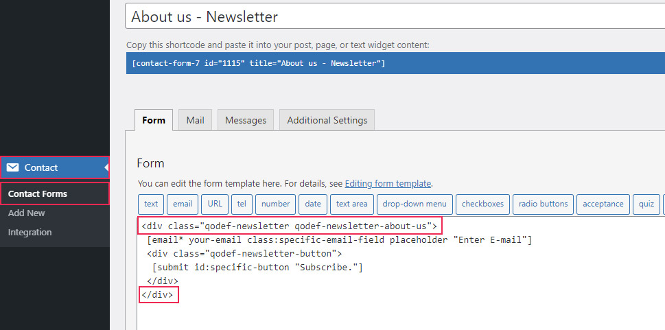
There are two other tricks you can use for creating form-specific styles. The first is to edit the HTML structure of the CF7 form by inserting the appropriate wrapping HTML elements. By adding specific classes or IDs to these HTML elements, you should find creating form-specific styles much easier.
For example, we wrapped fields of a newsletter subscription form with a div element and assigned two custom classes to it: qodef-newsletter and qodef-newsletter-about-us. You can use either of those classes (or even both) to reference that specific contact form.
To add a new custom class, you need to edit the structure of the contact form. To do so, navigate to Contact > Contact Forms, select the form you wish to edit, and wrap it with appropriate HTML elements.
You can then use the assigned classes or IDs to reference that specific form. In the example shown above, we used two custom classes, so you can choose between the following CSS selectors:
-
.qodef-newsletter
-
.qodef-newsletter-about-us
-
.qodef-newsletter.qodef-newsletter-about-us
Additionally, you can even use them in conjunction with the CF7 form class selector we previously discussed—wpcf7 or the form ID, to make them more precise. Doing this can prove useful if you have conflicting CSS that comes from your theme or plugins.
With that being said, the second trick we wanted to mention ties directly into the first one. If you look closely at the screenshot above, you can see that we wrapped the submit button with a div element and assigned a custom class to it—qodef-newsletter-button.
This goes to show that the approach mentioned above isn’t limited to forms only. You can reference specific fields within a specific form by wrapping them with appropriate HTML elements and using the assigned classes or IDs as CSS selectors. For example, to reference the submit button, you could use the following CSS selector .qodef-newsletter-button .wpcf7-submit.
The final thing we want to mention is that you can also add classes and IDs to the form fields directly instead of adding them to the wrapping HTML element. This is done by adding the class:class-name-here or id:id-name-here attributes to the form fields, with the appropriate class and ID names inserted. An example of both can be seen in the screenshot below.
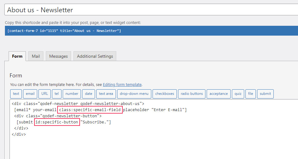
To reference those fields in your form-specific CSS, you would simply use those classes or IDs. For example, to reference the email field from the screenshot, you can use .specific-email-field as the CSS selector. To reference the submit button, you can use #specific-button as the selector.
This concludes the section on tips you can use to create a form-specific CSS selector. Now that you have a better grasp of this topic, you can style Contact Form 7 forms by applying common CSS rules to those specific selectors.
form-specific-selector {
// CSS rules go here
}
Final Thoughts
Having contact forms on your WordPress website is a crucial step in properly interacting with your visitors. However, styling those forms to seamlessly blend with your current brand is a challenge for any webmaster. This is where our article comes in—to provide you with the ideas needed to style any form. Within it, we explore how to use specific classes and IDs to target specific forms or form parts. As a practical example, we created CSS to style a Contact Form 7 form. Whether you’re using that plugin or any other contact form plugins, you will be able to use all the approaches we described to create a custom style for your form in a matter of minutes.
Приветствую вас, уважаемый читатель! Сегодня я покажу вам, как создать форму обратной связи с автором сайта/блога в ВордПресс, при помощи популярного плагина Contact Form 7 (более 5 млн. установок). В пост включено: правильная настройка Contact Form 7, защита от спама, как изменить и настроить внешний вид формы. А также указал на основные причины — почему не работает и не отправляет письма контактная форма.
Контактная форма является важным средством для поддержки связи со своими читателями и наоборот. Чиркнуть личное письмецо, сделать предложение автору (от которого он не сможет отказаться), задать вопрос, отправить какой нибудь файл и многое другое. Все это возьмет на себя и не разгласит посторонним ценную информацию, наша контактная форма WordPress Contact Form 7. Вот, как то, так. Написал так написал, самому аж понравилось.

Не буду вас утомлять, уважаемый читатель, всякой писаниной — перейдем к делу. Установка и правильная настройка модуля для ВордПресс — контактная форма 7.
Ещё один плагин контактных форм. Простой, но гибкий.

Contact Form 7 может управлять многочисленными контактными формами, где вы можете гибко настраивать содержимое форм и почты с достаточно простой разметкой. Формы имеют встроенную поддержку Ajax отправки, CAPTCHA, спам фильтра Akismet и не только.
Все манипуляции производим в админке ВордПресс. Для того, чтобы установить плагинчик, в разделе «Плагины» нажимаем «Добавить новый». Вводим в окошко «Поиска» Contact Form 7. Естественно он отобразится первым. Кликаем кнопку «Установить:

После успешной установки не забудьте его активировать. Полдела сделано. Следующий шаг, это — настройка вашей контактной формы.
Contact form 7 настройка
Находим в панели управления появившийся новый раздел «Contact Form 7» — пункт «Контактные формы». На данной странице у вас уже будет готовая по умолчанию форма контактов. С номером 1.

Из картинки видно, что по умолчанию представлена стандартный вариант формы для связи и готовый шорткод для вставки на новую страницу, запись или на боковую панель (через текстовый виджет). Contact form 7 внешний вид по умолчанию, установленная на отдельной странице сайта:

Если вы хотите просто посмотреть, проверить или изменить, то есть, добавить к ней дополнительные поля, тогда нажмите пункт «Изменить». Скрин выше.
Откроется страница «Редактировать контактную форму». Плагин на русском языке и поэтому вам разобраться что к чему, будет очень легко. Вкладка «Шаблон формы». Вы можете изменить шаблон формы под свои нужды.
Например, чтобы добавить в шаблон формы тег поле для загрузки файла, нужно: Отметить мышкой место для вставки тега (лучше всего после сообщения) и нажать соответствующею вкладку «файл». С помощью этой функции вы можете разрешить пользователям загружать свои файлы через вашу форму, а затем вам будет отправлено электронное письмо с вложениями файлов:

Откроется окно — Генератор тега формы: файл:

Контактная форма 7 применяет ограничения по умолчанию для типа файла и размера файла. Когда вы не устанавливаете свои параметры, то по умолчанию расширения файлов являются: jpg, jpeg, png, gif, pdf, doc, docx, ppt, pptx, odt, avi, m4a, mov, mp3, mp4, mpg, wav, wmv. А допустимый размер файла составляет 1 МБ (1048576 байт). Жмём кнопочку «Вставить тег»:

Где отметили курсором мышки там и появится дополнительный тег. Если вставился не в том месте, то просто копируете его и помещаете в нужное. Таким же способом добавьте нужные теги в вашу форму. Обязательно после добавления дополнительных тегов нажимайте синею кнопку «Сохранить». А вот так, будет выглядеть кнопка для прикрепления файла к письму, после поля сообщения:

Если всё правильно делаете, то проблем с дополнительными полями, у вас не будет.
Ещё проверьте вкладки Письмо, Уведомления при отправке формы и Дополнительные настройки. По моему там и менять ничего не надо. Если только в Дополнительных настройках можно указать параметр — только для подписчиков — subscribers_only: true. Для подробной информации будет ссылка на страницу настроек дополнительных параметров.
А теперь, друзья, нам нужно подготовленную контактную форму разместить на отдельную, новую страницу или боковую панель веб-ресурса. Делается это легко.
Размещаем контактную форму на отдельной странице сайта/блога
После всех настроек и сохранения формы, скопируйте шорткод на странице Контактные формы или Редактировать контактную форму.
После этого, создайте новую страницу — раздел Страницы — Добавить новую. Вписываем название страницы, например «Контакты». Переключаем редактор сообщений в режим «Текст» и вставляем шорткод в поле сообщений:

Если у вас новая страница автоматически добавляется в меню, то выставляем «Порядок» 1, 2 или 3 (какая по счету в меню, будет отображаться страница Контакт). Нажимаем кнопку «Опубликовать». Всё. Готово.
Так же вы можете добавить страницу в меню вручную. Теперь у вас установлена форма для связи с автором блога/сайта.
Таким же методом контактную форму добавляют на боковую панель, футер или в текст статьи. Скопируйте шорткод и вставьте его в свои записи или содержимое текстового виджета. Знайте, что в любой момент форму можно отредактировать или создать новую, с разными тегами/полями.
Получаете спам через Contact Form 7?
Есть защита. Спамеры затрагивают всё, ваши контактные формы не являются исключением. Прежде чем вас заспамят, защитите ваши контактные формы с помощью мощных анти-спам функций Contact Form 7.
Contact Form 7 поддерживает фильтрацию спама с Akismet. Интеллектуальная reCAPTCHA блокирует раздражающих спам ботов. Используя черный список комментариев вы можете также блокировать сообщения, содержащие определенные ключевые слова или отправляемые с определённых IP адресов.
Сервис Google reCAPTCHA защищает вас от спама и других видов автоматического злоупотребления. С модулем интеграции reCAPTCHA в Контактную форму 7 вы можете заблокировать форму отправку спам-ботами.
Интеграция Google reCAPTCHA v3 в Contact Form 7: защита от спама
reCAPTCHA v3 проверяет запросы с оценкой и дает вам возможность предпринимать действия в контексте вашего сайта.
Нажмите пункт «Интеграция». Вы увидите поле под названием reCAPTCHA:

Клик Настройки интеграции, а после перейдите по ссылке, чтобы получить ключи ReCaptcha API:

Чтобы начать использовать Contact Form 7 reCAPTCHA, сначала необходимо зарегистрировать ваш сайт WordPress где установлена контактная форма.
reCAPTCHA — это сервис Google, поэтому для его использования вам необходим аккаунт Google.
Войдите в Google, используя учетную запись, и перейдите по ссылке https://www.google.com/recaptcha/admin. Вы увидите простую регистрационную форм:

Укажите название (Ярлык). Выберите reCAPTCHA v3 (для работы reCAPTCHA v3 не нужен виджет CAPTCHA (флажок «Я не робот», используемый в reCAPTCHA v2)) и введите домен сайта в поле Домены. Примите Условия использования reCAPTCHA и нажмите кнопку Отправить.
После регистрации сайта вы получите ключ сайта и секретный ключ:

Введите их (скриншот выше) и сохраните настройки. Вот и все. Теперь ваша контактная форма используют счет reCAPTCHA, чтобы проверить, была ли отправлена сообщение от человека или от спам-бота.

Если вы решите установить Contact Form 7, то я советую дополнительно к нему установить аддон Contact Form 7 Style. Он позволит вам редактировать внешний вид вашей формы. Вы сможете не только выбрать один из готовых шаблонов, но и создать свой собственный уникальный дизайн. Хотите изменить внешний вид? Тогда продолжение специально для вас, ценителей красоты.
Внешний вид контактной формы — Contact Form 7 Style

Плагин Contact Form 7 Style — это аддон для Contact Form 7, который необходимо установить на вашем сайте WordPress. Поддерживает пользовательские стили, которыми можно легко управлять через панель администратора. Также есть предопределенные шаблоны которые можно активировать в настройках контактной форме 7. В настройках основного плагина появится новая вкладка — Contact Form 7 Style Template. Настройка внешнего вида:

Пример, я изменил стандартный внешний на такой симпатичный:

Не забывайте, что можно задать свои, пользовательские параметры стиля:

И в заключение:
Отправка электронных писем из контактной формы 7 работает без проблем для большинства людей. Но оказывается не для всех. Несмотря на то, что плагин успешно отправляет миллионы писем каждый день, существует множество проблем, которые могут задерживать или останавливать электронные письма, как на отправляющей, так и на принимающей стороне типичной электронной почты.
Почему не работает (не отправляет письма) Contact Form 7?
- Проблемы вашего хостинга. Важно отметить, что отправка и получение электронных писем в значительной степени зависит от сервера, на котором размещен ваш сайт WordPress;
- Убедитесь, что используется правильный обратный электронный адрес;
- Ваше письмо может рассматриваться как спам;
- Плагины или тема конфликтует с Contact Form 7;
- Конфликты Javascript.
Если вы не можете отправлять электронные письма из этого плагина, вполне вероятно, что вы не можете отправлять электронные письма из WordPress в целом. В случае чего, господа, получить на часто задаваемые вопросы по работе плагина вы можете на странице https://contactform7.com/faq/.
Или на форуме поддержки https://wordpress.org/support/plugin/contact-form-7/. Английский язык не беда, с переводом любимого браузера будет всё понятно.
На этом у меня всё. Вроде, ни чего не забыл. Всего доброго. Удачи, друзья.
P.S. Оказывается на редактирование старых постов (информация для читателей должна быть актуальной всегда) уходит столько же времени, как на написание новой инструкции. Ужас!
 Плагин Contact form 7 мы обсудили в предыдущей статье. Но не затронули тему изменения внешнего вида самой формы. Именно этот вопрос мы сегодня и попробуем решить.
Начнем с использования специально созданного для Contact form 7 плагина.
Contact Form 7 Style
Этот плагин находится в библиотеке WordPress. Просто введите его название или просто название плагина контактной формы и он будет выложен на первой странице. Активируем его.
Теперь при редакции новой формы, к четырем вкладкам настроек, добавляется пятая, которая так и называется “Contact Form 7 Style шаблоны”

Если Вы переходите на эту вкладку, то просто выбираете тот шаблон, который вам понравился (их несколько, просмотреть их можно перелистывая страницы “карусели” с шаблонами) и сохраняете выбор.

Для примера выберем шаблон формы для контактов в день Валентина. И вот что у нас получилось.

Теперь пройдемся по настройкам самого плагина. Вы их найдете в левом меню консоли блога.
All Styles – Все стили
В этой опции показаны все стили в виде списка. Если нажать под стилем формы на ссылку “Свойства”, то откроются настройки всех созданных вами форм в плагине Contact form 7. Каждая будет обозначена чек боксом. Установив напротив выбранной формы галочку, вы не заходя в настройке присваиваете ей вид того стиля, который выбрали. Или наоборот – убираете раннее выбранный. Очень удобно.

Add new – Добавить новую
Это страница конструктора формы. Первое что необходимо сделать – дать ей название. Здесь же – предварительный просмотр и возможность ее публикации или сохранения.

Можно не создавать новую форму, а выбрать ту, которая уже создана, но у вас появилось желание изменить ее внешний вид. Просто делаете выбор в окне ниже. Нажав на красную клавишу – предварительно просмотра, отправляете ее в соответствующее окно. Вторая клавиша – отправка изменения и сохранения в плагине Contact form 7.
Здесь же есть очень большой выбор дополнительных шрифтов.

Теперь самое интересное – работа с настройками формы. Здесь все очень просто – выбираете кнопку соответствующей настройки – настройки самой формы (ширина, длина, цвет), натройка кнопки, текстового поля, радиокнопок и т.д. И работаете с ними. Если возникают вопросы – просто переведите текст.
Настройки можно сделать для обычного состояния и изменения внешнего вида при наведении курсора. Просто установите флажок в нужном положении.
После завершения работы – сохраните стиль формы.

CSS Editor – Настройки CSS
Здесь вы найдет поле для введения разметки CSS, которую невозможно добавить через настройки, указанные выше.
Setting – Настройки плагина
Переведите интерфейс этих настроек и выберите те, которые считаете нужным. Практически здесь все понятно. Я установила флажки во всех чек боксах.

System Status – Обратная связь с поддержкой плагина.
Вот и все настройки. Плагин очень удобен и прост. Пройдитесь по настройкам, не бойтесь попробовать настройки всех предложенных кнопочек. Чем больше вы будете экспериментировать, тем быстрее освоите плагин.
Плагин SiteOrigin CSS, я его уже упоминала в предыдущей статье, так же очень хорошо и быстро меняет внешний вид формы
Как всегда, предлагаю Вам свою рассылку – “Инструменты в помощь начинающему блогеру”. Подписавшись на которую, будете получать всю последнюю информацию о настройках блога
Ну что же, удачной Вам работы! Будут вопросы или пожелания, пишите в комментариях. Если информация была для Вас полезной – делитесь ей со своими друзьями в социальных сетях

На чтение 3 мин Опубликовано 02.01.2019
Привет! Сегодня я покажу вам очень полезный плагин WordPress для настройки внешнего вида контактной формы Contact form 7. Вы можете очень просто и быстро изменить CSS стили формы обратной связи. Можно изменить цвет текста, фона, кнопки, границ, установить фото на фон и т.д. Смотрите инструкцию далее и пишите комментарии, если вам что-то не понятно. Поехали!
Установить плагин CF7 Customizer вы можете прямо из админ-панели WordPress. Перейдите на страницу: Плагины — Добавить новый, введите название плагина в форму поиска, установите и активируйте плагин.

Далее, в админ-панели, слева в боковой панели, перейдите на страницу: Внешний вид — Настроить.
Обратите внимание. На вашем сайте, уже должен быть установлен плагин Contact form 7. Форма должна отображаться на сайте.

Далее, слева у вас откроется окно с настройками. Нажмите на вкладку CF7 Customizer. Справа на сайте откройте страницу где стоит форма связи, чтобы вы могли сразу видеть все изменения.

Здесь вы можете выбрать, какие стили вы хотите изменить. Ниже разберём всё по порядку.

Form Text & BG Colors
- Text Color, цвет текста обозначения полей;
- Background Color, цвет фона текста названия полей;
- Background Image, изображение в виде фона;
- Font Size, размер шрифта, текста.

Обратите внимание. Фото будет фоном только для области, где отображаются названия полей.

Form Padding, Margin & Border
- Padding, отступ в пикселях от полей формы;
- Margin, можно расширить границы (форма станет меньше);
- Border, увеличить размер бордюра;
- Border Radius, изменить радиус бордюра;
- Border Color, цвет бордюра, границы.

Input Fields Styling
- Make input fields full width? Сделать поля ввода на всю ширину?
- Input Text Color, изменить цвет текста ввода;
- Input Background Color, изменить цвет фона текста ввода;
- Padding, отступы от полей ввода информации;
- Margin Between Input Fields, разница между полями ввода;
- Font Size, размер текста;
- Input Fields Border, граница полей ввода;
- Input Fields Border Radius, радиус границы полей ввода;
- Input Field Border Color, цвет границы полей ввода.

Button Styling
- Full Width Button, сделать кнопку на всю ширину?
- Button Text Color, цвет текста в кнопке;
- Button Background Color, цвет фона кнопки;
- Button Hover Text Color, цвет текста в кнопке при наведении;
- Button Hover Background Color, цвет фона кнопки при наведении;
- Border, бордюр, граница;
- Border Radius, радиус границ;
- Button Border Color, цвет границ кнопки;
- Button Border Hover Color, цвет границ кнопки при наведении.
После того как вы настроите внешний вид, нажмите вверху на кнопку Опубликовать, чтобы сохранить сделанные изменения.

Остались вопросы? Напиши комментарий! Удачи!