
Несмотря на то, что красота понятие относительное, мы все хотим обучаться на удобных платформах, которые будут приятны глазу. Вкусы у всех разные — кому-то нравятся пастельные оттенки в оформлении, кому-то подавай определённый шрифт, а кто-то любит минимализм.
Для системы Moodle это не является проблемой, поэтому сегодня расскажем о том, как сделать ее более удобной для работы.
Как изменить дизайн платформы Moodle?
Начнем с того, что сделать это можно двумя способами. Первый — выбрать одну из стандартных тем, которые уже есть в системе. Второй — скачать понравившийся вам вариант оформления на официальном сайте, а затем установить его.
Для первого способа перейдите в раздел Настройки и выберите пункт Внешний вид — Темы — Выбор темы. Так вы перейдете на страницу, где увидите список всех доступных тем. Далее вам нужно выбрать понравившуюся и нажать кнопку Использовать тему. Некоторые темы можно изменять самостоятельно. Поэтому если вы выберете тему, которая содержит в себе какие-либо дополнительные настройки, то система обязательно предоставит вам возможность их использовать.

Результат можно увидеть уже после перехода на главную страницу платформы. Если он вам не понравится, вы всегда можете вернуться в раздел настроек и выбрать другую тему. Вы можете менять их столько раз, сколько захотите.
Второму способу — установке новой темы в Moodle, мы уже посвящали целую статью. Там есть некоторые нюансы, с которыми лучше ознакомиться. А сейчас мы поделимся основной инструкцией к установке.

- Перейдите в раздел Настройки и выберите пункт Администрирование — Плагины — Установка дополнений. Далее нажмите кнопку «Установить дополнение из каталога плагинов Moodle…», после этого вы будете перенаправлены на сайт moodle.org и там вам предложат войти в аккаунт.
- После авторизации на сайте вы увидите страницу со списком плагинов для системы Moodle. Теперь вам необходимо выбрать вашу версию системы и перейти в раздел «Themes» (темы).
- Выберите понравившуюся вам тему и нажмите Install. Далее вы увидите страницу, где будет указано, на какой сайт произойдёт установка выбранной темы. Снова нажимаем Install и переходим на страницу загрузки дополнений, выбираем Продолжить. Начнется загрузка и проверка файлов темы.
- В случае успешной проверки можно идти дальше, щелкаем кнопку Установить дополнение. После этого на странице проверки плагинов появится пункт с выбранной вами темой и пометкой «Будет установлен». Чтобы начать установку темы, нажимаем Обновить Moodle. Если все пройдет успешно – вы увидите оповещение. Далее выбираем Продолжить.
- Это завершающий шаг. На нем вы перейдете на страницу, где можно будет изменить установленную вами тему — настроить логотип, цвета и т.д. На этом установка темы завершена. После этого получившийся шаблон вы можете применить к вашей системе: перейти в раздел Настройки и выбрать пункт Внешний вид — Темы — Выбор темы.
Индивидуальный дизайн
Что делать, если для обучения внутри вашей фирмы хочется систему с индивидуальным дизайном — определенным шрифтом, фирменным логотипом, фотографией на странице входа и прочими элементами? Ответ: обратиться к команде LMS-Service.
Обязательным требованием практически для всех наших проектов является создание индивидуального дизайна системы, основанного на корпоративном стиле заказчика.
Например, для транспортной компании «РесурсТранс» мы не только разработали уникальный дизайн системы, но и упростили навигацию пользователей, а также разработали ряд дополнительных страниц и интерфейсов, чтобы система полностью вписывалась в их корпоративный стиль. Полностью с историей этого сотрудничества можно ознакомиться по ссылке.


Если вы задумались о внедрении системы дистанционного обучения в свой бизнес, подписывайтесь на нашу полезную рассылку. Для этого оставляйте почту в специальном окошке внизу сайта и получайте информацию самыми первыми!
В статье подробно объясняем установку базовых тем в системе дистанционного обучения.
Начнем с того, что система Moodle поддерживает множество вариантов оформления. Вы свободно можете изменять цветовую гамму сайта, виды значков, шрифты и многое другое.
Выбор темы
Для визуалов записали отдельную видеоинструкцию, как сменить дизайн в Moodle.
Начнем с самого простого варианта — установим тему, которая уже есть в стандартном пакете системы. Чтобы выбрать тему для оформления, вам нужно перейти в раздел Настройки и выбрать пункт Внешний вид — Темы — Выбор темы.
Далее вы увидите страницу со списком всех доступных тем. Далее дело за малым — выбираете любую понравившуюся и нажимаете кнопку Использовать тему. Если в ней будут какие-либо дополнительные настройки, система обязательно предоставит вам возможность их использовать.
Чтобы полюбоваться результатом, просто перейдите на главную страницу. Если вас что-то не устроит, вы всегда можете вернуться в раздел Настройки и попробовать другую тему для оформления ваших курсов.
Установка новой темы
Если ни одна из стандартных тем оформления вам не понравится, вы всегда можете скачать и установить свою. Мы рекомендуем скачивать новые темы с официального сайта — moodle.org
Для начала вам потребуется зарегистрироваться на этом сайте, а затем просмотреть все представленные темы в разделе загрузок (Downloads).
Чтобы выполнить регистрацию вам нужно:
- Перейти на сайт moodle.org
- Нажать «Создать учетную запись»
- Заполнить форму своими данными — указать фамилию, имя, адрес электронной почты.
- Подтвердить почту, чтобы активировать аккаунт
Если какая-либо тема вам понравилась, и подходит для вашей версии Moodle, то мы можем приступить к ее установке. Для этого вам необходимо сделать несколько простых шагов:
Шаг 1.
Перейдите в раздел Настройки и выберите пункт Администрирование — Плагины — Установка дополнений. Далее нажмите кнопку «Установить дополнение из каталога плагинов Moodle…», после этого вас перенаправят на сайт moodle.org и предложат войти в аккаунт.
Шаг 2.
После авторизации на сайте вы увидите страницу со списком плагинов для системы Moodle. Теперь вам необходимо выбрать вашу версию системы и перейти в раздел «Themes» (темы).
Выберите понравившуюся вам тему и нажмите Install.Далее вы увидите страницу, где будет указано, на какой сайт произойдёт установка выбранной темы. Снова нажимаем Install и переходим на страницу загрузки дополнений, выбираем Продолжить. Начнется загрузка и проверка файлов темы.
Шаг 3.
В случае успешной проверки можно идти дальше, щелкаем кнопку Установить дополнение. После этого на странице проверки плагинов появится пункт с выбранной вами темой и пометкой «Будет установлен».
Чтобы начать установку темы, нажимаем Обновить Moodle. Если все пройдет успешно – вы увидите оповещение. Далее выбираем Продолжить.
Шаг 4.
Это завершающий шаг. На нем вы перейдете на страницу, где можно будет изменить установленную вами тему — настроить логотип, цвета и т.д.
На этом установка темы завершена. После этого получившийся шаблон вы можете применить к вашей системе также, как мы писали вначале статьи: перейти в раздел Настройки и выбрать пункт Внешний вид — Темы — Выбор темы.
Дополнительные возможности: устанавливаем логотип
Как мы уже говорили выше, некоторые темы для оформления имеют дополнительные настройки. В частности, вы можете установить свой собственный логотип для сайта. Давайте разберем, как это сделать.
Для начала вам необходимо выбрать свой логотип или создать его самостоятельно. Обычно это изображение или надпись, которое отражает название или тематику вашего сайта в системе Moodle.
Конечно, вы можете просто скачать понравившееся изображение из интернета, но лучше, если логотип вы создадите сами.
Также для создания логотипов можно воспользоваться одним из онлайн-сервисов, например:
- Wix Logo Maker
- LogoTypeMaker
- Logaster
- Ucraft
- Logoza и т.д.
Получившийся логотип должен гармонично вписаться в общий дизайн вашего сайта для дистанционного обучения. Желательно, чтобы он имел формат PNG, т.е. изображение на прозрачном фоне.
Чтобы установить свой логотип на сайт Moodle, необходимо загрузить изображение на сервер и в настройках темы указать его адрес. Для начала загрузим его в корневую директорию:
- Заходим в панель управления хостингом, авторизуемся и переходим в раздел «Файловый менеджер»;
- Открываем папку ваш_сайт/public_html/ и загружаем в нее ваш логотип. Например, logotype.png Адрес картинки в этом случае будет следующим — ваш_сайт/public_html/logo.png;
- Переходим в систему Moodle, переходим во вкладку Администрирование — Внешний вид —Темы — *Ваша тема*. Затем в строке Logo прописываем адрес из предыдущего шага и щелкаем Сохранить изменения;
- Чтобы изменения вступили в силу, очищаем кэш тем: Администрирование — Внешний вид — Темы —Выбор темы. В самом верху нажмите Очистить кэш тем. Готово!
Надеемся, что наша статья помогла вам с установкой темы для системы Moodle. Чтобы получать еще больше полезной информации, подписывайтесь на наш телеграм-канал об онлайн-образовании 
Warning: This page is no longer in use. The information contained on the page should NOT be seen as relevant or reliable.
Moodle 2.1
Moodle 2.0
This document describes how to create a theme for Moodle 2.0 and Moodle 2.1. ONLY. It assumes you have some understanding of how themes within Moodle work as well as a good understanding of HTML and CSS.
For Themes in Moodle 2.2 onwards please read the tutorial about How to clone a Moodle 2.2 theme.
Theme designer mode
Under normal operation Moodle does several things in the name of performance, one of these is to combine all of the CSS into one file, minimize it, cache it on the server, and then serve it. After the first request the cached version is served to greatly improve page performance.
What this means for you as a themer? When you make changes they will not be seen immediately. In fact you will need to tell Moodle to rebuild the cache that it is serving.
This isn’t practical for designing themes of course so the theme designer mode was added. When enabled it tells Moodle not to combine or cache the CSS that gets delivered. This has the downside that page load times will take significantly longer, however you will see your changes immediately every time.
Theme designer mode may be enabled via Administration > Appearance > Themes > Theme settings.
Warning: Internet Explorer versions 6 and 7 have BIG problems when a site attempts to link to more than 31 stylesheets, in which case either a limited number or no styles get applied. Because Moodle sends up all of the CSS all of the time with theme designer mode turned on there is a very high chance you will get more than 31 stylesheets being included. This will, of course, cause major problems for Internet Explorer until theme designer mode is turned off.
Getting started
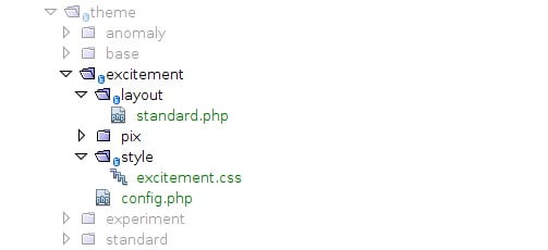
The first thing you need to do is create the directories and files you will be using, the first thing to create is the actual directory for your theme. This should be the name of your theme, in my case it’s ‘excitement’. The directory should be located within the theme directory of Moodle, ./moodle/theme/excitement/ will be the directory I create.
Now within that directory we can immediately create several files that we know we are going to need.
So the files that we want to create are:
- config.php
- All of our settings will go here.
- /style/
- This directory will contain all of our stylesheets.
- /style/excitement.css
- All of our css will go in here.
- /pix/
- Into this directory we’ll put a screen shot of our theme as well as our favicon and any images we use in CSS.
- /layout/
- Our layout files will end up in this directory.
- /layout/standard.php
- This will be our one basic layout file.
- /lang/en/
- The file we put here will make our theme name show properly on the Theme Selector page. You need a few standard entries. Copy the one from the Standard theme and modify is easiest.
So after this setup step you should have a directory structure similar to what is shown below.
Configuring our theme
Open config.php in your favourite editor and start by adding the opening PHP tags <?php.
Now we need to add the settings:
$THEME->name = 'excitement';
Very simply this tells Moodle the name of your theme, and if you ever have several config.php files open this will help you identify which one you are looking at.
Next, the parents for this theme.
$THEME->parents = array('base');
This tells Moodle that my new theme `excitement`’ wants to extend the base theme.
A theme can extend any number of themes. Rather than creating an entirely new theme and copying all of the CSS, you can simply create a new theme, extend the theme you like and just add the changes you want to your theme.
Also worth noting is the purpose of the base theme: it provides us with a basic layout and just enough CSS to make everything fall into place.
Now we will tell Moodle about our stylesheets:
$THEME->sheets = array('excitement');
The final thing we need to add into our theme’s config.php file is the definition of the layouts for our theme:
(in the code below, replace ‘general.php’ with ‘standard.php’ because that is the file that is previously created)
$THEME->layouts = array(
    // Most backwards compatible layout without the blocks - this is the layout used by default
    'base' => array(
        'file' => 'general.php',
        'regions' => array(),
    ),
    // Standard layout with blocks, this is recommended for most pages with general information
    'standard' => array(
        'file' => 'general.php',
        'regions' => array('side-pre', 'side-post'),
        'defaultregion' => 'side-pre',
    ),
    // Main course page
    'course' => array(
        'file' => 'general.php',
        'regions' => array('side-pre', 'side-post'),
        'defaultregion' => 'side-pre',
        'options' => array('langmenu'=>true),
    ),
    'coursecategory' => array(
        'file' => 'general.php',
        'regions' => array('side-pre', 'side-post'),
        'defaultregion' => 'side-pre',
    ),
    // part of course, typical for modules - default page layout if $cm specified in require_login()
    'incourse' => array(
        'file' => 'general.php',
        'regions' => array('side-pre', 'side-post'),
        'defaultregion' => 'side-pre',
    ),
    // The site home page.
    'frontpage' => array(
        'file' => 'frontpage.php',
        'regions' => array('side-pre', 'side-post'),
        'defaultregion' => 'side-pre',
    ),
    // Server administration scripts.
    'admin' => array(
        'file' => 'general.php',
        'regions' => array('side-pre'),
        'defaultregion' => 'side-pre',
    ),
    // My dashboard page
    'mydashboard' => array(
        'file' => 'general.php',
        'regions' => array('side-pre', 'side-post'),
        'defaultregion' => 'side-pre',
        'options' => array('langmenu'=>true),
    ),
    // My public page
    'mypublic' => array(
        'file' => 'general.php',
        'regions' => array('side-pre', 'side-post'),
        'defaultregion' => 'side-pre',
    ),
    'login' => array(
        'file' => 'general.php',
        'regions' => array(),
        'options' => array('langmenu'=>true),
    ),

    // Pages that appear in pop-up windows - no navigation, no blocks, no header.
    'popup' => array(
        'file' => 'general.php',
        'regions' => array(),
        'options' => array('nofooter'=>true, 'nonavbar'=>true, 'nocustommenu'=>true, 'nologininfo'=>true, 'nocourseheaderfooter'=>true),
    ),
    // No blocks and minimal footer - used for legacy frame layouts only!
    'frametop' => array(
        'file' => 'general.php',
        'regions' => array(),
        'options' => array('nofooter'=>true, 'nocoursefooter'=>true),
    ),
    // Embeded pages, like iframe/object embeded in moodleform - it needs as much space as possible
    'embedded' => array(
        'file' => 'embedded.php',
        'regions' => array(),
        'options' => array('nofooter'=>true, 'nonavbar'=>true, 'nocustommenu'=>true, 'nocourseheaderfooter'=>true),
    ),
    // Used during upgrade and install, and for the 'This site is undergoing maintenance' message.
    // This must not have any blocks, and it is good idea if it does not have links to
    // other places - for example there should not be a home link in the footer...
    'maintenance' => array(
        'file' => 'general.php',
        'regions' => array(),
        'options' => array('noblocks'=>true, 'nofooter'=>true, 'nonavbar'=>true, 'nocustommenu'=>true, 'nocourseheaderfooter'=>true),
    ),
    // Should display the content and basic headers only.
    'print' => array(
        'file' => 'general.php',
        'regions' => array(),
        'options' => array('noblocks'=>true, 'nofooter'=>true, 'nonavbar'=>false, 'nocustommenu'=>true, 'nocourseheaderfooter'=>true),
    ),
    // The pagelayout used when a redirection is occuring.
    'redirect' => array(
        'file' => 'embedded.php',
        'regions' => array(),
        'options' => array('nofooter'=>true, 'nonavbar'=>true, 'nocustommenu'=>true, 'nocourseheaderfooter'=>true),
    ),
    // The pagelayout used for reports.
    'report' => array(
        'file' => 'report.php',
        'regions' => array('side-pre'),
        'defaultregion' => 'side-pre',
    ),
    // The pagelayout used for safebrowser and securewindow.
    'secure' => array(
        'file' => 'general.php',
        'regions' => array('side-pre', 'side-post'),
        'defaultregion' => 'side-pre',
        'options' => array('nofooter'=>true, 'nonavbar'=>true, 'nocustommenu'=>true, 'nologinlinks'=>true, 'nocourseheaderfooter'=>true),
    ),
);


/** List of javascript files that need to be included on each page */
$THEME->javascripts = array();
$THEME->javascripts_footer = array();
What you are looking at is the different layouts for our theme. Why are there so many? Because, that is how many there are in Moodle. There is one for every general type of page. With my `excitement` theme I have chosen to use my own layout. Unless there was a specific reason to do so, normally you would not need to create your own layouts, you could extend the base theme, and use its layouts, meaning you would only have to write CSS to achieve your desired look.
For each layout above, you will notice the following four things are being set:
- file
- This is the name of the layout file we want to use, it should always be located in the above themes layout directory. For us this is of course standard.php as we only have one layout file.
- regions
- This is an array of block regions that our theme has. Each entry in here can be used to put blocks in when that layout is being used.
- defaultregion
- If a layout has regions it should have a default region, this is where blocks get put when first added. It is also where the «add block» block is shown when editing is on.
- options
- These are special settings, anything that gets put into the options array is available later on when we are writing our layout file.
There are additional settings that can be defined in the config.php file — see Themes for the full list.
Configuring the language file
Open theme_boost.php file from boost/lang/en/theme_boost.php
Save it as excitement/lang/en/theme_excitement.php.
Change
$string['pluginname'] = 'Boost';
to
$string['pluginname'] = 'Excitement';
After making these changes and perhaps clearing theme caches and/or purging all caches, the new theme name should now show properly in the Theme Selector: Site Administration > Appearance > Themes > Theme Selector
You can also edit the theme description:
$string['choosereadme'] = 'Write your theme description here.';
You need to leave the following two lines in place (you can change the wording if you need to) to avoid notices when editing blocks etc.:
$string['region-side-pre'] = 'Right';
Writing the layout file
The excitement theme has just one layout file.
The downside of this is that I have to make the layout file do everything I want which means I need to make use of some options (as defined in the layouts in config.php).
The upside is that I only need to maintain one file.
Other than maintenance, using multiple layout files provides many advantages to real world themes in that you can easily tweak and customise specific layouts to achieve the goals of the organisation using the theme.
Before learning more it is good to understand the two primary objects that will be used in your layout files: $OUTPUT and $PAGE.
$OUTPUT is an instance of the
class which is defined in lib/outputrenderers.php. Each method is clearly documented there, along with which is appropriate for use within the layout files.
$PAGE is an instance of the
class defined in lib/pagelib.php. Most of the things you will want to use are the properties that are all documented at the top of the file. If you are not familiar with PHP properties, you access them like $PAGE->activityname, just like fields of an ordinary PHP object. (However, behind the scenes the value you get is produced by calling a function. Also, you cannot change these values, they are read-only. However, you don’t need to understand all that if you are just using these properties in your theme.)
So lets start writing standard.php, the layout file for my `excitement` theme.
The top of the layout file
<?php
$hassidepre = $PAGE->blocks->region_has_content('side-pre', $OUTPUT);
$hassidepost = $PAGE->blocks->region_has_content('side-post', $OUTPUT);
echo $OUTPUT->doctype(); ?>
<html <?php echo $OUTPUT->htmlattributes() ?>>
<head>
    <title><?php echo $PAGE->title ?></title>
    <?php echo $OUTPUT->standard_head_html() ?>
</head>
Lets look at the code that goes into this section:
<?php
echo $OUTPUT->doctype(); ?>
This is very important and is required to go at the very top of the page. This tells Moodle to print out the document type tag that is determined by the settings within Moodle.
<html <?php echo $OUTPUT->htmlattributes() ?>>
Here we open the HTML tag and then ask Moodle to print the attributes that should go inside it.
<title><?php echo $PAGE->title ?></title>
Simply creates the title tag and asks Moodle to fill it in.
<?php echo $OUTPUT->standard_head_html() ?>
Here we are asking Moodle to print all of the other tags and content that need to go into the head. This includes stylesheets, script tags, and inline JavaScript code.
<body id="<?php p($PAGE->bodyid); ?>" class="<?php p($PAGE->bodyclasses); ?>">
<?php echo $OUTPUT->standard_top_of_body_html() ?>
<div id="page">
<?php if ($PAGE->heading || (empty($PAGE->layout_options['nonavbar']) && $PAGE->has_navbar())) { ?>
    <div id="page-header">
        <?php if ($PAGE->heading) { ?>
            <h1 class="headermain"><?php echo $PAGE->heading ?></h1>
            <div class="headermenu"><?php
                if (method_exists($OUTPUT, 'user_menu')) {
                  echo $OUTPUT->user_menu(); // user menu, for Moodle 2.8
                } else {
                  echo $OUTPUT->login_info(); // login_info, Moodle 2.7 and before
                }
                if (!empty($PAGE->layout_options['langmenu'])) {
                    echo $OUTPUT->lang_menu();
                }
                echo $PAGE->headingmenu
            ?></div>
        <?php } ?>
        <?php if (empty($PAGE->layout_options['nonavbar']) && $PAGE->has_navbar()) { ?>
            <div class="navbar clearfix">
                <div class="breadcrumb"><?php echo $OUTPUT->navbar(); ?></div>
                <div class="navbutton"> <?php echo $PAGE->button; ?></div>
            </div>
        <?php } ?>
    </div>
<?php } ?>
So there is a bit more going on here obviously.
<body id="<?php p($PAGE->bodyid); ?>" class="<?php p($PAGE->bodyclasses); ?>">
Again much like what we did for the opening HTML tag in the head we have started writing the opening body tag and are then asking Moodle to give us the ID we should use for the body tag as well as the classes we should use.
<?php echo $OUTPUT->standard_top_of_body_html() ?>
This very important call writes some critical bits of JavaScript into the page. It should always be located after the body tag as soon as possible.
<?php if ($PAGE->heading || (empty($PAGE->layout_options['nonavbar']) && $PAGE->has_navbar())) { ?>
......
<?php } ?>
Here we are checking whether or not we need to print the header for the page. There are three checks we need to make here:
- $PAGE->heading : This checks to make sure that there is a heading for the page. This will have been set by the script and normally describes the page in a couple of words.
- empty($PAGE->layout_options[‘nonavbar’]) : Now this check is looking at the layout options that we set in our config.php file. It is looking to see if the layout set ‘nonavbar’ => true.
- $PAGE->has_navbar() The third check is to check with the page whether it has a navigation bar to display.
If either there is a heading for this page or there is a navigation bar to display then we will display a heading.
Leading on from this lets assume that there is a header to print.
<?php if ($PAGE->heading) { ?>
    <h1 class="headermain"><?php echo $PAGE->heading ?></h1>
    .....
<?php } ?>
This line is simply saying if the page has a heading print it. In this case we run the first check above again just to make sure there is a heading, we then open a heading tag that we choose and ask the page to print the heading.
<div class="headermenu"><?php
    if (method_exists($OUTPUT, 'user_menu')) {
      echo $OUTPUT->user_menu(); // user menu, for Moodle 2.8
    } else {
      echo $OUTPUT->login_info(); // login_info, Moodle 2.7 and before
    }
    if (!empty($PAGE->layout_options['langmenu'])) {
        echo $OUTPUT->lang_menu();
    }
    echo $PAGE->headingmenu
?></div>
Here we are looking to print the menu and content that you see at the top of the page (usually to the right). We start by getting Moodle to print the login information for the current user. If the user is logged in this will be their name and a link to their profile, if not then it will be a link to login. Note that on Moodle 2.8 and above, a new user menu renderable is available that visually shows the same information as the login info renderable, as well as a dropdown menu with user-centric actions.
Next we check our page options to see whether a language menu should be printed. If in the layout definition within config.php it sets langmenu => true then we will print the language menu, a drop down box that lets the user change the language that Moodle displays in.
Finally the page also has a heading menu that can be printed. This heading menu is special HTML that the page you are viewing wants to add. It can be anything from drop down boxes to buttons and any number of each.
<?php if (empty($PAGE->layout_options['nonavbar']) && $PAGE->has_navbar()) { ?>
    <div class="navbar clearfix">
        <div class="breadcrumb"><?php echo $OUTPUT->navbar(); ?></div>
        <div class="navbutton"> <?php echo $PAGE->button; ?></div>
    </div>
<?php } ?>
The final part of the header.
Here we want to print the navigation bar for the page if there is one. To find out if there is one we run checks number 2 and 3 again and proceed if they pass.
Assuming there is a header then there are two things that we need to print. The first is the navigation bar. This is a component that the OUTPUT library knows about. The second is a button to show on the page.
In both cases we choose to wrap them in a div tag with a class attribute to enable theming on those elements.
Well that is it for the header. There is a lot of PHP compared to the other sections of the layout file but it does not change and can be copied and pasted between themes.
The page content
I am going with the default two block regions plus the main content.
Because I have based this theme and layout file on the base theme the HTML looks a little intense. This is because it is a floating div layout where the content comes first and then we get the columns (even though one column will be to the left of the content.) Don’t worry too much about it. When it comes to writing your own theme you can go about it as you choose.
<div id="page-content">
    <div id="region-main-box">
        <div id="region-post-box">
            <div id="region-main-wrap">
                <div id="region-main">
                    <div class="region-content">
                        <?php echo core_renderer::MAIN_CONTENT_TOKEN ?>
                    </div>
                </div>
            </div>
            <?php if ($hassidepre) { ?>
                <div id="region-pre">
                    <div class="region-content">
                        <?php echo $OUTPUT->blocks_for_region('side-pre') ?>
                    </div>
                </div>
                <?php } ?>

                <?php if ($hassidepost) { ?>
                <div id="region-post">
                    <div class="region-content">
                        <?php echo $OUTPUT->blocks_for_region('side-post') ?>
                    </div>
                </div>
            <?php } ?>
        </div>
    </div>
</div>
In regards to PHP this section is very easy. There are only three lines for the whole section one to get the main content and one for each block region.
<?php echo core_renderer::MAIN_CONTENT_TOKEN ?>
This line prints the main content for the page.
PLEASE NOTE: In Moodle 2.2 onwards «core_renderer::MAIN_CONTENT_TOKEN» changed to «$OUTPUT->main_content()».
<?php if ($hassidepre) { ?>
....
<?php } ?>
These lines of code check the variables we created earlier on to decide whether we should show the pre block region. If you try to display a block region that isn’t there or has no content then Moodle will give you an error message so these lines are very important.
For those who get an error message if it is «unknown block region side-pre» or «unknown block region side-post» then this is the issue you are experiencing. Simply add the following lines and all will be fine.
<?php echo $OUTPUT->blocks_for_region('side-pre') ?>
This line gets all of the blocks and more particularly the content for the block region side-pre. This block region will be displayed to the left of the content.
<?php if ($hassidepost) { ?>
....
<?php } ?>
Again we should make this check for every block region as there are some pages that have no blocks what-so-ever.
<?php echo $OUTPUT->blocks_for_region('side-post') ?>
Here we are getting the other block region side-post which will be displayed to the right of the content.
Here we want to print the footer for the page, any content required by Moodle, and then close the last tags.
    <?php if (empty($PAGE->layout_options['nofooter'])) { ?>
    <div id="page-footer" class="clearfix">
        <p class="helplink"><?php echo page_doc_link(get_string('moodledocslink')) ?></p>
        <?php
        echo $OUTPUT->login_info();
        echo $OUTPUT->home_link();
        echo $OUTPUT->standard_footer_html();
        ?>
    </div>
    <?php } ?>
</div>
<?php echo $OUTPUT->standard_end_of_body_html() ?>
</body>
</html>
The section of code is responsible for printing the footer for the page.
    <?php if (empty($PAGE->layout_options['nofooter'])) { ?>
    <div id="page-footer" class="clearfix">
        <p class="helplink"><?php echo page_doc_link(get_string('moodledocslink')) ?></p>
        <?php
        echo $OUTPUT->login_info();
        echo $OUTPUT->home_link();
        echo $OUTPUT->standard_footer_html();
        ?>
    </div>
    <?php } ?>
The first thing we do before printing the footer is check that we actually want to print it. This is done by checking the options for the layout as defined in the config.php file. If nofooter => true is set the we don’t want to print the footer and should skip over this body of code.
Assuming we want to print a footer we proceed to create a div to house its content and then print the bits of the content that will make it up.
There are four things that the typical page footer will want to print:
- echo page_doc_link(get_string(‘moodledocslink’))
- This will print a link to the Moodle.org help page for this particular page.
- echo $OUTPUT->login_info();
- This is the same as at the top of the page and will print the login information for the current user.
- echo $OUTPUT->home_link();
- This prints a link back to the Moodle home page for this site.
- echo $OUTPUT->standard_footer_html();
- This prints special HTML that is determined by the settings for the site. Things such as performance information or debugging will be printed by this line if they are turned on.
And the final line of code for our layout file is:
<?php echo $OUTPUT->standard_end_of_body_html(); ?>
This is one of the most important lines of code in the layout file. It asks Moodle to print any required content into the page, and there will likely be a lot although most of it will not be visual.
It will instead be things such as inline scripts and JavaScript files required to go at the bottom of the page. If you forget this line its likely no JavaScript will work!
We’ve now written our layout file and it is all set to go. The complete source is below for reference. Remember if you want more practical examples simply look at the layout files located within the layout directory of other themes.
<?php
$hassidepre = $PAGE->blocks->region_has_content('side-pre', $OUTPUT);
$hassidepost = $PAGE->blocks->region_has_content('side-post', $OUTPUT);
echo $OUTPUT->doctype() ?>
<html <?php echo $OUTPUT->htmlattributes() ?>>
<head>
    <title><?php echo $PAGE->title; ?></title>
    <link rel="shortcut icon" href="<?php echo $OUTPUT->pix_url('favicon', 'theme')?>" />
    <?php echo $OUTPUT->standard_head_html() ?>
</head>

<body id="<?php p($PAGE->bodyid); ?>" class="<?php p($PAGE->bodyclasses); ?>">
<?php echo $OUTPUT->standard_top_of_body_html() ?>
<div id="page">
<?php if ($PAGE->heading || (empty($PAGE->layout_options['nonavbar']) && $PAGE->has_navbar())) { ?>
    <div id="page-header">
        <?php if ($PAGE->heading) { ?>
        <h1 class="headermain"><?php echo $PAGE->heading ?></h1>
        <div class="headermenu"><?php
            echo $OUTPUT->login_info();
            if (!empty($PAGE->layout_options['langmenu'])) {
                echo $OUTPUT->lang_menu();
            }
            echo $PAGE->headingmenu
        ?></div><?php } ?>
        <?php if (empty($PAGE->layout_options['nonavbar']) && $PAGE->has_navbar()) { ?>
            <div class="navbar clearfix">
                <div class="breadcrumb"><?php echo $OUTPUT->navbar(); ?></div>
                <div class="navbutton"> <?php echo $PAGE->button; ?></div>
            </div>
        <?php } ?>
    </div>
<?php } ?>

    <div id="page-content">
        <div id="region-main-box">
            <div id="region-post-box">
                <div id="region-main-wrap">
                    <div id="region-main">
                        <div class="region-content">
                            <?php echo core_renderer::MAIN_CONTENT_TOKEN ?>
                        </div>
                    </div>
                </div>
                <?php if ($hassidepre) { ?>
                <div id="region-pre">
                    <div class="region-content">
                        <?php echo $OUTPUT->blocks_for_region('side-pre') ?>
                    </div>
                </div>
                <?php } ?>

                <?php if ($hassidepost) { ?>
                <div id="region-post">
                    <div class="region-content">
                        <?php echo $OUTPUT->blocks_for_region('side-post') ?>
                    </div>
                </div>
                <?php } ?>
            </div>
        </div>
    </div>

    <?php if (empty($PAGE->layout_options['nofooter'])) { ?>
    <div id="page-footer" class="clearfix">
        <p class="helplink"><?php echo page_doc_link(get_string('moodledocslink')) ?></p>
        <?php
        echo $OUTPUT->login_info();
        echo $OUTPUT->home_link();
        echo $OUTPUT->standard_footer_html();
        ?>
    </div>
    <?php } ?>
</div>
<?php echo $OUTPUT->standard_end_of_body_html() ?>
</body>
</html>
Adding some CSS
With config.php and standard.php both complete the theme is now usable and starting to look like a real theme, however if you change to it using the theme selector you will notice that it still lacks any style.
This of course is where CSS comes in. When writing code Moodle developers are strongly encouraged to not use inline styles anywhere. This is fantastic for us as themers because there is nothing (or at least very little) in Moodle that cannot be styled using CSS.
Moodle CSS basics
In Moodle 2.0 all of the CSS for the whole of Moodle is delivered all of the time! This was done for performance reasons. Moodle now reads in all of the CSS, combines it into one file, shrinks it removing any white space, caches it, and then delivers it.
What this means for you as a themer?
You will need to write good CSS that won’t clash with any other CSS within Moodle.
Moodle is so big and complex,there is no way to ensure that classes don’t get reused. What we can control however is the classes and id that get added to the body tag for every page. When writing CSS it is highly encouraged to make full use of these body classes, using them will help ensure the CSS you write has the least chance of causing conflicts.
You should also take the time to look at how the Moodle themes use CSS. Look at their use of the body classes and how they separate the CSS for the theme into separate files based on the region of Moodle it applies to.
Check out Themes 2.0 and CSS coding style for more information about writing good CSS.
Starting to write excitement.css
a {
    text-decoration: none;
}

.addcoursebutton .singlebutton {
    text-align: center;
}

h1.headermain {
    color: #fff;
}

h2.main {
    border-bottom: 3px solid #013D6A;
    color: #013D6A;
    text-align: center;
}

h2.headingblock {
    font-size: 18pt;
    margin-top: 0;
    background-color: #013D6A;
    color: #FFF;
    text-align: center;
}

#page-header {
    background-color: #013D6A;
}

#page-header .headermenu {
    color: #FFF;
}

#page-header .headermenu a {
    color: #FDFF2A;
}

.navbar {
    padding-left: 1em;
}

.breadcrumb li {
    color: #FFF;
}

.breadcrumb li a {
    color: #FFF;
}

.block {
    background-color: #013D6A;
}

.block .header .title {
    color: #FFF;
}

.block .header .title .block_action input {
    background-color: #FFF;
}

.block .content {
    border: 1px solid #000;
    padding: 5px;
    background-color: #FFF;
}

.block .content .block_tree p {
    font-size: 80%;
}

.block_settings_navigation_tree .content .footer {
    text-align: center;
}

.block_settings_navigation_tree .content .footer .adminsearchform {
    margin-left: 5%;
    width: 90%;
    font-size: 9pt;
}

.block_settings_navigation_tree .content .footer .adminsearchform #adminsearchquery {
    width: 95%;
}

.block_calendar_month .content .calendar-controls a {
    color: #013D6A;
    font-weight: bold;
}

.block_calendar_month .content .minicalendar td {
    border-color: #FFF;
}

.block_calendar_month .content .minicalendar .day {
    color: #FFF;
    background-color: #013D6A;
}

.block_calendar_month .content .minicalendar .day a {
    color: #FFF000;
}

.block_calendar_month .content .minicalendar .weekdays th {
    border-width: 0;
    font-weight: bold;
    color: #013D6A;
}

.block_calendar_month .content .minicalendar .weekdays abbr {
    border-width: 0;
    text-decoration: none;
}
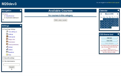
Excitement theme screenshot
This isn’t all of the CSS for the theme, but just enough to style the front page when the user is not logged in.
Remember this theme extends the base theme so there is already CSS for layout as well.
Note:
- The CSS is laid out in a single line format. This is done within the core themes for Moodle. It makes it quicker to read the selectors and see what is being styled.
- I have written my selectors to take into account the structure of the HTML (more than just the one tag I want to style). This helps further to reduce the conflicts that I may encounter.
- I use generic classes like .sideblock only where I want to be generic, as soon as I want to be specific I use the unique classes such as .block_calendar_month
Using images within CSS
I will add two image files to the pix directory of my theme:
- /theme/excitement/pix/background.png
- This will be the background image for my theme.
- /theme/excitement/pix/gradient.jpg
- This will be a gradient I use for the header and headings.
I quickly created both of these images using gimp and simply saved them to the pix directory.
html {
    background-image: url([[pix:theme|background]]);
}

h2.headingblock,
#page-header,
.sideblock,
.block_calendar_month .content .minicalendar .day {
    background-image: url([[pix:theme|gradient]]);
    background-repeat: repeat-x;
    background-color: #0273C8;
}
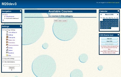
Excitement theme screenshot
The CSS above is the two new rules that I had to write to use my images within CSS.
The first rule sets the background image for the page to background.png
The second rule sets the background for headings, and the sideblocks to use gradient.jpg
You will notice that I did not need to write a path to the image. This is because Moodle has this special syntax that can be used and will be replaced when the CSS is parsed before delivery.
The advantage of using this syntax over writing the path in is that the path may change depending on where you are or what theme is being used.
Other themers may choose to extend your theme with their own; if you use this syntax then all they need to do to override the image is to create one with the same name in their themes directory.
You will also notice that I don’t need to add the image files extension. This is because Moodle is smart enough to work out what extension the file uses. It also allows themers to override images with different formats.
The following is the complete CSS for my theme:
a {text-decoration: none;}
.addcoursebutton .singlebutton {text-align: center;}

h1.headermain {color: #fff;}
h2.main {border-bottom: 3px solid #013D6A;color: #013D6A;text-align: center;}
h2.headingblock {font-size: 18pt;margin-top: 0;background-color: #013D6A;color: #FFF;text-align: center;}
#page-header {background-color: #013D6A;border-bottom:5px solid #013D6A;}
#page-header .headermenu  {color: #FFF;}
#page-header .headermenu a {color: #FDFF2A;}

.sideblock {background-color: #013D6A;}
.sideblock .header .title {color: #FFF;}
.sideblock .header .title .block_action input {background-color: #FFF;}
.sideblock .content {border: 1px solid #000;padding: 5px;background-color: #FFF;}
.sideblock .content .block_tree p {font-size: 80%;}

.block_settings_navigation_tree .content .footer {text-align: center;}
.block_settings_navigation_tree .content .footer .adminsearchform {margin-left: 5%;width: 90%;font-size: 9pt;}
.block_settings_navigation_tree .content .footer .adminsearchform #adminsearchquery {width: 95%;}

.block_calendar_month .content .calendar-controls a {color: #013D6A;font-weight: bold;}
.block_calendar_month .content .minicalendar td {border-color: #FFF;}
.block_calendar_month .content .minicalendar .day {color: #FFF;background-color: #013D6A;}
.block_calendar_month .content .minicalendar .day a {color: #FFF000;}
.block_calendar_month .content .minicalendar .weekdays th {border-width: 0;font-weight: bold;color: #013D6A;}
.block_calendar_month .content .minicalendar .weekdays abbr {border-width: 0;text-decoration: none;}

html {background-image:url([[pix:theme|background]]);}

h2.headingblock,
#page-header,
.sideblock,
.block_calendar_month .content .minicalendar .day {background-image:url([[pix:theme|gradient]]);
   background-repeat:repeat-x;background-color: #0273C8;}
Adding a screenshot and favicon
The final thing to do at this point is add both a screenshot for this theme as well as a favicon for it.
The screenshot will be shown in the theme selector screen and should be named screenshot.jpg.
The favicon will be used when someone bookmarks this page.
Both images should be located in your themes pix directory as follows:
- /theme/excitement/pix/screenshot.jpg
- /theme/excitement/pix/favicon.ico
In the case of my theme I have taken a screenshot and added it to that directory, and because I don’t really want to do anything special with the favicon I have copied it from /theme/base/pix/favicon.ico so that at least it will be recognisable as Moodle.
Я новичок в Moodle, и я использую 2.9. У меня есть отдельный дизайн для страницы регистрации (HTML5 & CSS). Как интегрировать эту страницу?
Я знаю процесс изменения страницы входа по умолчанию, как это
В config.php моей темы
   'login' => array(
'file' => 'login.php',
'regions' => array(),
'options' => array('langmenu'=>true),
),
Где моя пользовательская страница входа — это login.php, который находится в моей папке макета. Таким образом, я могу перенять дизайн страницы входа в систему с помощью моего нового дизайна.
Но я не вижу никакого регистрационного массива на странице конфигурации для регистрации. Кто-нибудь может сказать мне, как сделать это изменение?
Изменить — я проверил этот файл moodle2 login index_form.html Я вижу дизайн подписки. Но моя проблема в том, что файл index_form.html имеет CSS-код ядра Moodle. Если я добавлю туда свой CSS-файл, он будет конфликтовать, и я не знаю, как загрузить CSS из папки моей темы в index_form.html.
Кто-нибудь может направить меня?
Я уже проверил форум Moodle.org, но не смог найти процесс.
Заранее спасибо
грузовой автомобиль
1
Решение
Hiii,
Я один из Moodler, который работает с Moodle.
чтобы отредактировать страницу регистрации, перейдите в следующую папку и откройте файл signup.php.
./moodle/login/signup.php
в этом файле вы можете увидеть внизу страницы три строки.
...
echo $OUTPUT->header();
$mform_signup->display();
echo $OUTPUT->footer();
в котором $ mform signup-> display (); создать форму вы можете комментировать и писать HTML для вашей формы регистрации.
Но удостоверьтесь в действии URL и валидации.
$mform is the object that create form and its class file is signup_form.php.
Надеюсь, это поможет вам … Удачи [‘}
1
Другие решения
Если вы хотите избежать внесения изменений в основной код в Moodle (который почти всегда должен быть тем, что вы хотите), то вы можете создать новую форму регистрации с нуля, сначала создав новый плагин аутентификации (в auth / NAMEOFPLUGIN).
Когда вы создаете плагин аутентификации, вы должны убедиться, что функция ‘can_signup’ возвращает true, что функция ‘user_signup’ выполняет любую обработку, необходимую для создания новой учетной записи пользователя, и что функция ‘signup_form’ возвращает пользовательский Форма Moodle который содержит поля, которые вы хотите.
Можно дополнительно настроить эту форму путем вывода пользовательских элементов HTML (используя $ mform-> addElement (‘html’, ‘HTML to output’);). Я бы не советовал полностью отказываться от формы Moodle (то есть заменять ее пользовательскими элементами с ручной кодировкой), так как она не будет совместима с кодом регистрации в login / signup.php (а также терять правила проверки, поддерживаемые библиотека форм).
0
В дополнение к тому, что упомянул @davosmith, вы можете использовать существующий плагин auth / email в качестве основы для вашего плагина, так что:
-
Скопируйте auth / email и переименуйте его как хотите, например auth / foo. И переименуйте все остальные экземпляры «email» в «foo».
-
Скопируйте файл login / signup_form.php в каталог плагинов
-
в вашем файле auth / foo / auth.php добавьте функцию:
function signup_form() { global $CFG; require_once($CFG->dirroot.'/auth/foo/signup_form.php'); return new login_signup_form(null, null, 'post', '', array('autocomplete'=>'on')); } -
Измените auth / foo / signup_form.php так, как вам нужно.
0
In addition to default Moodle themes, there are custom themes you can use with your Moodle site. These themes are often provided by custom theme sites or purchased from software developers. In this article we will discuss how to change between the default themes that were included in your Moodle installation and custom themes.
Topics Include:
- Moodle Default Themes
- How to Change Moodle Themes
Moodle Default Themes
When installing and working with Moodle for the first time, the default theme Standard is set as the theme or template for the site. To customize the look of the Moodle site, Moodle includes 12 different themes that can be used for free. The initial installation of Moodle comes with the following themes:
|
|
|
|
- First, log into the Moodle Dashboard.
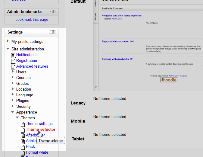
- Navigate to the Site administration > Appearance > Themes > Theme selector in the Settings section on the left.

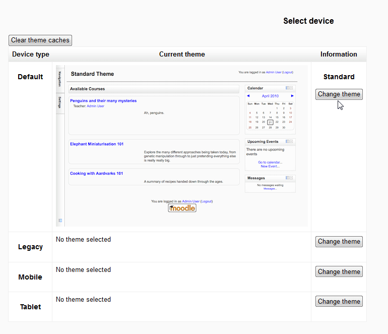
Current Theme Device Types Default The default theme is the standard theme for the Moodle site. This is what a user or student will see in a standard web browser like Internet Explorer, FireFox, or Safari. Legacy The Legacy theme is designed to work in old out of date browsers. Mobile This gives the Moodle site the ability to display in common mobile devices like iPhones. Tablet This theme Device type is designed to display the Moodle site specifically for tablets. This is good for sites that require less JavaScript. In this tutorial, the standard theme will be changed. In the information column, click the Change Theme button for the standard default theme.

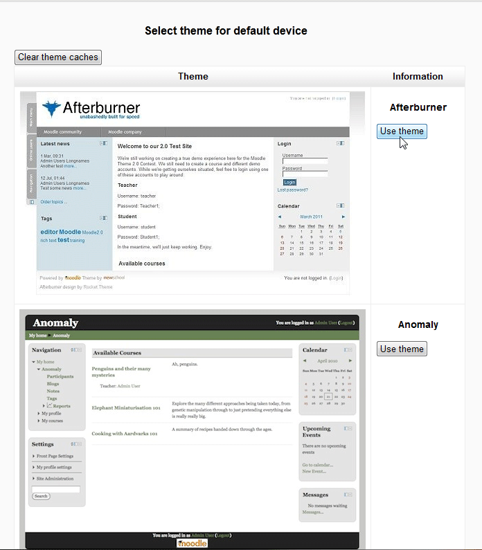
- On the Select theme for default device page, select a theme from the list In this case the Afterburner theme will be selected. On the Information column, click the Use Theme button for the Afterburner theme.

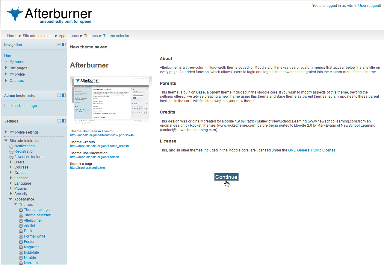
- On the New theme saved page, basic information about the new theme that was selected will be displayed. Click Continue.

- Now when going to the theme selector page the new theme will display in place of the old theme.

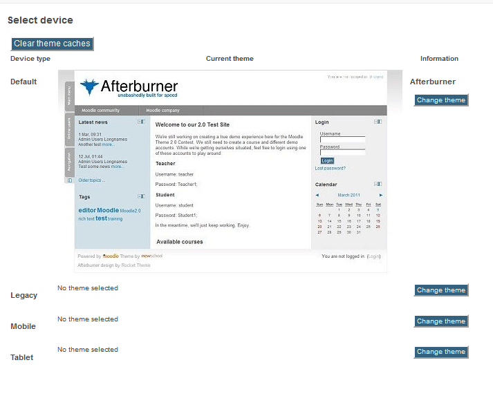
Congratulations, the theme for your Moodle site was changed!
Trust your website to an industry leader in website hosting. Secure web hosting with InMotion Hosting and enjoy 99.99% uptime, 24/7/365 technical support, and risk-free money-back guarantee.
moodle-theme_boost_campus

Moodle Boost child theme which is intended to meet the needs of university campuses and adds several features and improvements
Requirements
This plugin requires Moodle 3.11+
Motivation for this theme
Moodle installations on university campuses have certain constraints which are not completely covered by the Boost theme in Moodle core. We implemented this Boost child theme to accommodate these needs as much as possible while keeping the functionality from Boost from Moodle core as much as possible as well.
Installation
Install the plugin like any other theme to folder
/theme/boost_campus
See http://docs.moodle.org/en/Installing_plugins for details on installing Moodle plugins
Usage & Settings
After installing the theme, it does not do anything to Moodle yet.
To configure the theme and its behaviour, please visit:
Site administration -> Appearance -> Themes -> Boost Campus.
There, you find multiple settings tabs:
1. Tab «General Settings»
In this tab there are the following settings:
Theme presets
Theme preset
This setting is already available in the Moodle core theme Boost. For more information how to use it, please have a look at the official Moodle documentation: http://docs.moodle.org/en/Boost_theme
Additional theme preset files
This setting is already available in the Moodle core theme Boost. For more information how to use it, please have a look at the official Moodle documentation: http://docs.moodle.org/en/Boost_theme
Background image
This setting is already available in the Moodle core theme Boost. For more information how to use it, please have a look at the official Moodle documentation: http://docs.moodle.org/en/Boost_theme
Please note: This will not override the setting «theme_boost_campus | loginbackgroundimage» which means that the pictures uploaded to the login page background will be displayed anyway.
Brand colors
Brand color
This setting is already available in the Moodle core theme Boost. For more information how to use it, please have a look at the official Moodle documentation: http://docs.moodle.org/en/Boost_theme
Brand success color
This color is used for example in regards to form validations.
Brand info color
This color is used for example for availability information of course activities or resources.
Brand warning color
This color is used for example for warning texts.
Brand danger color
This color is used for example in regards to form validations.
Favicon
This setting allows you to upload an image (.ico or .png format) that your browser will display as a favicon.
2. Tab «Advanced Settings»
In this tab there are the following settings:
Raw initial SCSS
This setting is already available in the Moodle core theme Boost. For more information how to use it, please have a look at the official Moodle documentation: http://docs.moodle.org/en/Boost_theme
Raw SCSS
This setting is already available in the Moodle core theme Boost. For more information how to use it, please have a look at the official Moodle documentation: http://docs.moodle.org/en/Boost_theme
Catch keyboard commands
The following settings are intended to serve the needs for advanced users, especially if your Moodle instance has a large footer. Advanced users are likely to use keyboard shortcuts to navigate through the sites. They may use this for reaching the end of the page in the intention to get fast to the most recent topic in the course (for adding content or grading latest activities). If the footer is not quite small, they would need to scroll up again. With these settings you can enable that the following shortcuts are caught and would only scroll to the bottom of the main course content.
End key
This setting will catch the «End» key (should work on all main browsers and operating systems), prevent the default scrolling to the bottom of the web page and changes the behavior to scroll only to the bottom of the main course content.
Cmd + Arrow down shortcut
This setting will catch the «Cmd + Arrow down» shortcut (MAC), prevent the default scrolling to the bottom of the web page and changes the behavior to scroll only to the bottom of the main course content.
Ctrl + Arrow down shortcut
This setting will catch the «Ctrl + Arrow down» shortcut (Windows), prevent the default scrolling to the bottom of the web page and changes the behavior to scroll only to the bottom of the main course content.
Position of «Add a block» widget
With this setting you can manage where the «Add a block» widget should be displayed. «At the bottom of the nav drawer» means the widget to add new blocks is displayed in the left sliding navigation panel like in theme Boost. «At the bottom of the default block region» means the widget to add new blocks will be displayed in the default block region.
Boost Campus «Back to top» button
Since Moodle 3.9, a «Go to top» button was integrated into theme Boost and usually that would make our provided solution obsolete.
However, the core solution has still some little itches and that is the reason why we would like to provide the Boost Campus «Back to top» button as an optional setting.
If you enable this setting, the core «Go to top» button will not be displayed and instead the Boost Campus «Back to top» button will occur. The differences are:
- Smooth scolling: Boost Campus «Back to top» button uses smooth scrolling whilst the core «Go to top» button jumps directly to the top.
- URL implications: Boost Campus «Back to top» button only uses Javascript and has no implication to the URL whilst the core «Go to top» button adds a «#» at the end of the URL by clicking the button. If you copy the URL the «#» will be copied along.
- Styling: The styling of both buttons differ.
- Accessibility: Boost Campus «Back to top» button is not improved in terms of accessibility whilst the core «Go to top» button is.
Please note:
This setting will be removed as soon a the core feature is improved so that no individual theme solution is needed anymore.’;
3. Tab «Course Layout Settings»
Section 0: Title
This setting can change the behaviour Moodle displays the title for the first course section. Moodle does not display it as long as the default title for this section is set. As soon as a user changes the title, it will appear. With this setting (option is checked), you can achieve a consistent behaviour by always showing the title for section 0.
Course related hints
Position of switch role information
With this setting you can choose the place where the information to which role a user has switched is being displayed. If set to ‘Just in the user menu’ (default value), the role information will be displayed right beneath the user’s name in the user menu (like in theme Boost). If set to ‘Just in the course settings’, this information — together with a link to switch back — will be displayed beneath the course, as this functionality is course related. If set to ‘Both in the user menu and in the course settings’ it will be shown in both places.
Show hint in hidden courses
With this setting a hint will appear in the course header as long as the visibility of the course is hidden. This helps to identify the visibility state of a course at a glance without the need for looking at the course settings.
Show hint guest for access
With this setting a hint will appear in the course header when a user is accessing it with the guest access feature. If the course provides an active self enrolment, a link to that page is also presented to the user.
Show hint for self enrolment without enrolment key
With this setting a hint will appear in the course header if the course is visible and an enrolment without enrolment key is currently possible.
Course settings
In course settings menu
With this setting you can change the displaying of the context menus. In Boost, there is a popup context menu right next to the cog icon. By enabling this setting the settings will occur directly beneath the course header. The settings are arranged in tabs, so it is easier for the user to get to the desired setting instead of scanning a long list of menu items. With this setting we also hide the settings icon on the participants page as the entries on this page are duplicated with the in-course course menu and therefore not necessary.
Please note that this change does not affect users who have switched off javascript in their browsers — they will still get the behaviour from Moodle core with a popup course context menu.
Switch role to…» location(s)
With this setting you can choose the place where the information to which role a user has switched is being displayed. If set to ‘Just in the user menu’ (default value), the role information will be displayed right beneath the user’s name in the user menu (like in theme Boost). If set to ‘Just in the course settings’, this information — together with a link to switch back — will be displayed beneath the course, as this functionality is course related. If set to ‘Both in the user menu and in the course settings’ it will be shown in both places.
4. Tab «Footer Layout Settings»
Footer blocks
You can chose if you want to enable the possibility to place blocks into the footer. If enabled, you can choose between one, two or three block columns. These columns are only displayed on large screens. On small screens the columns will be automatically reduced to one column for better readability and layout.
Default footer links
Moodle provides some default links in the footer: Link to the Moodle docs, login information, a link to the webpage start and a link to reset the user tour for the current page. With these three settings you can decide if you want to hide specific links because you think that your users won’t need them in your instance. If checked, the link will not be displayed in the footer. If not checked (default), it will be shown.
Hiding the footer
Hiding the footer on the login page
By enabling this setting you can hide the footer on the login page. Please note, that this will only hide the footer section, not the footnote section.
5. Tab «Additional Layout Settings»
Image area
Image area items
With this widget you can upload your images that will be displayed in the additional image area region. The images will be sorted and displayed alphabetically by the filename. To remove this region, simply delete all uploaded images.
Image area item links
With this optional setting you can add links to your uploaded images.
Each line consists of the file identifier (the file name) the a link URL, separated by pipe characters. Each link declaration needs to be written in a new line.
For example:
moodle.jpg|http://moodle.org
You can declare links for a abitrary amount of your uploaded images. The links will be added only to those images that match their filename with the identifier declared in this setting.
Image area items maximal height
With this setting you can change the height in pixels for your uploaded images. All images will have the same maximum height and their width will be resized proportionally. The default value is set to 100 pixels.
Footnote
Whatever you add to this textarea will be displayed beneath the footer on every page that renders the theme standard footer (for layouts «columns2», «login» and «maintenance»). Content in this area could be for example the copyright, the terms of use and the name of your organisation.
Nav drawer menu
Default homepage on top
By checking this setting the default homepage link (Dashboard or Site home) will always be located at the top of the nav drawer. By default, this is already the case on every Moodle page except for course pages. There, the current course and its contents are placed on top. This might break user’s expectations for the placement of the default homepage link.
Nav drawer width on small screens
By checking this setting you can enlarge the opened nav drawer menu to the full page width on small screens. This may be wanted because on small screens only very few of the main content area in the background is visible. And a full width menu might serve the users’ expectations how menus are displayed on small screens.
6. Tab «Design Settings»
Login Page
Login page background images
In this setting you can add up to 25 files as a background image for the login page. One of these images will be picked randomly and delivered when the user visits the login page.
Please note: These images will not be rendered on small screens. We prevent the loading of the images for several reasons:
- The login field takes most of the space on small screens, so the background image is hidden behind it and therefore it is not really needed there.
- Smalls screens indicate that the user is visiting the page with a mobile device. Not loading the background image in this cases will also save data traffic for the user.
Display text for login background images
With this optional setting you can add text, e.g. a copyright notice to your uploaded background images.
Each line consists of the file identifier (the file name) and the text that should be displayed, separated by a pipe character. Each declaration needs to be written in a new line.
For example:
background-image-1.jpg|Copyright: CC0
You can declare texts for a arbitrary amount of your uploaded background images. The texts will be added only to those images that match their filename with the identifier declared in this setting.
Login form
With this setting you can optimize the login form to fit to a greater variety background images (if checked). This means that the login form will be moved to the left of the login page, will get smaller in width and will get a background that let the background image shine through. The login form will be placed on the left because many images have their main content rather in the center and so we keep this content visible. Note: You can also activate this setting if no background images are uploaded, of course.
Fonts
Font files
With this dialogue you can upload own font files. The upload is resricted to the font files of type .eot, .woff, .woff2, .ttf and .svg.
Important: To be able to use the uploaded fonts within this theme, you have to add related code to your «Raw SCSS» area in the tab «Advanced Settings»!
First you have to add all font-faces correctly and then you can set the font as font-family to any tag. Set it for the body tag to use it all over the instance. With the following expamle you can see how the SCSS code should look like. Of course you have to adapt it for your individual font and the number and type of uploaded files.
/* your-font-regular - latin */
@font-face {
        font-family: "Your Font";
        font-style: normal;
        font-weight: 400;
        /* IE9 Compat Modes */
        src: url("/pluginfile.php/1/theme_boost_campus/fontfiles/0/your-font-latin-regular.eot");
        src: local("Your Font"), local("YourFont-Regular"),
               /* IE6-IE8 */
                url("/pluginfile.php/1/theme_boost_campus/fontfiles/0/your-font-latin-regular.eot?#iefix") format("embedded-opentype"),
                /* Super Modern Browsers */
                url("/pluginfile.php/1/theme_boost_campus/fontfiles/0/your-font-latin-regular.woff2") format("woff2"),
                /* Modern Browsers */
                url("/pluginfile.php/1/theme_boost_campus/fontfiles/0/your-font-latin-regular.woff") format("woff"),
                /* Safari, Android, iOS */
                url("/pluginfile.php/1/theme_boost_campus/fontfiles/0/your-font-latin-regular.ttf") format("truetype"),
                /* Legacy iOS */
                url("/pluginfile.php/1/theme_boost_campus/fontfiles/0/your-font-latin-regular.svg#YourFont") format("svg");
}
/* your-font-italic - latin */
@font-face {
        font-family: "Your Font";
        font-style: italic;
        font-weight: 400;
        src: url("/pluginfile.php/1/theme_boost_campus/fontfiles/0/your-font-latin-italic.eot");
        src: local("Your Font Italic"), local("YourFont-Italic"),
                url("/pluginfile.php/1/theme_boost_campus/fontfiles/0/your-font-latin-italic.eot?#iefix") format("embedded-opentype"),
                url("/pluginfile.php/1/theme_boost_campus/fontfiles/0/your-font-latin-italic.woff2") format("woff2"),
                url("/pluginfile.php/1/theme_boost_campus/fontfiles/0/your-font-latin-italic.woff") format("woff"),
                url("/pluginfile.php/1/theme_boost_campus/fontfiles/0/your-font-latin-italic.ttf") format("truetype"),
                url("/pluginfile.php/1/theme_boost_campus/fontfiles/0/your-font-latin-italic.svg#YourFont") format("svg");
}
/* your-font-700 - latin */
@font-face {
        font-family: "Your Font";
        font-style: normal;
        font-weight: 700;
        src: url("/pluginfile.php/1/theme_boost_campus/fontfiles/0/your-font-latin-700.eot");
        src: local("Your Font Bold"), local("YourFont-Bold"),
                url("/pluginfile.php/1/theme_boost_campus/fontfiles/0/your-font-latin-700.eot?#iefix") format("embedded-opentype"),
                url("/pluginfile.php/1/theme_boost_campus/fontfiles/0/your-font-latin-700.woff2") format("woff2"),
                url("/pluginfile.php/1/theme_boost_campus/fontfiles/0/your-font-latin-700.woff") format("woff"),
                url("/pluginfile.php/1/theme_boost_campus/fontfiles/0/your-font-latin-700.ttf") format("truetype"),
                url("/pluginfile.php/1/theme_boost_campus/fontfiles/0/your-font-latin-700.svg#YourFont") format("svg");
}
/* your-font-700italic - latin */
@font-face {
        font-family: "Your Font";
        font-style: italic;
        font-weight: 700;
        src: url("/pluginfile.php/1/theme_boost_campus/fontfiles/0/your-font-latin-700italic.eot");
        src: local("Your Font Bold Italic"), local("YourFont-BoldItalic"),
                url("/pluginfile.php/1/theme_boost_campus/fontfiles/0/your-font-latin-700-italic.eot?#iefix") format("embedded-opentype"),
                url("/pluginfile.php/1/theme_boost_campus/fontfiles/0/your-font-latin-700-italic.woff2") format("woff2"),
                url("/pluginfile.php/1/theme_boost_campus/fontfiles/0/your-font-latin-700-italic.woff") format("woff"),
                url("/pluginfile.php/1/theme_boost_campus/fontfiles/0/your-font-latin-700-italic.ttf") format("truetype"),
                url("/pluginfile.php/1/theme_boost_campus/fontfiles/0/your-font-latin-700-italic.svg#YourFont") format("svg");
}

body {
        font-family: "Your Font";
}
Please note: The code itself and the URLs have to fit exactly to your uploaded files, unless the fonts cannot be loaded! As the font files will be delivered with an expires header to the client but currently without a timestamp in the URL, emptying the Moodle cache unfortunately will not force a reload of the font files on the client side.
Blocks
Block icon
With this setting you can add a default Font Awesome icon in front of the block title. If checked, we additionally provide individual icon replacements for many Moodle core blocks and also some widely used blocks. You also can change the icons easily for each block individually in your raw SCSS via the change of the Font Awesome content. For all available icons please visit https://fontawesome.com/v4.7.0/icons/ and use the Unicode value of the icon to replace the default one. The code to change the icon looks like this example change for the block «People»: .block_people .card-block .card-title::before { content: 'f0c0' ; }.
Navbar
Dark navbar
By enabling this setting you can invert the default light navbar to a dark one with white links.
Help texts
Show help texts in a modal dialogue
The default solution to display help texts in popover leads to different issues. For example popovers are not scrollable and they can reach over the viewport.
For this reason, with this setting you can decide that the help texts should be displayed in a dedicated text box (modal dialogue) that appears in the middle of the page with enough space to hold even long helping texts.
Breakpoint
Change breakpoint
In theme Boost, the right block column will break down even on devices with a width up to 1200 pixels (widescreen resolution of the iPad is 1024 pixels, for example).
This is because the breakpoint is set to media-breakpoint-down(lg).
If you think there is enough space to show the content plus the blocks column side by side on a screen width of 992 pixels and up, then enable this setting. It will change the breakpoint to media-breakpoint-down(md). This will break the blocks column only on screens with widths of less than 992 pixels.
Additional resources
Add additional resources
With this setting you can upload additional resources to the theme. You can reference these resources by using a link.
The advantage of uploading files to this file area is that those files can be delivered without a check if the user is logged in. This is also why you should only add files that are uncritical and everyone should be allowed to access and don’t need be protected with a valid login.
Use case and usage example:
We’re using the footer blocks setting and some of the blocks are displaying an image that was added to the HTML block. When a newly registered user logs in, he will be redirected to the policy page (user/policy.php). The footer blocks are displayed on this page layout and because the HTML block will only deliver its resources after the user is logged in and accepted the user policy, the delivering will be prevented and the redirect is saved to this resource. This leads to the behavior that after accepting the policy the resource was displayed and not the Dashbaord as intended.
With this setting, the image (e.g. htmlblockimage.png) that should be displayed in the block could be added to this file area and added as a link with the url «/pluginfile.php/1/theme_boost_campus/additionalresources/0/htmlblockimage.png».
7. Tab «Info Banner Settings»
Perpetual information banner
Enable perpetual info banner
With this checkbox you can decide if the perpetual information banner should be shown or hidden on the selected pages.
Perpetual information banner content (dependent on setting «Enable perpetual info banner»)
Enter your information which should be shown within the banner here.
Page layouts to display the info banner on (dependent on setting «Enable perpetual info banner»)
With this setting you can select the pages on which the perpetual information banner should be displayed.
Bootstrap css class for the perpetual info banner (dependent on setting «Enable perpetual info banner»)
With this setting you can select the Bootstrap style with which the perpetual information banner should be displayed.
Perpetual info banner dismissible (dependent on setting «Enable perpetual info banner»)
With this checkbox you can make the banner dismissible permanently. If the user clicks on the x-button a confirmation dialogue will appear and only after the user confirmed this dialogue the banner will be hidden for this user permanently.
Please note:
This setting has no effect for the banners shown on the login page. Because banners on the login page cannot be clicked away permanently, we do not offer the possibility to click the banner away at all on the login page.
Confirmation dialogue (dependent on setting «Perpetual info banner dismissible»)
When you enable this setting you can show a confirmation dialogue to a user when he is dismissing the info banner.
The text is saved in the string with the name «closingperpetualinfobanner»:
Are you sure you want to dismiss this information? Once done it will not occur again!
You can override this within your language customization if you need some other text in this dialogue.
Reset visibility for perpetual info banner (dependent on setting «Perpetual info banner dismissible»)
By enabling this checkbox, the visibility of the individually dismissed perpetual info banners will be set to visible again. You can use this setting if you made important content changes and want to show the info to all users again.
Please note:
After saving this option, the database operations for resetting the visibility will be triggered and this checkbox will be unticked again. The next enabling and saving of this feature will trigger the database operations for resetting the visibility again.
Time controlled information banner
Enable time controlled info banner
With this checkbox you can decide if the time controlled information banner should be shown or hidden on the selected pages.
Time controlled information banner content (dependent on setting «Enable time controlled info banner»)
Enter your information which should be shown within the time controlled banner here.
Page layouts to display the info banner on (dependent on setting «Enable time controlled info banner»)
With this setting you can select the pages on which the time controlled information banner should be displayed.
If both info banners are active on a selected layout, the time controlled info banner will always appear above the perpetual info banner!
Bootstrap css class for the time controlled info banner (dependent on setting «Enable time controlled info banner»)
With this setting you can select the Bootstrap style with which the time controlled information banner should be displayed.
Start time for the time controlled info banner (dependent on setting «Enable time controlled info banner»)
With this setting you can define when the time controlled information banner should be displayed on the selected pages.
Please enter a valid in this format: YYYY-MM-DD HH:MM:SS. For example: «2020-01-01 08:00:00». The time zone will be the time zone you have defined in the setting «Default timezone».
If you leave this setting empty but entered a date in the for the end, it is the same as if you entered a date far in the past.
End time for the time controlled info banner (dependent on setting «Enable time controlled info banner»)
With this setting you can define when the time controlled information banner should be hidden on the selected pages.
Please enter a valid date in this format: YYYY-MM-DD HH:MM:SS. For example: «2020-01-07 08:00:00. The time zone will be the time zone you have defined in the setting «Default timezone».
If you leave this setting empty but entered a date in the for the start, the banner won’t hide after the starting time has been reached.
Further improvements to Boost core theme
Apart from the features which can be configured in the theme’s settings, we have added some more improvements which are simply there without any settings:
Flat navigation (nav-drawer) menu
We improved the code of the new flatnavigation nay-drawer menu items to be uniformly. Furthermore, we made slight improvements to the design by deleting borders to those nodes that are children of a parent node. So logical groups should be better recognisable.
Course settings icon
The course settings icon will now be displayed on all sites that renders the course header. This improves the accessibility to those settings as there is not a onmipresent block anymore.
Back to top button
We added a back to top button that appears in the right bottom corner when the user scrolls down the page. With a click on it the page scrolls back to top smoothly and the button will disappear again.
Design
- Added Font Awesome icons to mailto and broken links. Furthermore, colored broken link in red for fast recognizability.
- Added a Video JS skin that fits to the brand color.
Course Design:
- Used the brand color as border color.
- Improved highlighting of a highlighted section.
- Improved recognisability of hidden activities by gray scaling the icon.
- Improved paddings and margins for better alignment and better delineation of sections.
- Designed description and intro boxes.
- Designed blockquotes.
- Improved design of maintenance warning to be more visible.
- Changed the design of the activity navigation links within a course to buttons for better recognisability.
Categories overview page
Improved font sizes and weights on category overview page for better readability.
User profile page
- Replaced the the user settings icon with a button to edit the profile. The menu items shown in this setting are not related to the user profile in the closer sense, they are related to the user’s system preferences. So we decided to replace this with the only profile related function. Furthermore, the user preferences can be accessed any time over the user’s menu in the fixed to top navigation bar.
Layout
- Reduced paddings on small screens (max. 768px) to be able to show a little bit more content and less whitespace.
Capabilities
This theme also introduces these additional capabilities:
theme/boost_campus:viewhintcourseselfenrol
This capability controls who is able to see a hint for unrestricted self enrolment in a visible course.
theme/boost_campus:viewhintinhiddencourse
This capability controls who is able to see a hint in a hidden course.
How this theme works
This Boost child theme is implemented with minimal code duplication in mind. It inherits / requires as much code as possible from theme_boost and only implements the extended or modified functionalities.
Plugin repositories
This plugin is published and regularly updated in the Moodle plugins repository:
http://moodle.org/plugins/view/theme_boost_campus
The latest development version can be found on Github:
https://github.com/moodle-an-hochschulen/moodle-theme_boost_campus
Bug and problem reports / Support requests
This plugin is carefully developed and thoroughly tested, but bugs and problems can always appear.
Please report bugs and problems on Github:
https://github.com/moodle-an-hochschulen/moodle-theme_boost_campus/issues
We will do our best to solve your problems, but please note that due to limited resources we can’t always provide per-case support.
Feature proposals
Due to limited resources, the functionality of this plugin is primarily implemented for our own local needs and published as-is to the community. We are aware that members of the community will have other needs and would love to see them solved by this plugin.
Please issue feature proposals on Github:
https://github.com/moodle-an-hochschulen/moodle-theme_boost_campus/issues
Please create pull requests on Github:
https://github.com/moodle-an-hochschulen/moodle-theme_boost_campus/pulls
We are always interested to read about your feature proposals or even get a pull request from you, but please accept that we can handle your issues only as feature proposals and not as feature requests.
Moodle release support
Due to limited resources, this plugin is only maintained for the most recent major release of Moodle as well as the most recent LTS release of Moodle. Bugfixes are backported to the LTS release. However, new features and improvements are not necessarily backported to the LTS release.
Apart from these maintained releases, previous versions of this plugin which work in legacy major releases of Moodle are still available as-is without any further updates in the Moodle Plugins repository.
There may be several weeks after a new major release of Moodle has been published until we can do a compatibility check and fix problems if necessary. If you encounter problems with a new major release of Moodle — or can confirm that this plugin still works with a new major release — please let us know on Github.
If you are running a legacy version of Moodle, but want or need to run the latest version of this plugin, you can get the latest version of the plugin, remove the line starting with $plugin->requires from version.php and use this latest plugin version then on your legacy Moodle. However, please note that you will run this setup completely at your own risk. We can’t support this approach in any way and there is an undeniable risk for erratic behavior.
Translating this plugin
This Moodle plugin is shipped with an english language pack only. All translations into other languages must be managed through AMOS (https://lang.moodle.org) by what they will become part of Moodle’s official language pack.
As the plugin creator, we manage the translation into german for our own local needs on AMOS. Please contribute your translation into all other languages in AMOS where they will be reviewed by the official language pack maintainers for Moodle.
Right-to-left support
This plugin has not been tested with Moodle’s support for right-to-left (RTL) languages.
If you want to use this plugin with a RTL language and it doesn’t work as-is, you are free to send us a pull request on Github with modifications.
Maintainers
The plugin is maintained by
Moodle an Hochschulen e.V.
Copyright
The copyright of this plugin is held by
Moodle an Hochschulen e.V.
Individual copyrights of individual developers are tracked in PHPDoc comments and Git commits.
Initial copyright
This plugin was initially built, maintained and published by
Ulm University
Communication and Information Centre (kiz)
Kathrin Osswald
It was contributed to the Moodle an Hochschulen e.V. plugin catalogue in 2022.
moodle-theme_boost_campus
Moodle Boost child theme which is intended to meet the needs of university campuses and adds several features and improvements
Requirements
This plugin requires Moodle 3.11+
Motivation for this theme
Moodle installations on university campuses have certain constraints which are not completely covered by the Boost theme in Moodle core. We implemented this Boost child theme to accommodate these needs as much as possible while keeping the functionality from Boost from Moodle core as much as possible as well.
Installation
Install the plugin like any other theme to folder
/theme/boost_campus
See http://docs.moodle.org/en/Installing_plugins for details on installing Moodle plugins
Usage & Settings
After installing the theme, it does not do anything to Moodle yet.
To configure the theme and its behaviour, please visit:
Site administration -> Appearance -> Themes -> Boost Campus.
There, you find multiple settings tabs:
1. Tab «General Settings»
In this tab there are the following settings:
Theme presets
Theme preset
This setting is already available in the Moodle core theme Boost. For more information how to use it, please have a look at the official Moodle documentation: http://docs.moodle.org/en/Boost_theme
Additional theme preset files
This setting is already available in the Moodle core theme Boost. For more information how to use it, please have a look at the official Moodle documentation: http://docs.moodle.org/en/Boost_theme
Background image
This setting is already available in the Moodle core theme Boost. For more information how to use it, please have a look at the official Moodle documentation: http://docs.moodle.org/en/Boost_theme
Please note: This will not override the setting «theme_boost_campus | loginbackgroundimage» which means that the pictures uploaded to the login page background will be displayed anyway.
Brand colors
Brand color
This setting is already available in the Moodle core theme Boost. For more information how to use it, please have a look at the official Moodle documentation: http://docs.moodle.org/en/Boost_theme
Brand success color
This color is used for example in regards to form validations.
Brand info color
This color is used for example for availability information of course activities or resources.
Brand warning color
This color is used for example for warning texts.
Brand danger color
This color is used for example in regards to form validations.
Favicon
This setting allows you to upload an image (.ico or .png format) that your browser will display as a favicon.
2. Tab «Advanced Settings»
In this tab there are the following settings:
Raw initial SCSS
This setting is already available in the Moodle core theme Boost. For more information how to use it, please have a look at the official Moodle documentation: http://docs.moodle.org/en/Boost_theme
Raw SCSS
This setting is already available in the Moodle core theme Boost. For more information how to use it, please have a look at the official Moodle documentation: http://docs.moodle.org/en/Boost_theme
Catch keyboard commands
The following settings are intended to serve the needs for advanced users, especially if your Moodle instance has a large footer. Advanced users are likely to use keyboard shortcuts to navigate through the sites. They may use this for reaching the end of the page in the intention to get fast to the most recent topic in the course (for adding content or grading latest activities). If the footer is not quite small, they would need to scroll up again. With these settings you can enable that the following shortcuts are caught and would only scroll to the bottom of the main course content.
End key
This setting will catch the «End» key (should work on all main browsers and operating systems), prevent the default scrolling to the bottom of the web page and changes the behavior to scroll only to the bottom of the main course content.
Cmd + Arrow down shortcut
This setting will catch the «Cmd + Arrow down» shortcut (MAC), prevent the default scrolling to the bottom of the web page and changes the behavior to scroll only to the bottom of the main course content.
Ctrl + Arrow down shortcut
This setting will catch the «Ctrl + Arrow down» shortcut (Windows), prevent the default scrolling to the bottom of the web page and changes the behavior to scroll only to the bottom of the main course content.
Position of «Add a block» widget
With this setting you can manage where the «Add a block» widget should be displayed. «At the bottom of the nav drawer» means the widget to add new blocks is displayed in the left sliding navigation panel like in theme Boost. «At the bottom of the default block region» means the widget to add new blocks will be displayed in the default block region.
Boost Campus «Back to top» button
Since Moodle 3.9, a «Go to top» button was integrated into theme Boost and usually that would make our provided solution obsolete.
However, the core solution has still some little itches and that is the reason why we would like to provide the Boost Campus «Back to top» button as an optional setting.
If you enable this setting, the core «Go to top» button will not be displayed and instead the Boost Campus «Back to top» button will occur. The differences are:
- Smooth scolling: Boost Campus «Back to top» button uses smooth scrolling whilst the core «Go to top» button jumps directly to the top.
- URL implications: Boost Campus «Back to top» button only uses Javascript and has no implication to the URL whilst the core «Go to top» button adds a «#» at the end of the URL by clicking the button. If you copy the URL the «#» will be copied along.
- Styling: The styling of both buttons differ.
- Accessibility: Boost Campus «Back to top» button is not improved in terms of accessibility whilst the core «Go to top» button is.
Please note:
This setting will be removed as soon a the core feature is improved so that no individual theme solution is needed anymore.’;
3. Tab «Course Layout Settings»
Section 0: Title
This setting can change the behaviour Moodle displays the title for the first course section. Moodle does not display it as long as the default title for this section is set. As soon as a user changes the title, it will appear. With this setting (option is checked), you can achieve a consistent behaviour by always showing the title for section 0.
Course related hints
Position of switch role information
With this setting you can choose the place where the information to which role a user has switched is being displayed. If set to ‘Just in the user menu’ (default value), the role information will be displayed right beneath the user’s name in the user menu (like in theme Boost). If set to ‘Just in the course settings’, this information — together with a link to switch back — will be displayed beneath the course, as this functionality is course related. If set to ‘Both in the user menu and in the course settings’ it will be shown in both places.
Show hint in hidden courses
With this setting a hint will appear in the course header as long as the visibility of the course is hidden. This helps to identify the visibility state of a course at a glance without the need for looking at the course settings.
Show hint guest for access
With this setting a hint will appear in the course header when a user is accessing it with the guest access feature. If the course provides an active self enrolment, a link to that page is also presented to the user.
Show hint for self enrolment without enrolment key
With this setting a hint will appear in the course header if the course is visible and an enrolment without enrolment key is currently possible.
Course settings
In course settings menu
With this setting you can change the displaying of the context menus. In Boost, there is a popup context menu right next to the cog icon. By enabling this setting the settings will occur directly beneath the course header. The settings are arranged in tabs, so it is easier for the user to get to the desired setting instead of scanning a long list of menu items. With this setting we also hide the settings icon on the participants page as the entries on this page are duplicated with the in-course course menu and therefore not necessary.
Please note that this change does not affect users who have switched off javascript in their browsers — they will still get the behaviour from Moodle core with a popup course context menu.
Switch role to…» location(s)
With this setting you can choose the place where the information to which role a user has switched is being displayed. If set to ‘Just in the user menu’ (default value), the role information will be displayed right beneath the user’s name in the user menu (like in theme Boost). If set to ‘Just in the course settings’, this information — together with a link to switch back — will be displayed beneath the course, as this functionality is course related. If set to ‘Both in the user menu and in the course settings’ it will be shown in both places.
4. Tab «Footer Layout Settings»
Footer blocks
You can chose if you want to enable the possibility to place blocks into the footer. If enabled, you can choose between one, two or three block columns. These columns are only displayed on large screens. On small screens the columns will be automatically reduced to one column for better readability and layout.
Default footer links
Moodle provides some default links in the footer: Link to the Moodle docs, login information, a link to the webpage start and a link to reset the user tour for the current page. With these three settings you can decide if you want to hide specific links because you think that your users won’t need them in your instance. If checked, the link will not be displayed in the footer. If not checked (default), it will be shown.
Hiding the footer
Hiding the footer on the login page
By enabling this setting you can hide the footer on the login page. Please note, that this will only hide the footer section, not the footnote section.
5. Tab «Additional Layout Settings»
Image area
Image area items
With this widget you can upload your images that will be displayed in the additional image area region. The images will be sorted and displayed alphabetically by the filename. To remove this region, simply delete all uploaded images.
Image area item links
With this optional setting you can add links to your uploaded images.
Each line consists of the file identifier (the file name) the a link URL, separated by pipe characters. Each link declaration needs to be written in a new line.
For example:
moodle.jpg|http://moodle.org
You can declare links for a abitrary amount of your uploaded images. The links will be added only to those images that match their filename with the identifier declared in this setting.
Image area items maximal height
With this setting you can change the height in pixels for your uploaded images. All images will have the same maximum height and their width will be resized proportionally. The default value is set to 100 pixels.
Footnote
Whatever you add to this textarea will be displayed beneath the footer on every page that renders the theme standard footer (for layouts «columns2», «login» and «maintenance»). Content in this area could be for example the copyright, the terms of use and the name of your organisation.
Nav drawer menu
Default homepage on top
By checking this setting the default homepage link (Dashboard or Site home) will always be located at the top of the nav drawer. By default, this is already the case on every Moodle page except for course pages. There, the current course and its contents are placed on top. This might break user’s expectations for the placement of the default homepage link.
Nav drawer width on small screens
By checking this setting you can enlarge the opened nav drawer menu to the full page width on small screens. This may be wanted because on small screens only very few of the main content area in the background is visible. And a full width menu might serve the users’ expectations how menus are displayed on small screens.
6. Tab «Design Settings»
Login Page
Login page background images
In this setting you can add up to 25 files as a background image for the login page. One of these images will be picked randomly and delivered when the user visits the login page.
Please note: These images will not be rendered on small screens. We prevent the loading of the images for several reasons:
- The login field takes most of the space on small screens, so the background image is hidden behind it and therefore it is not really needed there.
- Smalls screens indicate that the user is visiting the page with a mobile device. Not loading the background image in this cases will also save data traffic for the user.
Display text for login background images
With this optional setting you can add text, e.g. a copyright notice to your uploaded background images.
Each line consists of the file identifier (the file name) and the text that should be displayed, separated by a pipe character. Each declaration needs to be written in a new line.
For example:
background-image-1.jpg|Copyright: CC0
You can declare texts for a arbitrary amount of your uploaded background images. The texts will be added only to those images that match their filename with the identifier declared in this setting.
Login form
With this setting you can optimize the login form to fit to a greater variety background images (if checked). This means that the login form will be moved to the left of the login page, will get smaller in width and will get a background that let the background image shine through. The login form will be placed on the left because many images have their main content rather in the center and so we keep this content visible. Note: You can also activate this setting if no background images are uploaded, of course.
Fonts
Font files
With this dialogue you can upload own font files. The upload is resricted to the font files of type .eot, .woff, .woff2, .ttf and .svg.
Important: To be able to use the uploaded fonts within this theme, you have to add related code to your «Raw SCSS» area in the tab «Advanced Settings»!
First you have to add all font-faces correctly and then you can set the font as font-family to any tag. Set it for the body tag to use it all over the instance. With the following expamle you can see how the SCSS code should look like. Of course you have to adapt it for your individual font and the number and type of uploaded files.
/* your-font-regular - latin */
@font-face {
        font-family: "Your Font";
        font-style: normal;
        font-weight: 400;
        /* IE9 Compat Modes */
        src: url("/pluginfile.php/1/theme_boost_campus/fontfiles/0/your-font-latin-regular.eot");
        src: local("Your Font"), local("YourFont-Regular"),
               /* IE6-IE8 */
                url("/pluginfile.php/1/theme_boost_campus/fontfiles/0/your-font-latin-regular.eot?#iefix") format("embedded-opentype"),
                /* Super Modern Browsers */
                url("/pluginfile.php/1/theme_boost_campus/fontfiles/0/your-font-latin-regular.woff2") format("woff2"),
                /* Modern Browsers */
                url("/pluginfile.php/1/theme_boost_campus/fontfiles/0/your-font-latin-regular.woff") format("woff"),
                /* Safari, Android, iOS */
                url("/pluginfile.php/1/theme_boost_campus/fontfiles/0/your-font-latin-regular.ttf") format("truetype"),
                /* Legacy iOS */
                url("/pluginfile.php/1/theme_boost_campus/fontfiles/0/your-font-latin-regular.svg#YourFont") format("svg");
}
/* your-font-italic - latin */
@font-face {
        font-family: "Your Font";
        font-style: italic;
        font-weight: 400;
        src: url("/pluginfile.php/1/theme_boost_campus/fontfiles/0/your-font-latin-italic.eot");
        src: local("Your Font Italic"), local("YourFont-Italic"),
                url("/pluginfile.php/1/theme_boost_campus/fontfiles/0/your-font-latin-italic.eot?#iefix") format("embedded-opentype"),
                url("/pluginfile.php/1/theme_boost_campus/fontfiles/0/your-font-latin-italic.woff2") format("woff2"),
                url("/pluginfile.php/1/theme_boost_campus/fontfiles/0/your-font-latin-italic.woff") format("woff"),
                url("/pluginfile.php/1/theme_boost_campus/fontfiles/0/your-font-latin-italic.ttf") format("truetype"),
                url("/pluginfile.php/1/theme_boost_campus/fontfiles/0/your-font-latin-italic.svg#YourFont") format("svg");
}
/* your-font-700 - latin */
@font-face {
        font-family: "Your Font";
        font-style: normal;
        font-weight: 700;
        src: url("/pluginfile.php/1/theme_boost_campus/fontfiles/0/your-font-latin-700.eot");
        src: local("Your Font Bold"), local("YourFont-Bold"),
                url("/pluginfile.php/1/theme_boost_campus/fontfiles/0/your-font-latin-700.eot?#iefix") format("embedded-opentype"),
                url("/pluginfile.php/1/theme_boost_campus/fontfiles/0/your-font-latin-700.woff2") format("woff2"),
                url("/pluginfile.php/1/theme_boost_campus/fontfiles/0/your-font-latin-700.woff") format("woff"),
                url("/pluginfile.php/1/theme_boost_campus/fontfiles/0/your-font-latin-700.ttf") format("truetype"),
                url("/pluginfile.php/1/theme_boost_campus/fontfiles/0/your-font-latin-700.svg#YourFont") format("svg");
}
/* your-font-700italic - latin */
@font-face {
        font-family: "Your Font";
        font-style: italic;
        font-weight: 700;
        src: url("/pluginfile.php/1/theme_boost_campus/fontfiles/0/your-font-latin-700italic.eot");
        src: local("Your Font Bold Italic"), local("YourFont-BoldItalic"),
                url("/pluginfile.php/1/theme_boost_campus/fontfiles/0/your-font-latin-700-italic.eot?#iefix") format("embedded-opentype"),
                url("/pluginfile.php/1/theme_boost_campus/fontfiles/0/your-font-latin-700-italic.woff2") format("woff2"),
                url("/pluginfile.php/1/theme_boost_campus/fontfiles/0/your-font-latin-700-italic.woff") format("woff"),
                url("/pluginfile.php/1/theme_boost_campus/fontfiles/0/your-font-latin-700-italic.ttf") format("truetype"),
                url("/pluginfile.php/1/theme_boost_campus/fontfiles/0/your-font-latin-700-italic.svg#YourFont") format("svg");
}

body {
        font-family: "Your Font";
}
Please note: The code itself and the URLs have to fit exactly to your uploaded files, unless the fonts cannot be loaded! As the font files will be delivered with an expires header to the client but currently without a timestamp in the URL, emptying the Moodle cache unfortunately will not force a reload of the font files on the client side.
Blocks
Block icon
With this setting you can add a default Font Awesome icon in front of the block title. If checked, we additionally provide individual icon replacements for many Moodle core blocks and also some widely used blocks. You also can change the icons easily for each block individually in your raw SCSS via the change of the Font Awesome content. For all available icons please visit https://fontawesome.com/v4.7.0/icons/ and use the Unicode value of the icon to replace the default one. The code to change the icon looks like this example change for the block «People»: .block_people .card-block .card-title::before { content: 'f0c0' ; }.
Navbar
Dark navbar
By enabling this setting you can invert the default light navbar to a dark one with white links.
Help texts
Show help texts in a modal dialogue
The default solution to display help texts in popover leads to different issues. For example popovers are not scrollable and they can reach over the viewport.
For this reason, with this setting you can decide that the help texts should be displayed in a dedicated text box (modal dialogue) that appears in the middle of the page with enough space to hold even long helping texts.
Breakpoint
Change breakpoint
In theme Boost, the right block column will break down even on devices with a width up to 1200 pixels (widescreen resolution of the iPad is 1024 pixels, for example).
This is because the breakpoint is set to media-breakpoint-down(lg).
If you think there is enough space to show the content plus the blocks column side by side on a screen width of 992 pixels and up, then enable this setting. It will change the breakpoint to media-breakpoint-down(md). This will break the blocks column only on screens with widths of less than 992 pixels.
Additional resources
Add additional resources
With this setting you can upload additional resources to the theme. You can reference these resources by using a link.
The advantage of uploading files to this file area is that those files can be delivered without a check if the user is logged in. This is also why you should only add files that are uncritical and everyone should be allowed to access and don’t need be protected with a valid login.
Use case and usage example:
We’re using the footer blocks setting and some of the blocks are displaying an image that was added to the HTML block. When a newly registered user logs in, he will be redirected to the policy page (user/policy.php). The footer blocks are displayed on this page layout and because the HTML block will only deliver its resources after the user is logged in and accepted the user policy, the delivering will be prevented and the redirect is saved to this resource. This leads to the behavior that after accepting the policy the resource was displayed and not the Dashbaord as intended.
With this setting, the image (e.g. htmlblockimage.png) that should be displayed in the block could be added to this file area and added as a link with the url «/pluginfile.php/1/theme_boost_campus/additionalresources/0/htmlblockimage.png».
7. Tab «Info Banner Settings»
Perpetual information banner
Enable perpetual info banner
With this checkbox you can decide if the perpetual information banner should be shown or hidden on the selected pages.
Perpetual information banner content (dependent on setting «Enable perpetual info banner»)
Enter your information which should be shown within the banner here.
Page layouts to display the info banner on (dependent on setting «Enable perpetual info banner»)
With this setting you can select the pages on which the perpetual information banner should be displayed.
Bootstrap css class for the perpetual info banner (dependent on setting «Enable perpetual info banner»)
With this setting you can select the Bootstrap style with which the perpetual information banner should be displayed.
Perpetual info banner dismissible (dependent on setting «Enable perpetual info banner»)
With this checkbox you can make the banner dismissible permanently. If the user clicks on the x-button a confirmation dialogue will appear and only after the user confirmed this dialogue the banner will be hidden for this user permanently.
Please note:
This setting has no effect for the banners shown on the login page. Because banners on the login page cannot be clicked away permanently, we do not offer the possibility to click the banner away at all on the login page.
Confirmation dialogue (dependent on setting «Perpetual info banner dismissible»)
When you enable this setting you can show a confirmation dialogue to a user when he is dismissing the info banner.
The text is saved in the string with the name «closingperpetualinfobanner»:
Are you sure you want to dismiss this information? Once done it will not occur again!
You can override this within your language customization if you need some other text in this dialogue.
Reset visibility for perpetual info banner (dependent on setting «Perpetual info banner dismissible»)
By enabling this checkbox, the visibility of the individually dismissed perpetual info banners will be set to visible again. You can use this setting if you made important content changes and want to show the info to all users again.
Please note:
After saving this option, the database operations for resetting the visibility will be triggered and this checkbox will be unticked again. The next enabling and saving of this feature will trigger the database operations for resetting the visibility again.
Time controlled information banner
Enable time controlled info banner
With this checkbox you can decide if the time controlled information banner should be shown or hidden on the selected pages.
Time controlled information banner content (dependent on setting «Enable time controlled info banner»)
Enter your information which should be shown within the time controlled banner here.
Page layouts to display the info banner on (dependent on setting «Enable time controlled info banner»)
With this setting you can select the pages on which the time controlled information banner should be displayed.
If both info banners are active on a selected layout, the time controlled info banner will always appear above the perpetual info banner!
Bootstrap css class for the time controlled info banner (dependent on setting «Enable time controlled info banner»)
With this setting you can select the Bootstrap style with which the time controlled information banner should be displayed.
Start time for the time controlled info banner (dependent on setting «Enable time controlled info banner»)
With this setting you can define when the time controlled information banner should be displayed on the selected pages.
Please enter a valid in this format: YYYY-MM-DD HH:MM:SS. For example: «2020-01-01 08:00:00». The time zone will be the time zone you have defined in the setting «Default timezone».
If you leave this setting empty but entered a date in the for the end, it is the same as if you entered a date far in the past.
End time for the time controlled info banner (dependent on setting «Enable time controlled info banner»)
With this setting you can define when the time controlled information banner should be hidden on the selected pages.
Please enter a valid date in this format: YYYY-MM-DD HH:MM:SS. For example: «2020-01-07 08:00:00. The time zone will be the time zone you have defined in the setting «Default timezone».
If you leave this setting empty but entered a date in the for the start, the banner won’t hide after the starting time has been reached.
Further improvements to Boost core theme
Apart from the features which can be configured in the theme’s settings, we have added some more improvements which are simply there without any settings:
Flat navigation (nav-drawer) menu
We improved the code of the new flatnavigation nay-drawer menu items to be uniformly. Furthermore, we made slight improvements to the design by deleting borders to those nodes that are children of a parent node. So logical groups should be better recognisable.
Course settings icon
The course settings icon will now be displayed on all sites that renders the course header. This improves the accessibility to those settings as there is not a onmipresent block anymore.
Back to top button
We added a back to top button that appears in the right bottom corner when the user scrolls down the page. With a click on it the page scrolls back to top smoothly and the button will disappear again.
Design
- Added Font Awesome icons to mailto and broken links. Furthermore, colored broken link in red for fast recognizability.
- Added a Video JS skin that fits to the brand color.
Course Design:
- Used the brand color as border color.
- Improved highlighting of a highlighted section.
- Improved recognisability of hidden activities by gray scaling the icon.
- Improved paddings and margins for better alignment and better delineation of sections.
- Designed description and intro boxes.
- Designed blockquotes.
- Improved design of maintenance warning to be more visible.
- Changed the design of the activity navigation links within a course to buttons for better recognisability.
Categories overview page
Improved font sizes and weights on category overview page for better readability.
User profile page
- Replaced the the user settings icon with a button to edit the profile. The menu items shown in this setting are not related to the user profile in the closer sense, they are related to the user’s system preferences. So we decided to replace this with the only profile related function. Furthermore, the user preferences can be accessed any time over the user’s menu in the fixed to top navigation bar.
Layout
- Reduced paddings on small screens (max. 768px) to be able to show a little bit more content and less whitespace.
Capabilities
This theme also introduces these additional capabilities:
theme/boost_campus:viewhintcourseselfenrol
This capability controls who is able to see a hint for unrestricted self enrolment in a visible course.
theme/boost_campus:viewhintinhiddencourse
This capability controls who is able to see a hint in a hidden course.
How this theme works
This Boost child theme is implemented with minimal code duplication in mind. It inherits / requires as much code as possible from theme_boost and only implements the extended or modified functionalities.
Plugin repositories
This plugin is published and regularly updated in the Moodle plugins repository:
http://moodle.org/plugins/view/theme_boost_campus
The latest development version can be found on Github:
https://github.com/moodle-an-hochschulen/moodle-theme_boost_campus
Bug and problem reports / Support requests
This plugin is carefully developed and thoroughly tested, but bugs and problems can always appear.
Please report bugs and problems on Github:
https://github.com/moodle-an-hochschulen/moodle-theme_boost_campus/issues
We will do our best to solve your problems, but please note that due to limited resources we can’t always provide per-case support.
Feature proposals
Due to limited resources, the functionality of this plugin is primarily implemented for our own local needs and published as-is to the community. We are aware that members of the community will have other needs and would love to see them solved by this plugin.
Please issue feature proposals on Github:
https://github.com/moodle-an-hochschulen/moodle-theme_boost_campus/issues
Please create pull requests on Github:
https://github.com/moodle-an-hochschulen/moodle-theme_boost_campus/pulls
We are always interested to read about your feature proposals or even get a pull request from you, but please accept that we can handle your issues only as feature proposals and not as feature requests.
Moodle release support
Due to limited resources, this plugin is only maintained for the most recent major release of Moodle as well as the most recent LTS release of Moodle. Bugfixes are backported to the LTS release. However, new features and improvements are not necessarily backported to the LTS release.
Apart from these maintained releases, previous versions of this plugin which work in legacy major releases of Moodle are still available as-is without any further updates in the Moodle Plugins repository.
There may be several weeks after a new major release of Moodle has been published until we can do a compatibility check and fix problems if necessary. If you encounter problems with a new major release of Moodle — or can confirm that this plugin still works with a new major release — please let us know on Github.
If you are running a legacy version of Moodle, but want or need to run the latest version of this plugin, you can get the latest version of the plugin, remove the line starting with $plugin->requires from version.php and use this latest plugin version then on your legacy Moodle. However, please note that you will run this setup completely at your own risk. We can’t support this approach in any way and there is an undeniable risk for erratic behavior.
Translating this plugin
This Moodle plugin is shipped with an english language pack only. All translations into other languages must be managed through AMOS (https://lang.moodle.org) by what they will become part of Moodle’s official language pack.
As the plugin creator, we manage the translation into german for our own local needs on AMOS. Please contribute your translation into all other languages in AMOS where they will be reviewed by the official language pack maintainers for Moodle.
Right-to-left support
This plugin has not been tested with Moodle’s support for right-to-left (RTL) languages.
If you want to use this plugin with a RTL language and it doesn’t work as-is, you are free to send us a pull request on Github with modifications.
Maintainers
The plugin is maintained by
Moodle an Hochschulen e.V.
Copyright
The copyright of this plugin is held by
Moodle an Hochschulen e.V.
Individual copyrights of individual developers are tracked in PHPDoc comments and Git commits.
Initial copyright
This plugin was initially built, maintained and published by
Ulm University
Communication and Information Centre (kiz)
Kathrin Osswald
It was contributed to the Moodle an Hochschulen e.V. plugin catalogue in 2022.