В который раз думаю кому понадобилась эта куча посленовогодних выходных. На четвертый день холодов уже не знаешь чем ещё себя развлечь. Вот перенести бы их на майские праздники или на лето… не все же проводят эти дни в пьяном угаре под Кисель-ТВ.
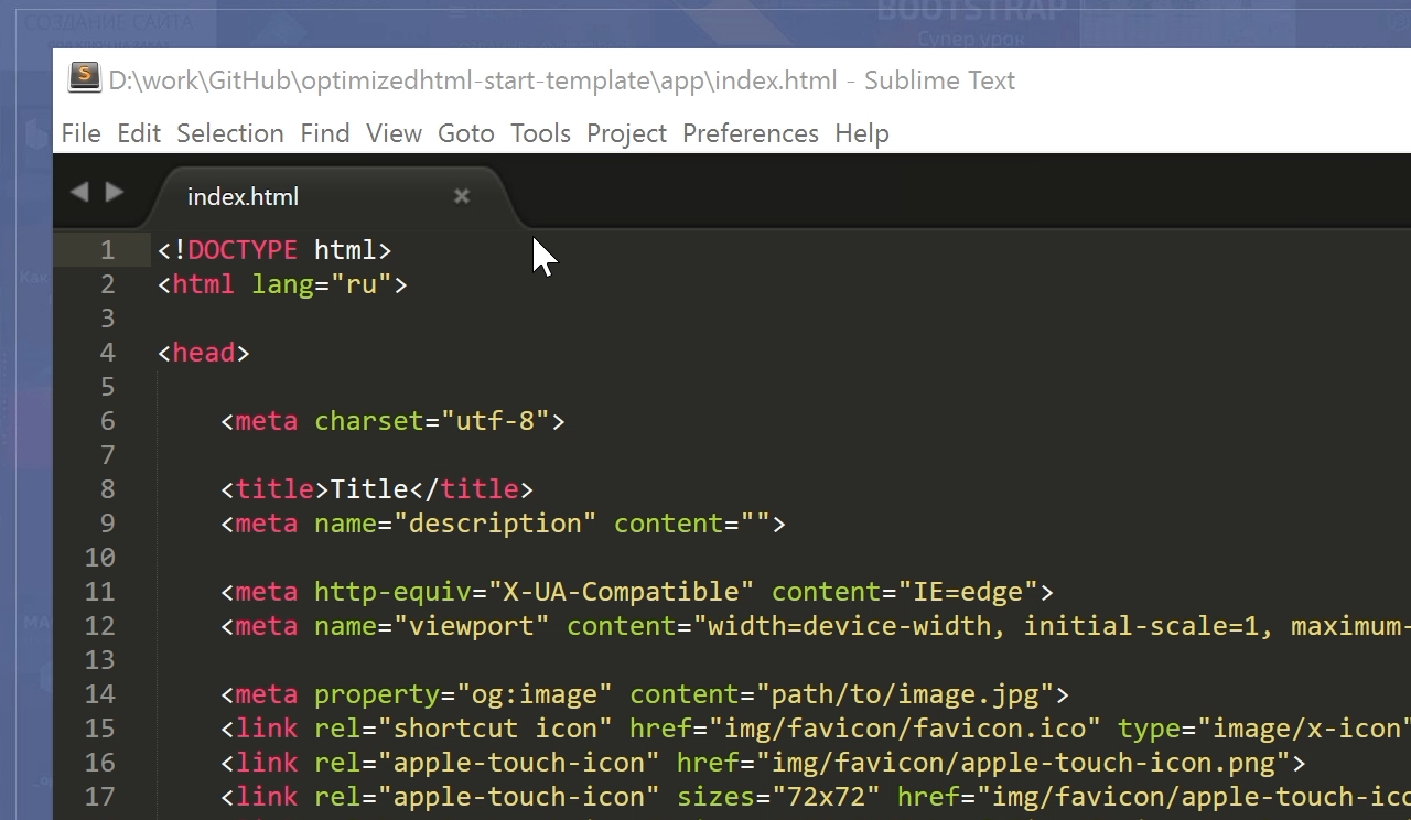
Решил обновить до третьей версии, а заодно и облагородить свой любимый текстовый редактор Sublime Text 2, в котором, собственно, и пишу сайты. Настроить тут можно практически всё как душа пожелает, ведь для Sublime Text существуют тысячи расширений, плагинов, тем и цветовых схем оформления. Всё это превращает процесс программирования в весьма приятное занятие, в том числе и для глаз.
Установка плагинов и дополнений
Плагины привносят дополнительный функционал редактору и могут быть невероятно полезными. Устанавливать и работать с ними гораздо проще если воспользоваться специальным расширением Package Control.
Устанавливается он очень просто. Мне больше нравится делать через консоль Sublime Text console. Перейти в неё можно комбинаций клавиш Ctrl + ` либо через меню View > Show Console menu.
Для Sublime Text 3 скопируйте в командную строку консоли следующий код на Python:
import urllib.request,os,hashlib; h = '6f4c264a24d933ce70df5dedcf1dcaee' + 'ebe013ee18cced0ef93d5f746d80ef60'; pf = 'Package Control.sublime-package'; ipp = sublime.installed_packages_path(); urllib.request.install_opener( urllib.request.build_opener( urllib.request.ProxyHandler()) ); by = urllib.request.urlopen( 'http://packagecontrol.io/' + pf.replace(' ', '%20')).read(); dh = hashlib.sha256(by).hexdigest(); print('Error validating download (got %s instead of %s), please try manual install' % (dh, h)) if dh != h else open(os.path.join( ipp, pf), 'wb' ).write(by)
Код для Sublime Text 2:
import urllib2,os,hashlib; h = '6f4c264a24d933ce70df5dedcf1dcaee' + 'ebe013ee18cced0ef93d5f746d80ef60'; pf = 'Package Control.sublime-package'; ipp = sublime.installed_packages_path(); os.makedirs( ipp ) if not os.path.exists(ipp) else None; urllib2.install_opener( urllib2.build_opener( urllib2.ProxyHandler()) ); by = urllib2.urlopen( 'http://packagecontrol.io/' + pf.replace(' ', '%20')).read(); dh = hashlib.sha256(by).hexdigest(); open( os.path.join( ipp, pf), 'wb' ).write(by) if dh == h else None; print('Error validating download (got %s instead of %s), please try manual install' % (dh, h) if dh != h else 'Please restart Sublime Text to finish installation')
Страшного тут ничего нет и коды эти придумал не я — вся информация по установке и работе есть на официальной страничке, ссылку дал выше.
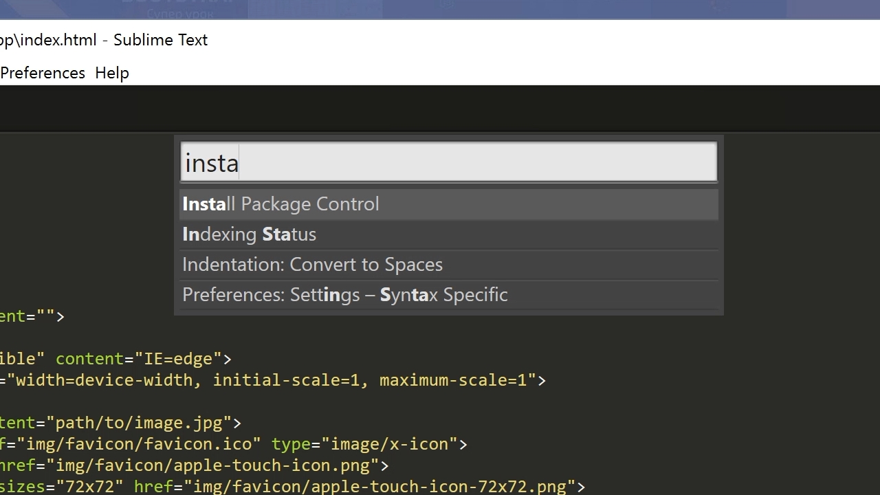
Теперь для установки расширений достаточно вызвать Package Control комбинацией клавиш Ctrl + Shift + P в Windows или Cmd + Shift + P на Mac.
Конечно, Package Control очень упрощает жизнь, особенно новичкам, однако в крайнем случае можно обойтись и без него, устанавливать плагины, расширения и темы оформления вручную.
Последние пару недель периодически возникают проблемы с чтением пакетов при установке через Package Control. При попытке вызвать Install Package выдается ошибка: package control there are no packages available for installation. Связана она с невозможностью прочитать репозиторий, но автор обещал решить эту проблему.
Настройка и лучшие темы оформления Sublime Text 2/3
Даже без дополнительных тем оформления Sublime Text уже «из коробки» предлагает огромное количество настроек, правда большинство из них по умолчанию отключены. Кроме размера шрифта для себя всегда устанавливаю две настройки:
- «highlight_line»: true
- «word_wrap»: true
Эта настройка подсвечивает строку, на которой находится курсор. Помогает быстрее ориентироваться в коде.
Смело включаем, если вас тоже раздражает горизонтальный скроллинг. Как уже понятно из названия, настройка запрещает тексту выходить за рамки текущего окна, перенося текст по словам на следующую строку.
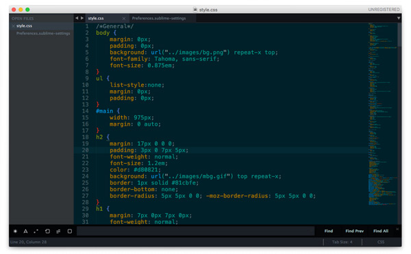
Sublime Text позволяет сочетать различные темы и цветовые схемы. Именно так настроено у меня — в качестве цветовой схеме подсветки синтаксиса установлена Solarized (Dark) а остальное оформление вкладок и иконок взято из темы Spacegray.
Цветовая схема: Solarized
Наверное самый известный проект Solarized доступен и для Sublime Text. Этот проект позиционируется как «аккуратные и точные цвета для машин и людей» и использует большое количество положений из теории цвета.
Тема: Spacegray
Очень популярная тема. Привлекает внимание невероятно минималистичным плоским интерфейсом и уникальными цветами. Цветовое решение подсветки синтаксиса не уступает схеме Solarized (лично мне для глаз приятнее всё-таки Solarized).
Тема: Flatland
Еще одна тема для поклонников плоского дизайна.
Подписывайтесь на канал
Яндекс.Дзен
и узнавайте первыми о новых материалах, опубликованных на сайте.
Привет, друзья! По многочисленным просьбам обновил руководство по быстрой настройке редактора кода Sublime Text 3, установке необходимых для верстки плагинов и создании своего пресета настроек для быстрого старта на новом рабочем месте.

Вам наверняка знакома ситуация, когда на новом рабочем месте необходимо быстро установить и настроить Sublime Text для работы над новыми проектами. Как правило, тонкая настройка Sublime Text занимает много времени и выполнять ее каждый раз не практично и долго.
Сегодня мы рассмотрим максимально быструю настройку Sublime Text, самые популярные среди верстальщиков плагины для ускорения верски и установим одну из лучших и комфортных тем оформления редактора One Dark Material Theme.
По умолчанию Sublime Text выглядит довольно печально:
Установка Package Control в Sublime Text
Для начала необходимо настроить Package Control. Для этого нажимаем хоткей Ctrl+Shift+P. Во всплывающем окне набираем Install Package Control и выбираем соответствующий пунк. Через несколько секунд Package Control будет установлен, о чем вы получите соответствующее уведомление.
Если вы пользователь MacOS, необходимо нажать на клавиатуре Cmd+Shift+P.
Package Control необходим для того, чтобы вы могли устанавливать дополнения и плагины в Sublime Text 3 из репозитория пакетов.
Установка плагинов в Sublime Text
Далее необходимо установить нужные для работы плагины. Мы рассмотрим установку самых популярных среди верстальщиков плагины, которые значительно упрощают разработку. Вы также можете поэкспериментировать с другими плагинами в Package Control, может быть вам понравятся и другие из огромного количества доступных пакетов.
Для установки плагинов в Sublime Text через Package Control необходимо вызвать меню, как мы это делали ранее: Ctrl+Shift+P. Затем вводим команду «Install Package» и выбираем нужный пакет из списка.
Самые популярные плагины для Sublime Text:
- Emmet — ускоряет написание HTML и CSS кода до скорости света. Урок по Emmet
- AutoFileName — дополняет код при написании путей до файлов в верстке;
- Gist — подключает в Sublime Text возможность использовать сервис сниппетов кода GitHub Gist. Урок по Gist;
- Sass — плагин для подсветки Sass синтаксиса в Sass и Scss файлах. Раскрывает Emmet в Sass файлах.
- terminus — плагин встроенного терминала Sublime Text.
- W3CValidators — мощный набор валидаторов для HTML разметки, CSS, SVG и т.д.
Установка внешнего оформления Sublime Text
Мне очень нравится тема оформления One Dark Material Theme и подсветка кода соответствующей цветовой гаммой. Это наиболее сбалансированные, достаточно контрастные, но не слишком резкие цвета для комфортной работы в редакторе.
Дя установки цветового оформления One Dark нам необходимо доустановить следующие пакеты через Package Control:
- One Dark Color Scheme — цветовая схема для подсветки кода;
- One Dark Material — Theme — тема оформления UI Sublime Text.
Установка плагина вручную
Некоторые плагины более не обновляются в Package Control или просто там не фигурируют. Кое-какие из этих плагинов имеют жизненную необходимость при работе с кодом и их приходится устанавливать вручную.
Один из таких плагинов BufferScroll — потрясающий плагин, который при повторном открытии документа устанавливает курсор на том месте, на котором вы закончили редактирование в прошлый раз, тем самым сокращая время на поиск нужной позиции для продолжения работы.
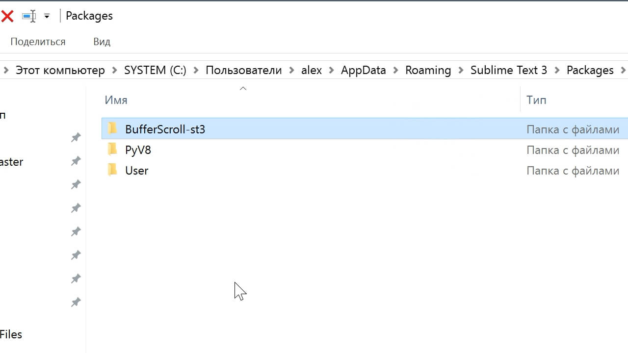
Для установки BufferScroll вручную, скачайте его и распакуйте в любое удобное место на вашем диске. Далее в Sublime Text выбираем пункт меню Preferences > Browse Packeges. Откроется папка пользовательских данных на вашем диске. Скопируйте сюда папку, содержащую файлы Buffer Scroll и перезапуститие Sublime Text. Теперь плагин работает.

Тонкая настройка редактора, пресет моих настроек
Переходим к настройкам Sublime Text.
Предтавляю мой пресет настроек, который я всегда использую для стартовой настройки редактора Sublime Text на новом рабочем месте или после переустановки системы. Вы можете использовать данный пресет в вашем редакторе и кастомизировать его при необходимости:
Keymap (Windows Users):
[
	{ "keys": ["alt+shift+f"], "command": "reindent" },
]

Settings:
{
	"show_definitions": false,
	"auto_complete": false,
	"bold_folder_labels": true,
	"color_scheme": "Packages/One Dark Material - Theme/schemes/OneDark.tmTheme",
	"fold_buttons": false,
	"font_size": 13,
	"highlight_line": true,
	"indent_guide_options":
	[
		"draw_normal",
		"draw_active"
	],
	"line_padding_bottom": 2,
	"line_padding_top": 2,
	"margin": 2,
	"material_theme_compact_sidebar": true,
	"material_theme_compact_panel": true,
	"material_theme_small_statusbar": true,
	"material_theme_small_tab": true,
	"tab_size": 2,
	"theme": "OneDarkMaterial.sublime-theme",
	"word_wrap": "false",
}
Код пресета для пользовательских настроек (Preferences.sublime-settings | Preferences > Settings) — отдельно:
{
	"show_definitions": false,
	"auto_complete": false,
	"bold_folder_labels": true,
	"color_scheme": "Packages/One Dark Material - Theme/schemes/OneDark.tmTheme",
	"fold_buttons": false,
	"font_size": 13,
	"highlight_line": true,
	"indent_guide_options":
	[
		"draw_normal",
		"draw_active"
	],
	"line_padding_bottom": 2,
	"line_padding_top": 2,
	"margin": 2,
	"material_theme_compact_sidebar": true,
	"material_theme_compact_panel": true,
	"material_theme_small_statusbar": true,
	"material_theme_small_tab": true,
	"tab_size": 2,
	"theme": "OneDarkMaterial.sublime-theme",
	"word_wrap": "false",
}
Код пресета для пользовательских клавиатурных сокращений (Default (Windows).sublime-keymap | Preferences > Key Bindings) — отдельно:
[
	{ "keys": ["alt+shift+f"], "command": "reindent" },
]
Теперь при выделении и по нажатию Alt+Shift+F ваш код будет автоматически выравниваться отступами с соответствующей иерархией вложенности элементов.
Разместив данные сниппеты в соответствующих файлах настроек вы получите полностью готовый к рабое, настроенный Sublime Text или можете настроить редактор под себя. В настройках есть два поля — левое с дефолтными настройками и правое с пользовательскими. В дефолтных настройках вы можете увидеть подсказки к каждому свойству и применить его в правой части скопировав и установив свое значение.
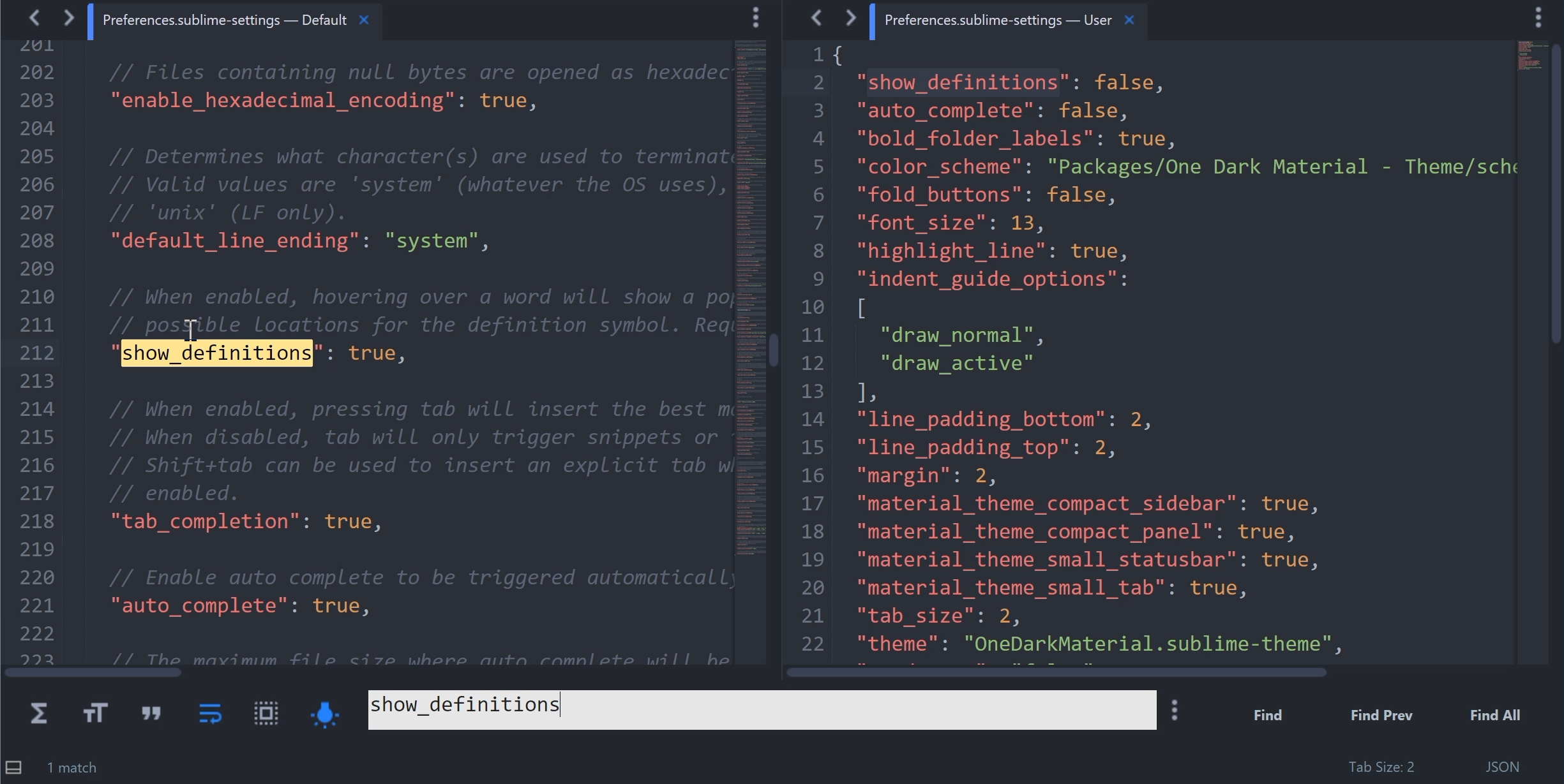
Узнать какое свойство за что отвечает довольно просто — все свойства имеют интуитивно понятные наименования на английском языке. Любое свойство из большого обилия доступных настроек можно просто перевести на русский язык и понять, что оно означает.
Для того, чтобы сделать бэкап всех ваших настроек и быстро развернуть Sublime Text на другом рабочем месте, достаточно скопировать папку
«C:Users{Ваш пользователь}AppDataRoamingSublime Text 3»
в потаенное резервное место на вашем диске или на флешку, а затем разместить у другого юзера или на другом компьютере в этой-же директории под пользователем.
Также дополнительно на ваше усмотрение можно отключить миникарту справа и скрыть меню. Это можно сделать перейдя в меню View > Hide Minimap и View > Hide Menu. Показать меню можно нажатием клавишы Ctrl на клавиатуре.
Премиум уроки от WebDesign Master
Другие уроки по теме «Инструменты»
- Настройка VS Code для верстки
- Simple Starter — простой стартер для верстки | Материалы урока
- Windows 11: Делаем вкладки в проводнике. Настройка QTTabBar от А до Я
- Хостинг от А до Я: Сайты, базы, домены, SSL, SSH, sFTP, перенос, деплой, секреты, лайфхаки
- Gulp 4 — Актуальное и исчерпывающее руководство для самых маленьких
- Актуальный способ установки и настройки окружения Windows WSL 2 (Windows Subsystem for Linux)
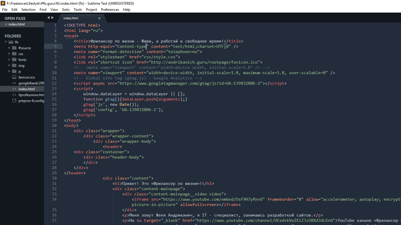
Сегодня расскажу о редакторе кода, которым пользуюсь для верстки сайтов уже много лет. Быстрый, удобный и полностью настраиваемый Sublime Text 3.
Мы с нуля настроем его внешний вид, а также применим плагины AutoFileName, BracketHighliter, ColorHighliter, Emmet, GotoCSSDeclaration и Tag, которые существенно помогут нам при верстке сайтов! Ну что ж, от слов к делу!
Внешний вид программы
Первым делом, после установки Sublime Text 3, я настраиваю внешний вид программы.
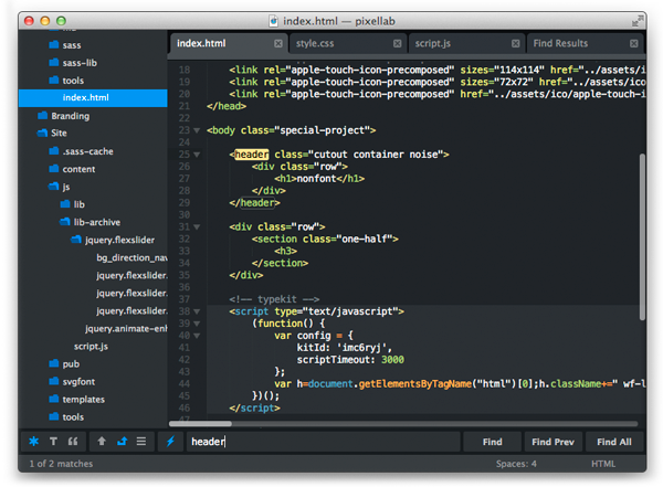
Боковая панель
Для отображения панели переходим View – Side Bar – Show Open Files. В этой панели будут отображаться наши проекты, то есть папки и файлы нашей верстки. Для наглядности сейчас добавлю один из них. Все что там нужно сделать — это просто перетащить папку с проектом на нашу панель.

Цветовая схема
Далее настраиваю цветовую схему программы и кода, для наглядности открою любой файл, например, с HTML кодом. Для этого два раза кликаю на нужном файле. Теперь перехожу Preferences – Color Scheme, открывается окошко с установленными цветовыми решениями и при выборе той или иной темы внешний вид нашего кода и сама программа будут меняться.
Лично мне не подходит ни один из предустановленных вариантов, поэтому я устанавливаю дополнительную цветовую схему. Огромное их количество можно найти и ознакомиться на сайте с дополнениями к Sublime packagecontrol.io. Я уже знаю какую именно я схему хочу установить, что сейчас и сделаю.
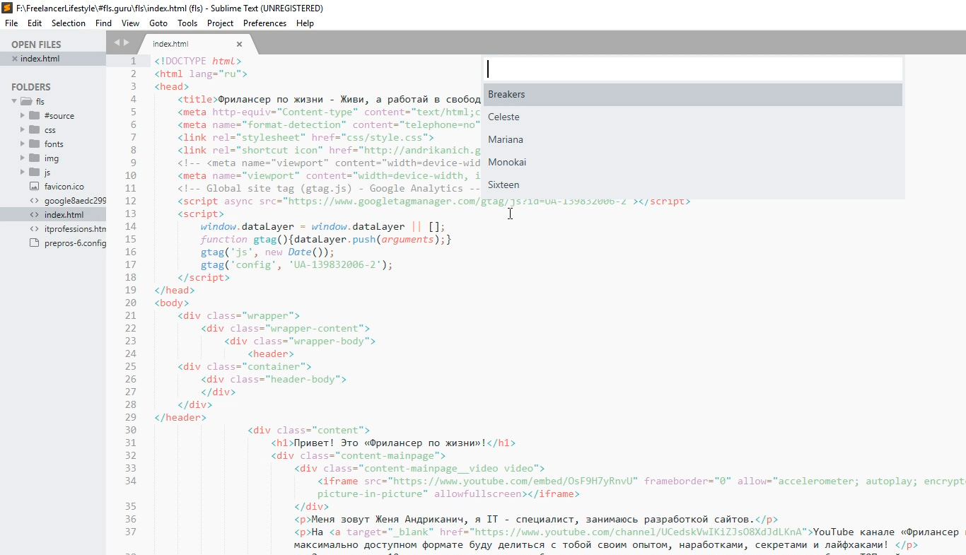
Для того что устанавливать новые цветовые схемы, плагины и прочие дополнения, мне нужно сперва установить установщик этих дополнений. Звучит сложно, но на деле все гораздо проще.
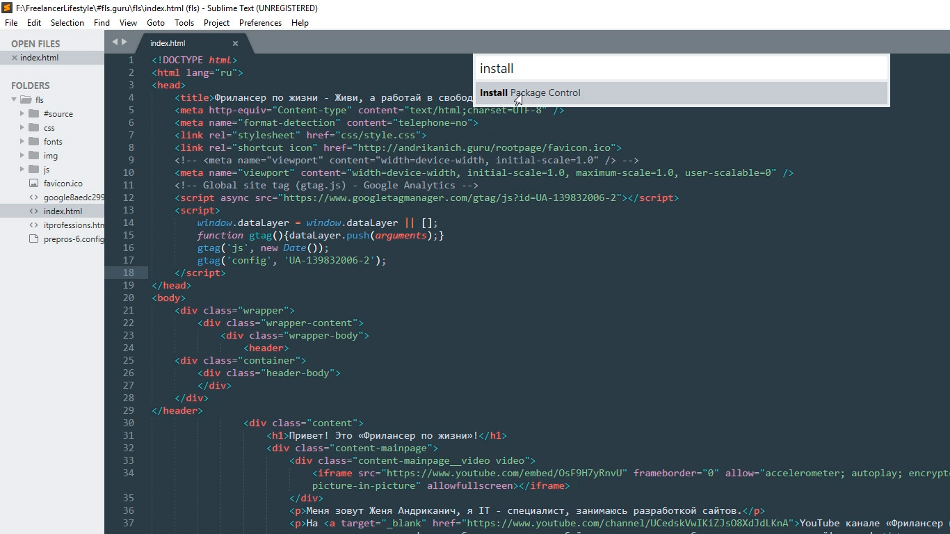
Перехожу в меню Tools – Command Palette, либо нажимаю Ctrl+Shift+P. Открывается вот такое окно с поиском, в поле поиска ввожу install пока не увижу пункт Install Package Control, и нажимаю на него. Спустя несколько секунд получаю сообщение о том, что Package Control успешно установлен. Теперь я могу приступить к установке нужной цветовой схемы.
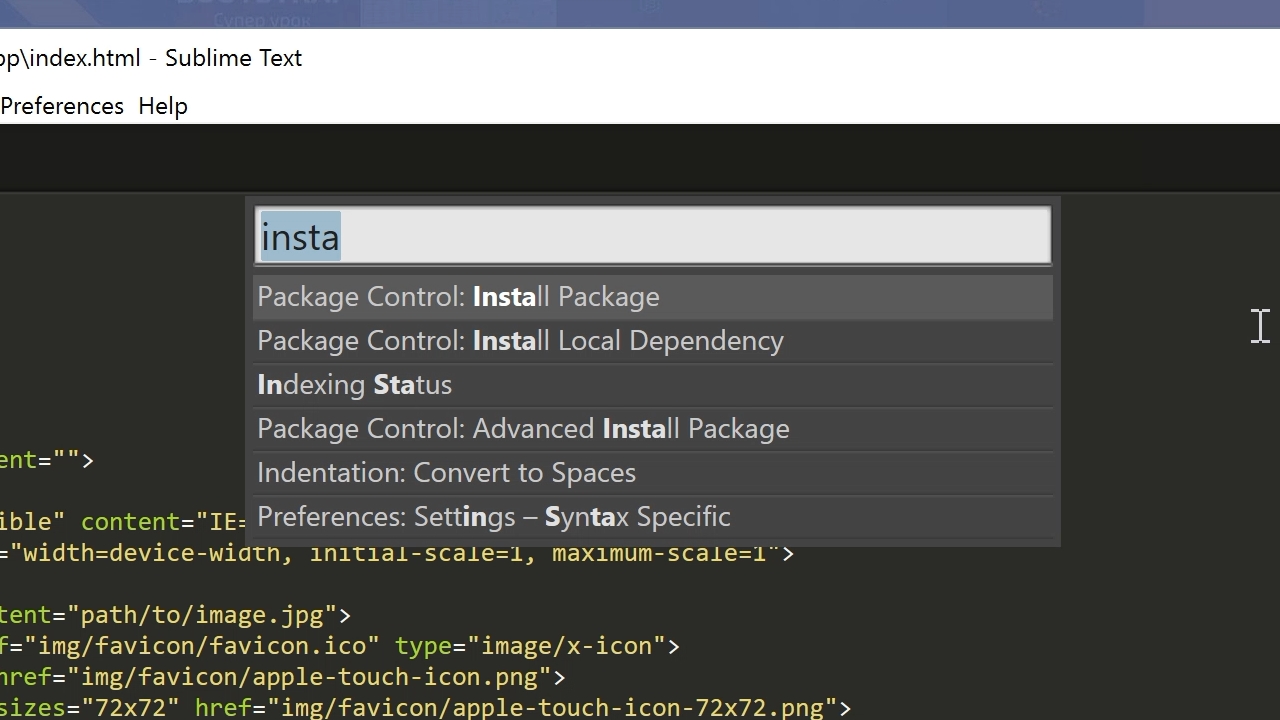
Для этого опять вызываю Command Palette зажимая Ctrl+Shift+P, в поле поиска опять ввожу install пока не увижу пункт Package Control: Install Package (установить пакет дополнения) нажимаю на него. Немного подождав вижу окно со списком всех доступных дополнений к Sublime. Ну, почти всех.
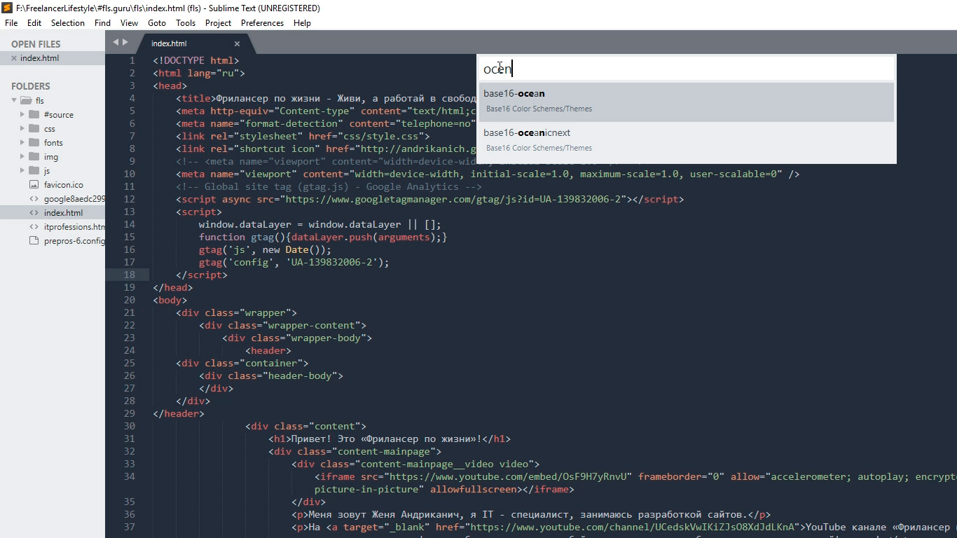
В поле поиска ввожу название того дополнения, которое хочу установить, в данный момент — это цветовая схема под названием Base16 Color Schemes, точнее это целый пакет с множеством цветовых схем. Нажимаю на найденный пункт и ожидаю установки. Индикатор процесса установки можно увидеть на нижней панели программы. Получив там же короткое сообщение о том, что все установлено перехожу к смене схемы. Для этого открываю уже знакомый пункт меню Preferences – Color Scheme и вижу в открывшемся окне уже большое множество разных вариантов. Меня интересует схема Ocean, ввожу название в поиске, их тут есть две: одна более контрастней другой.
Моя любимая цветовая схема установлена, ты конечно же можешь выбрать себе любую другую.
Общий вид программы мне больше нравится темный, поэтому перехожу Preferences – Theme, и переключаюсь на Adaptive.sublime-theme
Сочетание цветов очень важно для работы с кодом, так как это влияет не только на восприятие, но и на усталость и здоровье твоих глаз. Так что подбери себе цветовую схему так, чтобы тебя ничего в ней не напрягало. И помни про перерывы в работе!
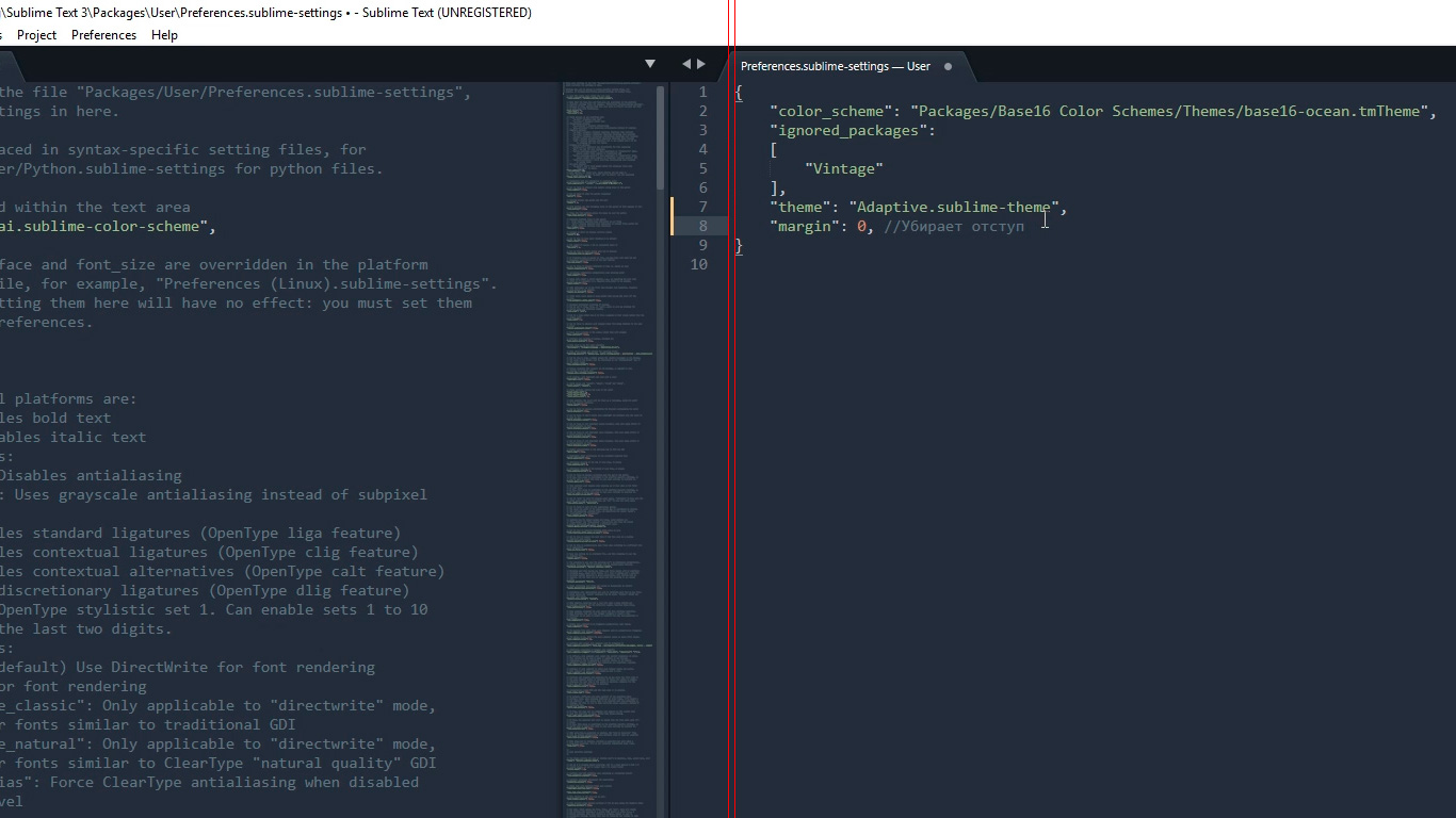
Дополнительные настройки
Дополнительно повысить восприятие кода и комфорт при работе с ним мне помогут следующие дополнительные настройки. Переходим Preferences – Settings. Открывается такое окно разделенное на две части. В левой части настройки по умолчанию, их изменить нельзя, а вот в правой части ты можешь эти настройки переназначить, каждая следующая должна идти через запятую. Вот какие настройки использую я:
Поясню каждую настройку.
Убирает странные отступы в программе между кодом и боковой панелью, что делает общую картину более компактной.
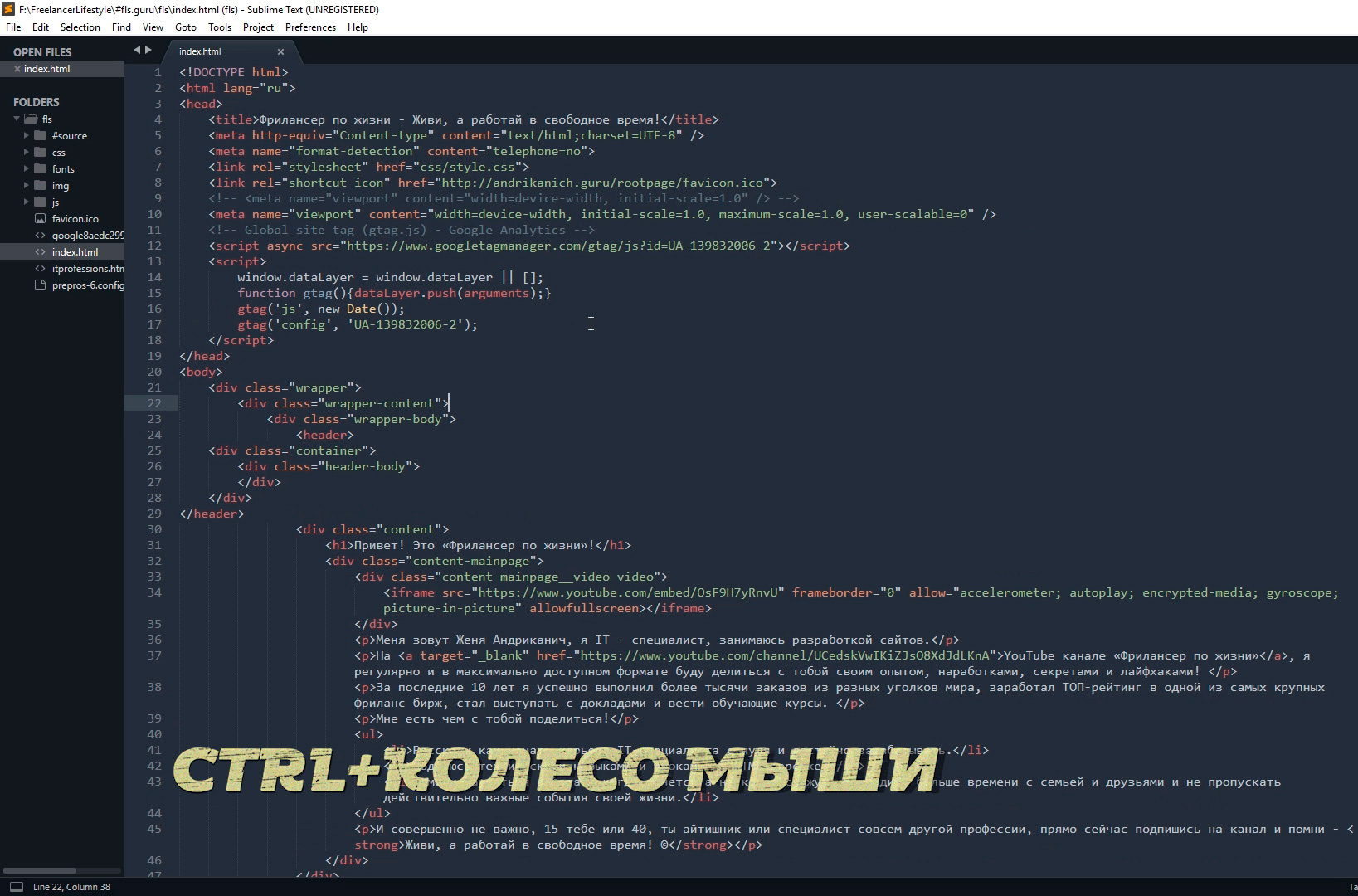
Выставляет размер шрифта по умолчанию.Также быстро изменить размер шрифта, работая с кодом, можно зажав контрол и покрутив колесо мыши.
Если ты вдруг размер изменил случайно, то сбросить его можно перейдя в Preferences – Font — Reset
Эти линии очень полезны для новичка, потому что визуально соединяют открывающий и закрывающий элемент, что существенно помогает в ориентации в коде.
Лично я отключаю их (false) по двум причинам. Первая — я уже не новичок и без них неплохо справляюсь, вторая причина — это следующая настройка.
Отображает невидимые табуляции и пробелы. То есть это не часть кода, а просто разметка для удобства работы. И вот, если включить и draw_indent_guides и draw_white_space то получатеся кашица которая лично меня напрягает. Что из этого использовать, а что нет — решать тебе.
Размер ширины линии отступа при нажатии Tab. Лично мне нравится 3й размер 🙂
Например мы работали работали, а потом неожиданно закрыли программу 🙂 Бывает такое? У меня постоянно, так вот эта настройка включает «память» у Sublime и при следующем открытии программы откроются и все последние файлы. И да, память работает и после перезагрузки компа.
Разделение рабочего окна
Еще более улучшить восприятие кода и ускорить процесс верстки нам поможет разделение рабочего окна.
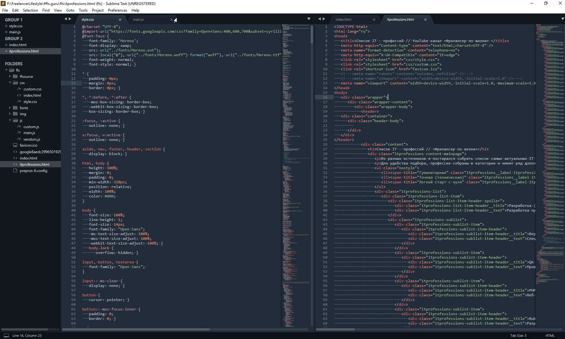
Поскольку практически всегда приходится работать с несколькими разными файлами, например index.html style.css и какой-то js файл, то дополнительным удобством будет разделение окна с кодом на секторы. Варинтов несколько. Переходим в View – Layout и смотрим что тут у нас есть.
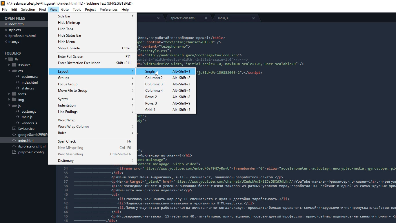
Соответственно Single – это вид без разделений как сейчас, Columns: 2, 3, 4 это разбивка по вертикали. Например нажав на Columns: 2 наш экран с кодом разделится пополам, и мы можем часть файлов переместить в пустую колонку, например CSS слева HTML и JS справа, что делает работу более наглядной и быстрой.
Так же у нас есть варианты поделить экран по горизонтали это Rows: 2 и Rows: 3, нажав например на Rows: 3 получим три горизонтальных окна и можно перекинуть JS файл в третье окно. И последний вариант это Grid: 4 который делит экран пополам как по горизонтали, так и по вертикали. В результате получаются четыре окна. Обрати внимание, что переключаться между режимами можно и с помощью горячих клавиш Alt+Shift+ соответствующая цифра.
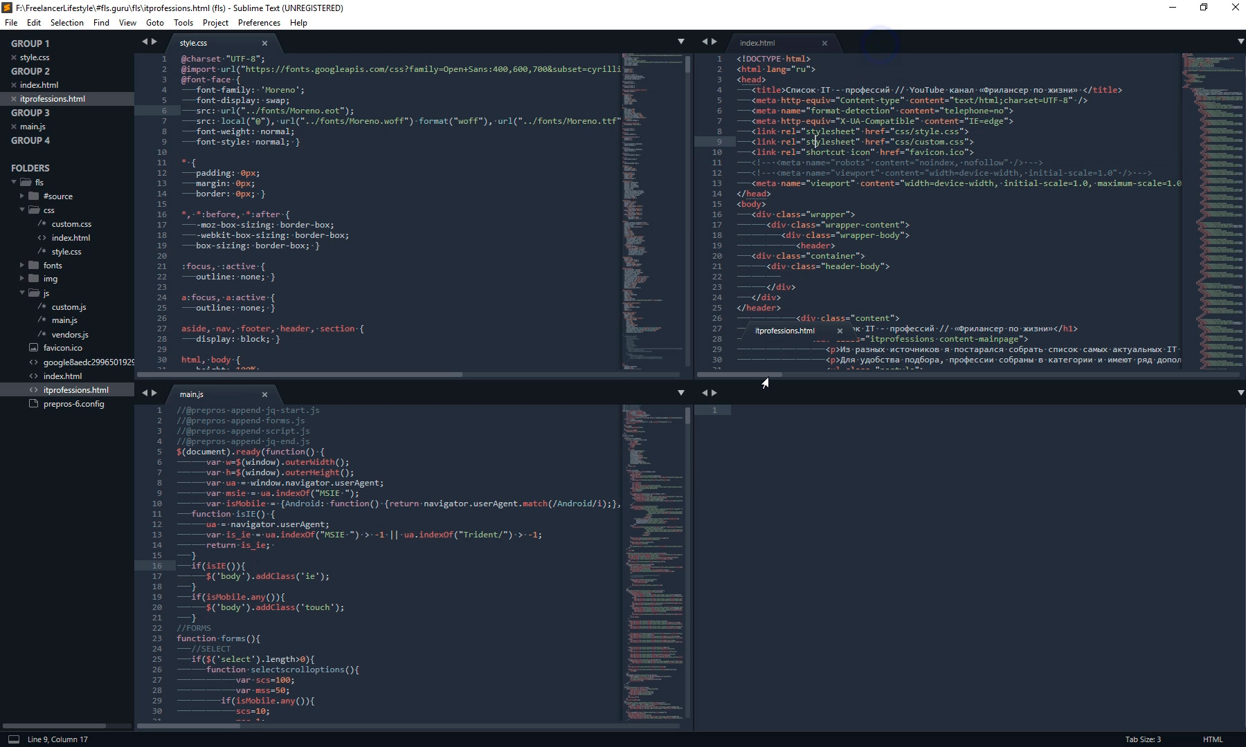
Так что у тебя есть широкий выбор по вкусу. Я чаще всего использую одно разделение по вертикали.
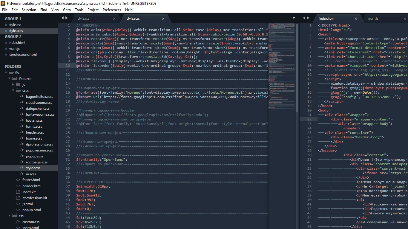
Подсветки синтаксиса
Конечной настройкой внешнего вида будет настройка подсветки синтаксиса. Слово страшное, однако на деле все просто.
Подсветки синтаксиса – это особое окрашивание цветом того или иного елемента в коде. Например, в этой цветовой схеме в HTML файле краcным выделен тег, зеленым — название класса, белым — текст и так далее. Это делает восприятие кода намного понятнее. Обрати внимание на правый нижний угол окна программы, в зависимости от того как кой файл у нас сейчас активен, CSS HTML JS и так далее происходит переключение отображения кода этого конкретного файла.
Зачем же тут что-то делать если все и так отлично работает? Дело в том что в начальном пакете Sublime установлены пакеты подсветки синтаксиса далеко не для всех форматов.
Например, в дальнейшем я планирую работать с файлами SCSS, открыв его я увижу сплошную простыню из набора белых символов. Не очень удобно, правда?

Так вот, в таких случаях я дополнительно устанавливаю нужный пакет.
Открываем наш привычный Commаnd Palette перейдя Tools – Command Palette, либо нажимаем Ctrl+Shift+P набираем install, жмем Install Package Control и ищем дополнение SCSS. Нажимаем на него, после установки мы можем переключить наше отображение на SCSS. Сейчас все выглядит симпатичнее, не так ли?
Настройка внешнего вида редактора важна, так как мы довольно длительное время проводим за написанием кода. Это влияет на нашу усталость, продуктивность, здоровье да и просто на настроение.
Следующее, что мы сделаем это установим ряд плагинов и дополнений. Их существует огромное количество, а я расскажу про основные, которые активно использую сам и которые в разы ускорят весь процесс верстки. Приступим!
Плагины
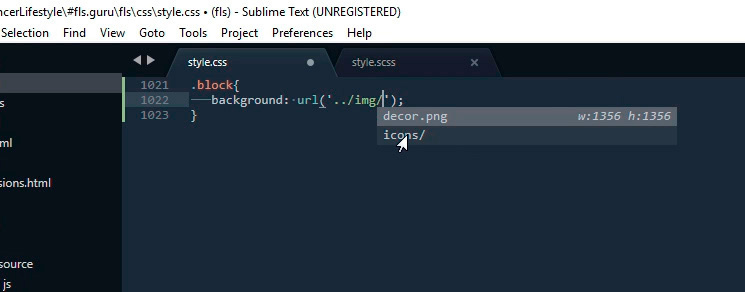
AutoFileName
Дело в том, что в процессе верстки часто приходится подключать различные картинки. Этот плагин в разы облегчает процесс подключения. Установим его. Нажимаем Ctrl+Shift+P далее Install Package Control ищем AutoFileName устанавливаем. Попробуем подключить картинку сейчас. Сразу замечаем появление выпадающего меню со списком локальных файлов. Переходим в нужную папку с картинками и видим тут нужный нам файл, а также его размеры, что тоже пригодится.
BracketHighliter
BracketHighliter можно перевести как подсветка кавычек. Установим его. Нажимаем Ctrl+Shift+P, Install Package Control ищем BracketHighliter. Устанавливаем. Тут даже открывается отдельный файл с сообщением об успешной установке. Теперь в нашем коде будет подсвечиваться начальный и конечный элемент, например открывающий и закрывающий тег, начальная и конечная ковычка, открывающая и закрывающая скобка. Это очень помогает с ориентацией в коде.
ColorHighliter
Обрати внимание на этот код — это код цвета, но какого именно непонятно.
Давай установим плагин. Ctrl+Shift+P, Install Package Control ищем ColorHighliter. Опять открывается отдельный файл с сообщением об успешной установке. И сообщения о некой ошибке, игнорируем их. Смотрим на наш код с цветом, и теперь видим что за цвет скрывается за буквенноцифровым кодом. Сам плагин можно дополнительно настроить в меню Tools — ColorHighliter но сейчас не будем останавливаться на этом. Все и так стало намного лучше.
Великий и могучий Emmet
Устанавливаем по наработанной схеме. Ctrl+Shift+P, Install Package Control ищем Emmet. Открывается отдельный файл с сообщением с просьбой перезагрузить программу для окончания установки. Закрываем и открываем Sublime. Получаем сообщение, что все установлено.
Итак, что же умеет Emmet?
Перейдем в HTML файл и попробуем записать тег div с классом .block, для этого нам теперь достаточно поставить точку, написать «block» и нажать клавишу Tab. Мы получим:
Чтобы сделать более сложную запись, например в тег div с классом .block вставить тег span используем следующую запись:
Жмем клавишу Tab и получаем:
Но и это еще не все, мы можем создавать свои сниппеты, то есть шаблоны/заготовки.
Для этого перейдем Preferences – Package Settings – Emmet – Settings User. Здесь запишем следующее:
Теперь для того чтобы вызвать запись:
нам достаточно написать bl и нажать клавишу Tab
Из этого следует, что возможности Emmet безграничны, и мы можем настроить свои сниппеты как угодно и работать очень быстро. Подробную информацию о возможностях плагина можно найти на сайте https://emmet.io
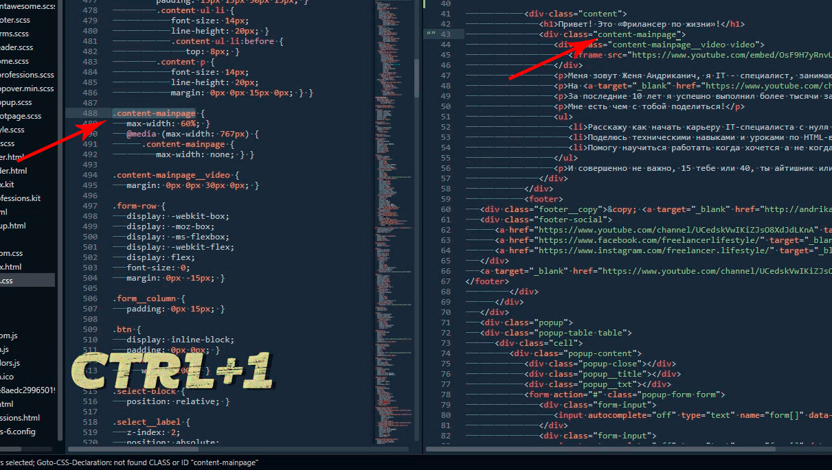
GotoCSSDeclaration
Плагин поможет нам с навигацией в коде. Устанавливаем ровно так же как и предыдущие плагины. Далее назначим горячие клавиши для работы с плагином для этого переходим Preferences – Key Bindings, и пишем следующий код
Где [«ctrl+1«] это и есть нужное сочетание клавиш. Сохраняем Cntr+S.
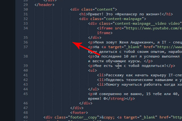
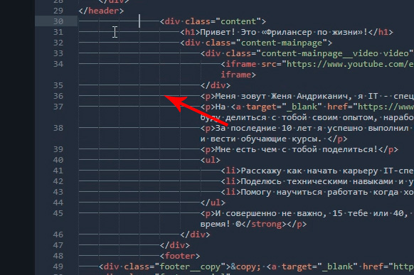
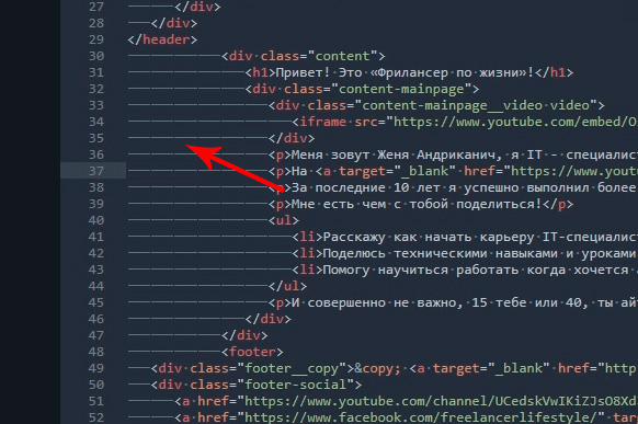
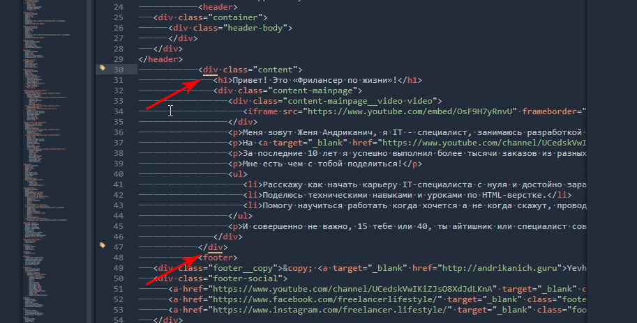
И вот как это работает. У нас должен быть открыт CSS и HTML файлы. CSS как правило очень большой и найти что-то быстро сложно, но это в прошлом. Например, нам нужно изменить CSS для класса content-mainpage кликаем на него мышкой и нажимаем ctrl+1. Вуаля, мы в нужном месте CSS файла.
Ну и для тех, кто дочитал до этого момента покажу еще один плагин, который установить не так просто, но он точно того стоит.
Зовут его Tag и установить нам придется его вручную. По этой ссылке можно скачать архив с плагином. Далее распаковываем в особую папку программы. Для Windows 10 это C:Users[Подставь свое имя пользователя]AppDataRoamingSublime Text 3Packages. Далее закрываем Sublime и открываем снова и добавляем горячие клавиши открыв Preferences – Key Bindings и дописав следующее:
Где ctrl+` это и есть наше сочетание клавиш.
Итак, для чего же мы проделали весь этот нелегкий путь? Как правило, в процессе написания, кода мы работаем сначала с HTML потом переносим названия классов в CSS и работаем уже там. Так вот этот перенос делать вручную давольно долго. И тут нам на помощь приходит плагин Tag. Сейчас нам достаточно выделить нужный HTML код, нажать наше сочетание клавиш ctrl+`
Настраиваем под себя Sublime Text 3
В который раз думаю кому понадобилась эта куча посленовогодних выходных. На четвертый день холодов уже не знаешь чем ещё себя развлечь. Вот перенести бы их на майские праздники или на лето. не все же проводят эти дни в пьяном угаре под Кисель-ТВ.
Решил обновить до третьей версии, а заодно и облагородить свой любимый текстовый редактор Sublime Text 2, в котором, собственно, и пишу сайты. Настроить тут можно практически всё как душа пожелает, ведь для Sublime Text существуют тысячи расширений, плагинов, тем и цветовых схем оформления. Всё это превращает процесс программирования в весьма приятное занятие, в том числе и для глаз.
Установка плагинов и дополнений
Плагины привносят дополнительный функционал редактору и могут быть невероятно полезными. Устанавливать и работать с ними гораздо проще если воспользоваться специальным расширением Package Control.
Устанавливается он очень просто. Мне больше нравится делать через консоль Sublime Text console. Перейти в неё можно комбинаций клавиш Ctrl + ` либо через меню View > Show Console menu.
Для Sublime Text 3 скопируйте в командную строку консоли следующий код на Python:
import urllib.request,os,hashlib; h = ‘6f4c264a24d933ce70df5dedcf1dcaee’ + ‘ebe013ee18cced0ef93d5f746d80ef60’; pf = ‘Package Control.sublime-package’; ipp = sublime.installed_packages_path(); urllib.request.install_opener( urllib.request.build_opener( urllib.request.ProxyHandler()) ); by = urllib.request.urlopen( ‘http://packagecontrol.io/’ + pf.replace(‘ ‘, ‘%20’)).read(); dh = hashlib.sha256(by).hexdigest(); print(‘Error validating download (got %s instead of %s), please try manual install’ % (dh, h)) if dh != h else open(os.path.join( ipp, pf), ‘wb’ ).write(by)
Код для Sublime Text 2:
import urllib2,os,hashlib; h = ‘6f4c264a24d933ce70df5dedcf1dcaee’ + ‘ebe013ee18cced0ef93d5f746d80ef60’; pf = ‘Package Control.sublime-package’; ipp = sublime.installed_packages_path(); os.makedirs( ipp ) if not os.path.exists(ipp) else None; urllib2.install_opener( urllib2.build_opener( urllib2.ProxyHandler()) ); by = urllib2.urlopen( ‘http://packagecontrol.io/’ + pf.replace(‘ ‘, ‘%20’)).read(); dh = hashlib.sha256(by).hexdigest(); open( os.path.join( ipp, pf), ‘wb’ ).write(by) if dh == h else None; print(‘Error validating download (got %s instead of %s), please try manual install’ % (dh, h) if dh != h else ‘Please restart Sublime Text to finish installation’)
Страшного тут ничего нет и коды эти придумал не я — вся информация по установке и работе есть на официальной страничке, ссылку дал выше.
Теперь для установки расширений достаточно вызвать Package Control комбинацией клавиш Ctrl + Shift + P в Windows или Cmd + Shift + P на Mac.
Конечно, Package Control очень упрощает жизнь, особенно новичкам, однако в крайнем случае можно обойтись и без него, устанавливать плагины, расширения и темы оформления вручную.
Последние пару недель периодически возникают проблемы с чтением пакетов при установке через Package Control. При попытке вызвать Install Package выдается ошибка: package control there are no packages available for installation. Связана она с невозможностью прочитать репозиторий, но автор обещал решить эту проблему.
Настройка и лучшие темы оформления Sublime Text 2/3
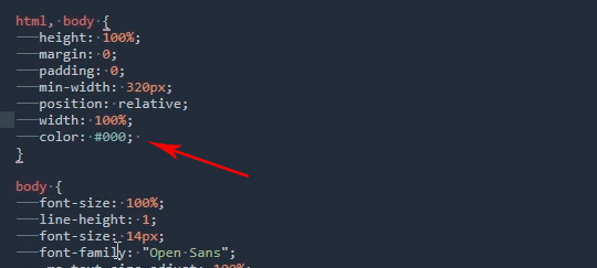
Даже без дополнительных тем оформления Sublime Text уже «из коробки» предлагает огромное количество настроек, правда большинство из них по умолчанию отключены. Кроме размера шрифта для себя всегда устанавливаю две настройки:
- «highlight_line»: true
Sublime Text позволяет сочетать различные темы и цветовые схемы. Именно так настроено у меня — в качестве цветовой схеме подсветки синтаксиса установлена Solarized (Dark) а остальное оформление вкладок и иконок взято из темы Spacegray.
Цветовая схема: Solarized
Наверное самый известный проект Solarized доступен и для Sublime Text. Этот проект позиционируется как «аккуратные и точные цвета для машин и людей» и использует большое количество положений из теории цвета.
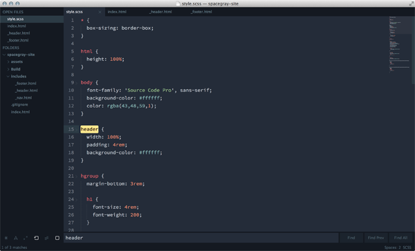
Тема: Spacegray
Очень популярная тема. Привлекает внимание невероятно минималистичным плоским интерфейсом и уникальными цветами. Цветовое решение подсветки синтаксиса не уступает схеме Solarized (лично мне для глаз приятнее всё-таки Solarized).
Тема: Flatland
Еще одна тема для поклонников плоского дизайна.
Если считаете статью полезной,
не ленитесь ставить лайки и делиться с друзьями.
 Нужен ли https блогам?
  Популярные движки для форумов
  Как сделать качественный сайт и заставить его работать?
  Выбор лучшего браузера для web-разработки
  Яндекс приглашает на седьмую Вебмастерскую
  Парсер XML -> JSON -> MySQL на PHP. Как я переносил комментарии из HyperComments в базу данных MaxSite CMS.
Русские Блоги

Требования к работе Установите и настройте частное облако рабочего стола, ссылку на конкретные требования к работекликните сюда Экспериментальные шаги Установить и настроить VirtualBox Для этого задан.
Метод Ньютона на языке Голанг для нахождения квадратного корня
Метод Ньютона для нахождения квадратного корня, это тест в руководстве по го.
rmats2sashimiplot: Визуализировать переменные результаты отсечения rmats
Добро пожаловать, чтобы обратить внимание на «Практическое руководство Шэнсинь»! В программном обеспечении для анализа переменного сдвига мисо предлагается метод визуализации событий перем.
Frameset Jump
Пример фреймета: Frameset содержит головной раздел (например, левый .HTM) присоединение Это щелкните HOC Connection по умолчанию, чтобы назвать в качестве DEENTPAGE в рамке страницы.

Реальный фильм «Двойник 11: Битва Зеро»
Это загадочная техническая команда. Они работают в мире кода, используют цифровые языки, создают программные структуры и особым образом касаются человеческих возможностей. Это история, которая меняет .
The look of the Sublime Text interface is controlled by themes. The term theme
refers strictly to the look of the UI – buttons, select lists, the sidebar,
tabs and so forth. The highlighting of source code, markup and prose is
controlled by a color scheme.
The theme engine for Sublime Text is based on raster graphics. PNGs are used to
prevent texture degradation and provide full alpha control. Each element in the
UI can have up to four layers of textures or fills applied, with properties to
control opacity and padding. The properties set on each element can be
conditionally changed based on user interaction and settings.
Sublime Text themes are implemented via the .sublime-theme format. It is
a JSON format that specifies rules for matching elements and modifying their
appearance.
-
Format
-
Terminology
-
General Information
-
Inheritance
-
Variables
-
Colors
-
Font Sizes
-
Attributes
-
Settings
-
Properties
-
Elements
-
Deprecated
-
Obsolete
-
Customization
Format🔗
A .sublime-theme file contains a single JSON document. The document
should be an object containing a key “rules” with the value of 3179
an array of rules. An optional key “variables” with an object
containing variable/value pairs may be added. 3179
The following is an example of a .sublime-theme file, showing the
format. A complete theme will have many more rules to cover all elements used in
the UI.
[
    // Set up the textures for a button
    {
        "class": "button_control",
        "layer0.tint": "#000",
        "layer0.opacity": 1.0,
        "layer1.texture": "Theme - Example/textures/button_background.png",
        "layer1.inner_margin": 4,
        "layer1.opacity": 1.0,
        "layer2.texture": "Theme - Example/textures/button_highlight.png",
        "layer2.inner_margin": 4,
        "layer2.opacity": 0.0,
        "content_margin": [4, 8, 4, 8]
    },
    // Show the highlight texture when the button is hovered
    {
        "class": "button_control",
        "attributes": ["hover"],
        "layer2.opacity": 1.0
    },
    // Basic text label style
    {
        "class": "label_control",
        "fg": [240, 240, 240],
        "font.bold": true
    },
    // Brighten labels contained in a button on hover
    {
        "class": "label_control",
        "parents": [{"class": "button_control", "attributes": ["hover"]}],
        "fg": [255, 255, 255]
    }
]
Terminology🔗
The primary contents of a theme is an array of rules. Each rule object
contains a "class" key used to match to an element. In addition to the
"class", matching can be further restricted by specifying "attributes",
"settings", "parents" and "platforms" keys. Properties affect the
look or behavior of the element.
- Variables allow reusing values throughout different rules. Variables may
-
contain any type of syntax, but may only be referenced by top-level keys
in a rule.
3179
Most elements have a single class name, although a few have more than one to
allow for both generic, and specific styling. For example, the
popup_control class can be used to set styles for the auto complete and
HTML popups, however popup_control auto_complete_popup may be used to
target just the auto complete popup. Multiple "class" values are separated
by a space. When a rule specified multiple class names, all must be present on
the element for the rule to be applied.
"attributes" are set by Sublime Text, and indicate the state of user
interaction, or other information about the nature of an element. The value is
an array of strings. Examples include "hover", "pressed"
and "dirty".
"settings" uses values from .sublime-settings files to filter rules.
This allowing theme authors to give users the ability to tweak a theme. Themes
may define their own settings, but there are a handful of “default” settings
that should be supported if possible. See Settings for more details.
The value for the "settings" key may be one of:
-
array of strings
Each string is the name of boolean settings. To check for a
false
value, prefix the setting name with a!.Example:
["bold_folder_labels", "!always_show_minimap_viewport"]. -
object
Each key is the name of a setting. A value may be a boolean, string, or array
of strings. If an array of strings is used, the setting will be matched if
any of the strings in the array matches the user’s value. When comparing to a
string, the user’s setting will be coerced to an empty string when not set.Example:
{"bold_folder_labels": true, "file_tab_style": "rounded"}.
The "parents" key is an array of objects specifying the "class" and
"attributes" that must be matched in a parent element. Note that the
parents must be ordered from furthest to closest parent.
The "platforms" key is an array of strings specifying the what operating
systems to apply the rule to. Valid options
include "osx", "windows" and "linux".
Properties refer to all other keys in the JSON objects. Some properties are
available on all elements, while others are specific to an individual element.
General Information🔗
The follow sections discuss information about images and how to specify styles.
Specificity🔗
Unlike CSS, a Sublime Text theme does not do specificity matching when applying
rules to elements. All rules are tested, in order, against each element.
Subsequent rules that match will override properties from previous rules.
Texture Images🔗
All textures in a theme are specified using PNG images. Each texture should be
saved at “normal” DPI, where each pixel in the file will be mapped to one
device pixel. All file paths in the theme definition should reference the
normal DPI version.
A second version of each texture should also be included at double the DPI, with
@2x added to the filename right before the extension. Sublime Text will
automatically use the @2x version when being displayed on a high-DPI
screen. :since:<It is also possible to specify @3x variants of textures for
screens running at 300% scale or higher <3167>>.
SVG images are not currently supported.
Dimensions🔗
Integer units in a theme referring to dimensions are always specified in
device-independent pixels (DIP). Sublime Text automatically handles scaling UI
elements based on the screen density.
Padding & Margins🔗
Padding and margin may be specified in one of three ways:
-
A single integer value – the same value is applied to the left, top, right and
bottom -
An array of two integers – the first value is applied to the left and right,
while the second value is applied to the top and bottom -
An array of four integers – the values are applied, in order, to the left,
top, right and bottom
Inheritance🔗
A theme may extend another theme, appending rules and overriding variables. To
extend a theme, add a top-level key "extends" to the JSON object, with a
string value of the base theme.
{
    "extends": "Default.sublime-theme",
    "rules":
    [
        {
            "class": "label_control",
            "parents": [{"class": "button_control", "attributes": ["hover"]}],
            "fg": "red"
        }
    ]
}
The resulting list of rules will start with the base theme rules followed by the
extending theme rules. Any variables from the extending theme will override
variables with the same name in the base theme. Variable overrides will affect
rules both in the base theme and the extending theme.
3179
Variables🔗
Reusable variables may be defined by a JSON object under the top-level key
"variables". Variable names are strings, however the value may be a string,
number, boolean, array or object. Using a variable requires specifying a string
in the format var(example_variable_name).
{
    "variables":
    {
        "light_gray": "rgb(240, 240, 240)"
    },
    "rules":
    [
        {
            "class": "label_control",
            "fg": "var(light_gray)"
        }
    ]
}
Variables may be used as the value for any properties, but
the variable must be the entire value, it may not be embedded within another
variable. The only exception to this rule is that variables may be used as the
base color for the CSS color() mod function.
3179
Colors🔗
Colors may be specified by CSS or legacy color syntax:
CSS Color Syntax🔗
Since Sublime Text build 3177, colors in themes may now be specified using CSS
syntax, as supported by minihtml Reference. This includes support for hex, rgb(),
hsl(), variables and the color mod function. Additionally, all
Predefined Variables that are derived from the color
scheme are available for use.
The color white, as hex
The color white, using rgb() functional notation
50% opacity white, using hsl() functional notation
The closest color to red, as defined in the color scheme
50% opacity of the closest color to red, as defined in the color scheme
color(var(--redish) a(0.5)
3179
Legacy Color Syntax🔗
Prior to supporting CSS syntax for colors, themes were only able to specify
colors using the following formats, which are now deprecated.
RGB🔗
Colors in the RGB color space are specified via an array of 3 or 4 numbers, with
the first three being integers ranging from 0 to 255
representing the components red, green and blue. The optional fourth number is
a float ranging from 0.0 to 1.0 that controls the opacity of
the color.
The color white, with full opacity
The color blue, with 50% opacity
HSL🔗
Colors may also be specified using the HSL color space by creating an array of 4
elements, with the first being the string "hsl". The second element is
an integer from 0 to 360 specifying the hue. The third is an
integer from 0 to 100 specifying the saturation, and the fourth
is an integer from 0 to 100 specifying the lightness.
A dark magenta, with full opacity
A float from 0.0 to 1.0 may be added as a fifth element to
control the opacity.
A bright teal, with 50% opacity
["hsl", 180, 100, 75, 0.5]
Derived Colors🔗
It is also possible to derive colors from the current global color scheme.
Colors in this format are specified using arrays with specific formats. In all
cases, the first element is the base color, which may
be "foreground", "background" or "accent".
Change Opacity of Base Color🔗
To change the opacity of a base color, specify an array of 2 elements, the first
being the base color name and the second being a float from 0.0
to 1.0. The opacity will be set to the float value.
The color scheme foreground, at 90% opacity
De-saturate Base Color🔗
To de-saturate a base color, specify an array with 3 elements. The first is the
name of the base color, the second is the string "grayscale", and the
third is an integer from 0 to 100 which specifies what
percentage of the saturation (in HSL color space) of the existing color should
be retained. A value of 100 means no change, whereas a value
of 0 would cause the color to be completely de-saturated.
The color scheme foreground, with the saturation adjusted to 1/4 of the
original value.
["foreground", "grayscale", 25]
Tint Base Color🔗
5 and 6-element derived colors allow blending a color into the base color. A
5-element colors uses an RGBA color, whereas a 6-element uses an HSLA. In both
cases, the last element, which normally represents the opacity, controls how
much of the secondary color is blended into the base.
The color scheme background, lightened with white
["background", 255, 255, 255, 0.1]
The color scheme accent, tinted with dark red
["accent", "hsl", 0, 100, 30, 0.2]
Colors derived from the color scheme will always be based on the global color
scheme, and will not reflect view-specific color schemes. Certain view-specific
controls in the UI have tinting properties that allow using the view-specific
color scheme colors.
Font Sizes🔗
Font sizes may be specified in the formats:
Numeric🔗
An integer or float to specify the size of the font in pixels.
Examples: 12, 13.5.
CSS Format🔗
A string of a px or rem CSS font size.
Examples: 12px, 1.`2rem
The rem size is based on the global setting font_size for most
elements. Elements that use a different root font size will specify in the
description.
4050
Attributes🔗
Attributes are specified as an array of strings. Each string is an attribute
name. To check for the absence of an attribute, prepend a ! to the name.
The following attributes are common to all elements:
-
hover -
Set whenever the user’s mouse is hovered over an element.
Luminosity🔗
Although not available on all elements, many have attributes set based on the
approximate luminosity of the current color scheme. Most elements have the
attributes set based on the global color scheme. Tabs and the tab background,
however, have the attributes based on the color scheme specific to the selected
view.
The attributes are assigned based on the V value of the background color,
when represented as HSV colors.
-
file_light -
Vfrom0.60—1.00
-
file_medium -
Vfrom0.30—0.59
-
file_medium_dark -
Vfrom0.10—0.29
-
file_dark -
Vfrom0.00—0.09
Settings🔗
Certain Sublime Text settings are design to influence the UI. Themes should
respect these settings and change elements based on them.
- «overlay_scroll_bars»🔗
-
This should affect the style of the scroll bars – generally they should be
semi-transparent and theoverlayproperty of the
scroll_area_controlshould be set totrue.
- «always_show_minimap_viewport»🔗
-
If the current viewport area should be highlighted on the minimap even when
the user is not hovering over the minimap.
- «bold_folder_labels»🔗
-
If folder names in the side bar should have the
font.boldproperty set totrue.
- «mouse_wheel_switches_tabs»🔗
-
This is used to control mouse wheel behavior of tabs on Linux. It should be
combined with checking for!enable_tab_scrollingto change the
mouse_wheel_switchproperty of thetabset_control
tofalse.
- «highlight_modified_tabs»🔗
-
If the tabs of modified files should be highlighted. This setting should be
checked in addition to thedirtyattribute.
- «show_tab_close_buttons»🔗
-
If tabs should have close buttons.
- «inactive_sheet_dimming»🔗
-
If sheets other than the one with the attribute
highlightedshould be
visually de-emphasized usingbackground_modifier.
4095
Properties🔗
The "rules" key of a .sublime-theme file is a JSON array of of
objects describing how UI elements should be styled. Every element in the UI
supports the following keys:
-
layer0.* -
The bottom-most texture layer for the element.
-
layer1.* -
The second texture layer for the element.
-
layer2.* -
The third texture layer for the element.
-
layer3.* -
The fourth texture layer for the element.
-
hit_test_level -
A float value setting the required opacity of a pixel for a click to be
considering a “hit”.
Layer Properties🔗
Every element in the UI supports up to four texture layers for displaying fill
colors and raster graphics. Each layer has dotted sub-keys in the format
layer#.sub-key. Valid sub-keys include:
-
layer#.opacity -
A float value from
0.0to1.0that controls the master
opacity of the layer.Example:
0.9
-
layer#.tint -
A color value of a fill color to apply to the layer.
Example:
[255, 0, 0, 127]
-
layer#.texture -
A string of the file path to a PNG image, relative to the Packages/
folder.Example:
"Theme - Default/arrow_right.png"
-
layer#.inner_margin -
Texture images are stretched to fit the element by slicing into a grid of 9
using four lines. See padding & margins for valid formats with which to
specify the margin used to make the slices.Example:
[5, 2, 5, 2]
-
layer#.draw_center -
A boolean that controls if the center rectangle of the 9-grid created via
layer#.inner_marginshould be drawn. This is an optimization that
allows skipping an unused section of texture.Example:
false
-
layer#.repeat -
A boolean that controls if the texture should be repeated instead of
stretched.Example:
false
Value Animation🔗
Properties specified by floats may be animated over time. Instead of providing a
single numeric value, the animation is specified with an object including
details of the animation. Value animation is primarily useful for changing
opacity over time. The object keys are:
-
target -
A float value from
0.0to1.0that controls the destination
value.Example:
1.0
-
speed -
A float value of
1.0or greater that controls the relative length of
time the animation takes.Example:
1.5
-
interpolation -
An optional string that allow specifying the use of smoothstep function
instead of the default linear function.Default:
"linear"Example:
"smoothstep"
Texture Animation🔗
The layer#.texture sub-key may be an object to specify an animation based on
two or more PNG images. The object keys are:
-
keyframes -
An array of strings of the paths to PNG images, in order
Example:
["Theme - Default/spinner.png", "Theme - Default/spinner1.png"]
-
loop -
An optional boolean that controls if the animation should repeat
Default:
falseExample:
true
-
frame_time -
An optional float specifying how long each frame should be
displayed.1.0represents 1 second.Default:
0.0333(30 fps)Example:
0.0166(60 fps)
Texture Tinting Properties🔗
Certain elements have an available tint value set by the background of current
color scheme. The tint can be modified and applied to a layer#.texture
image.
-
tint_index -
Controls which layer the tint is applied to. Must be an integer
from0to3.
-
tint_modifier -
An array of four integers in the range
0to255. The first
three are blended into the RGB values from the tint color with the fourth
value specifying how much of these RGB modifier values to apply.
Font Properties🔗
Certain textual elements allow setting the following font properties:
-
font.face -
The name of the font face.
-
font.size -
The font size.
-
font.bold -
A boolean, if the font should be bold.
-
font.italic -
A boolean, if the font should be italic.
-
color -
A color value to use for the text — the
fgproperty is an
alias for this for backwards compatibility.
-
shadow_color -
A color value to use for the text shadow.
-
shadow_offset -
A 2-element array containing the X and Y offsets of the shadow
-
A float from
0.0to1.0that is multiplied against the
opacity of thecolorandshadow_colorproperties.
Filter Label Properties🔗
Labels used in the quick panel have color control based on selection and
matching:
-
fg -
A color value for unselected, unmatched text.
-
match_fg -
A color value for unselected, matched text.
-
bg -
A color value for the background of an unselected row.
-
selected_fg -
A color value for selected, unmatched text.
-
selected_match_fg -
A color value for selected, matched text.
-
bg -
A color value for the background of a selected row.
-
font.face -
The name of the font face.
-
font.size -
The font size.
Data Table Properties🔗
Row-based tables of data provide the following properties:
-
dark_content -
If the background is dark – used to set the
darkattribute for
scrollbars.
-
row_padding -
Padding added to each row, in one of the formats described in Padding &
Margins.
Styled Label Properties🔗
Certain labels allow for additional control over their appearance. They support
the properties:
-
border_color -
A color value for the border of the label.
-
background_color -
A color value for the background of the label.
Elements🔗
The following is an exhaustive list of the elements that comprise the Sublime
Text UI, along with supported attributes and properties:
-
Windows
-
Side Bar
-
Tabs
-
Quick Panel
-
Views
-
Auto Complete
-
Panels
-
Status Bar
-
Dialogs
-
Scroll Bars
-
Inputs
-
Buttons
-
Labels
-
Tool Tips
Windows🔗
-
title_bar -
- Attributes
-
Luminosity
- Properties
-
-
fg -
A color value to use for the window title text – Mac 10.10
or newer only.
-
bg -
A color value to use for the title bar background – Mac
10.10 or newer only.
-
The OS style to use for the title
bar —"system","dark"(Mac/Linux only)
or"light"(Mac only).Default:
"system"
-
-
window -
This element can not be styled directly, however it can be used in a
"parents"key. The luminosity attributes are set based on the global
color scheme.- Attributes
-
Luminosity
-
edit_window -
This element contains the main editor window, and is intended for use in a
"parents"key.
-
switch_project_window -
This element contains the Switch Project window, and is intended for use in
a"parents"key.
Side Bar🔗
-
sidebar_container -
The primary sidebar container that handles scrolling.
- Properties
-
-
content_margin -
The margin around the
sidebar_tree.
-
-
sidebar_tree -
A tree control containing multiple
tree_rows.- Properties
-
-
indent -
An integer amount to indent each level of the tree structure.
-
indent_offset -
An additional indent applied to every row, for the sake of positioning
disclosure_button_controlandclose_button.
-
indent_top_level -
A boolean if top-level rows in the tree should be indented.
-
spacer_rows -
A boolean controlling if a blank row should be added between the Open
Files and Folders sections of the sidebar, when both are visible..
-
-
tree_row -
A row may contain a header, open file, folder or file.
- Attributes
-
-
selectable -
When a row is selectable.
-
selected -
When an selectable row is selected.
-
expandable -
When a row is expandable.
-
expanded -
When an expandable row is expanded.
-
-
sidebar_heading -
One of the “Open Files”, “Group #” or “Folders” headings in the sidebar.
- Properties
-
font properties
-
The case modification to use for the heading —
"upper",
"lower"or"title".Default:
"upper"
-
-
The container holding information about a file or folder in the sidebar.
Contains different controls based on which section of the sidebar it is
within.Within the Open Files section, this control will contain a
sidebar_labelwith the file name, plus possibly avcs_status_badge.Within the Folders section, this control will contain a folder or file
icon (eithericon_folder,icon_folder_loading,icon_folder_dup
oricon_file_type), asidebar_labelwith the file or folder name,
plus possibly avcs_status_badge.- Attributes
-
-
ignored -
Files: when a file is ignored.
Folders: when the entire folder is ignored.
-
untracked -
Files: when a file is new or not recognized.
Folders: when a folder contains one or more untracked files.
-
modified -
Files: when a file has been changed on disk.
Folders: when a folder contains one or more modified files.
-
missing -
Folders: when one or more of a folder‘s files is no longer on disk.
-
added -
Files: when a new file has been newly added to the index.
Folders: when a folder contains one or more added files.
-
staged -
Files: when a modified file has been added to the index.
Folders: when a folder contains one or more staged files.
-
deleted -
Folders: when one or more of a folder‘s files has been added to the
index for removal.
-
unmerged -
Files: when a file is in a conflict state and needs to be resolved.
Folders: when a folder contains one or more unmerged files.
-
- Properties
-
-
content_margin -
The margin around the contained controls.
-
spacing -
An integer number of pixels between each contained control.
-
-
sidebar_label -
Names of open files, folder names and filenames.
- Properties
-
font properties
-
close_button -
A button to the left of each file in the Open Files section.
- Properties
-
-
content_margin -
For buttons, the margin specifies the dimensions.
-
-
disclosure_button_control -
An expand/collapse icon present in all
tree_rows that can be expanded- Properties
-
-
content_margin -
For buttons, the margin specifies the dimensions.
-
-
icon_folder -
Used for a folder once the contents have been fully enumerated.
- Properties
-
-
content_margin -
For icons, the margin specifies the dimensions.
-
-
icon_folder_loading -
Used for a folder while the contents are being enumerated
- Properties
-
-
content_margin -
For icons, the margin specifies the dimensions.
-
-
icon_folder_dup -
Used for a folder that has been scanned previously in the sidebar. This is
necessary to prevent a possibly infinite list of files due to recursive
symlinks.- Properties
-
-
content_margin -
For icons, the margin specifies the dimensions.
-
-
icon_file_type -
The icon for a file. The
layer0.textureshould not be set since it is
determined dynamically based on theiconsetting provided
by .tmPreferences files.- Properties
-
-
content_margin -
For icons, the margin specifies the dimensions.
-
-
An icon contained within
file_system_entrythat is used to display the
status of a file or folder with regards to a Git repository it is contained
in. This icon will only be shown if the settingshow_git_status
istrue, the file is contained within a Git repository, and the
file has some sort of special state within the repository. A file that is
not shown viagit statusand is not ignored via a .gitignore
rule will have no icon.- Attributes
-
-
ignored -
Files: when a file is ignored.
Folders: when the entire folder is ignored.
-
untracked -
Files: when a file is new or not recognized.
Folders: when a folder contains one or more untracked files.
-
modified -
Files: when a file has been changed on disk.
Folders: when a folder contains one or more modified files.
-
missing -
Folders: when one or more of a folder‘s files is no longer on disk.
-
added -
Files: when a new file has been newly added to the index.
Folders: when a folder contains one or more added files.
-
staged -
Files: when a modified file has been added to the index.
Folders: when a folder contains one or more staged files.
-
deleted -
Folders: when one or more of a folder‘s files has been added to the
index for removal.
-
unmerged -
Files: when a file is in a conflict state and needs to be resolved.
Folders: when a folder contains one or more unmerged files.
-
- Properties
-
-
content_margin -
For icons, the margin specifies the dimensions.
-
Tabs🔗
-
tabset_control -
- Attributes
-
Luminosity
- Properties
-
texture tinting properties
-
content_margin -
The margin around the
tab_controls.
-
tab_overlap -
How many DIPs the tabs should overlap.
-
tab_width -
Default tab width when space is available.
-
tab_min_width -
The minimum tab width before tab scrolling occurs.
-
tab_height -
The height of the tabs in DIPs.
-
mouse_wheel_switch -
If the mouse wheel should switch tabs – this should only be set to
trueif the settingenable_tab_scrollingisfalse.
-
-
tab_control -
- Attributes
-
Luminosity
-
dirty -
When the associated view has unsaved changed.
-
selected -
When the associated view is the active view in its group.
-
transient -
When the associate view is a preview and not fully opened.
-
When the tab is for the sheet with input focus.
-
When the tab is the left-most tab in the tabset.
-
When the tab is the right-most tab in the tabset.
-
When the tab is part of a sheet multi-selection.
-
When the tab is to the left of a selected tab.
-
When the tab is to the left of a hovered tab.
-
When the tab is to the right of a selected tab.
-
When the tab is to the right of a hovered tab.
-
When the tab is overhanging to the left of its sheet, which can occur
during sheet multi-selection.
-
When the tab is overhanging to the right of its sheet, which can occur
during sheet multi-selection.
-
- Properties
-
texture tinting properties
-
content_margin -
The margin around the
tab_label.
-
max_margin_trim -
How much of the left and right
content_marginmay be removed when
tab space is extremely limited.
-
accent_tint_index -
Controls which layer the accent tint is applied to. Must be an integer
from0to3. The accent color is specified by the color
scheme.
-
accent_tint_modifier -
An array of four integers in the range
0to255. The
first three are blended into the RGB values from the accent tint color
with the fourth value specifying how much of these RGB modifier values
to apply.
-
-
tab_label -
- Attributes
-
-
transient -
When the associate view is a preview and not fully opened
-
- Properties
-
font properties
-
tab_close_button -
- Properties
-
-
content_margin -
For buttons, the margin specifies the dimensions.
-
accent_tint_index -
Controls which layer the accent tint is applied to. Must be an integer
from0to3. The accent color is specified by the color
scheme.
-
accent_tint_modifier -
An array of four integers in the range
0to255. The
first three are blended into the RGB values from the accent tint color
with the fourth value specifying how much of these RGB modifier values
to apply.
-
-
scroll_tabs_left_button -
- Properties
-
-
content_margin -
For buttons, the margin specifies the dimensions.
-
-
scroll_tabs_right_button -
- Properties
-
-
content_margin -
For buttons, the margin specifies the dimensions.
-
-
show_tabs_dropdown_button -
- Properties
-
-
content_margin -
For buttons, the margin specifies the dimensions.
-
-
- Attributes
-
-
left_overhang -
When the tab is overhanging to the left of its sheet, which can occur
during sheet multi-selection.
-
right_overhang -
When the tab is overhanging to the right of its sheet, which can occur
during sheet multi-selection.
-
- Properties
-
texture tinting properties
Quick Panel🔗
The quick panel is used for the various Goto functionality, the command palette
and is available for use by plugins.
-
overlay_control -
The container for the quick panel, including the input and data table.
- Specializations
-
To allow for targeting the
overlay_controlwhen the quick panel
is being used for specific functionality, the following multi-class
selectors are available:-
overlay_control goto_file -
The Goto File quick panel.
-
overlay_control goto_symbol -
The Goto Symbol quick panel.
-
overlay_control goto_symbol_in_project -
The Goto Symbol in Project quick panel.
-
overlay_control goto_line -
The Goto Line quick panel.
-
overlay_control goto_word -
The Goto Anything quick panel, filtering by word.
-
overlay_control command_palette -
The Command Palette.
-
- Properties
-
-
content_margin -
The margin around the
quick_panel.
-
4050
-
quick_panel -
The data table displayed below the input. Normally the height is dynamic so
the layers will not be visible, however the Switch Project window will use
layers for the blank space below the filtered options.- Properties
-
data table properties
-
mini_quick_panel_row -
A non-file row in
quick_panel. Contains onequick_panel_labelfor
each line of text in the row.- Attributes
-
-
selected -
When the row is selected.
-
-
quick_panel_row -
A Goto Anything file row in
quick_panel. Also used in the Switch Project
window.Contains
quick_panel_labelwith the filename, and
quick_panel_path_labelfor the file path.- Attributes
-
-
selected -
When the row is selected.
-
-
A spacing-only container to control the spacing between
quick_panel_labelandquick_panel_path_labelcontrols when a row
has one or more detail lines.- Properties
-
-
spacing -
An integer number of pixels between each line of text,
-
-
A container shown to the left of the symbols in the Goto Symbol and Goto
Symbol in Project quick panels. It contains thekind_labeland is used
to indicate the kind of the symbol.This element is also used in
auto_completeto show the kind of the item
being inserted. A"parents"key should be used to distinguish the two
uses.The element
kind_containeris always paired with a second class name
indicating the general category the kind belongs to. The categories for
usage in the quick panel are as follows:- Specializations
-
-
kind_container kind_ambiguous -
When the kind of the item is unknown – no color.
-
kind_container kind_keyword -
When the item is a keyword – typically pink.
-
kind_container kind_type -
When the item is a data type, class, struct, interface, enum, trait,
etc – typically purple.
-
kind_container kind_function -
When the item is a function, method, constructor or subroutine –
typically red.
-
kind_container kind_namespace -
When the item is a namespace or module – typically blue.
-
kind_container kind_navigation -
When the item is a definition, label or section – typically yellow.
-
kind_container kind_markup -
When the item is a markup component, including HTML tags and CSS
selectors – typically orange.
-
kind_container kind_variable -
When the item is a variable, member, attribute, constant or parameter –
typically cyan.
-
kind_container kind_snippet -
When the item is a snippet – typically green.
-
kind_container kind_color_redish -
When the plugin author wants to display red.
-
kind_container kind_color_orangish -
When the plugin author wants to display orange.
-
kind_container kind_color_yellowish -
When the plugin author wants to display yellow.
-
kind_container kind_color_greenish -
When the plugin author wants to display green.
-
kind_container kind_color_cyanish -
When the plugin author wants to display cyan.
-
kind_container kind_color_bluish -
When the plugin author wants to display blue.
-
kind_container kind_color_purplish -
When the plugin author wants to display purple.
-
kind_container kind_color_pinkish -
When the plugin author wants to display pink.
-
kind_container kind_color_dark -
When the plugin author wants to display a dark background.
-
kind_container kind_color_light -
When the plugin author wants to display a light background.
-
- Properties
-
-
content_margin -
A margin that is added around the
kind_label.
-
-
A label showing a single unicode character, contained within the
kind_container.This element is also used in
auto_completeto show the kind of the item
being inserted. A"parents"key should be used to distinguish the two
uses.- Properties
-
font properties
-
A container around the
quick_panel_labelwhen showing the Goto Symbol or
Goto Symbol in Project symbol lists.- Properties
-
-
content_margin -
A margin that is added around the
quick_panel_label.
-
-
quick_panel_label -
Filenames in
quick_panel_rowand all text inmini_quick_panel_row.- Properties
-
filter label properties
-
quick_panel_path_label -
File paths in
quick_panel_row.- Properties
-
filter label properties
-
quick_panel_label key_binding -
Key bindings show to the right-hand side of
quick_panel_row.- Properties
-
filter label properties
4073
-
quick_panel_label hint -
Annotations show to the right-hand side of
quick_panel_row.- Properties
-
filter label properties
4073
-
quick_panel_detail_label -
Detail rows in
quick_panel_row.- Properties
-
-
color -
A color value to use for the text.
-
link_color -
A color value to use for links.
-
monospace_color -
A color value to use for monospace text.
-
monospace_background_color -
A color value to use for the background of monospace text.
-
4083
Sheets🔗
-
A sheet can have text, image or HTML contents
- Attributes
-
Luminosity
-
When the sheet has input focus.
-
- Properties
-
-
background_modifier -
A string with a space-separated list of adjusters that are supported by
the color() mod function. Used for implementing
inactive sheet dimming.
-
Views🔗
-
text_area_control -
This element can not be styled directly since that is controlled by the
color scheme, however it can be used in a"parents"key.- Attributes
-
Luminosity
-
grid_layout_control -
The borders displayed between views when multiple groups are visible.
- Properties
-
-
border_color -
A color value to use for the border.
-
border_size -
An integer of the border size in DIPs.
-
-
minimap_control -
Control over the display of the viewport projection on the minimap.
- Properties
-
-
viewport_color -
A color value to fill the viewport projection with.
-
viewport_opacity -
A float from
0.0to1.0specifying the opacity of the
viewport projection.
-
-
fold_button_control -
Code folding buttons in the gutter.
- Attributes
-
-
expanded -
When a section of code is unfolded.
-
- Properties
-
-
content_margin -
For buttons, the margin specifies the dimensions.
-
-
A wrapper around popup windows that allows controlling the shadow.
-
popup_control html_popup -
The primary container for the HTML popups used by Show Definitions and
third-party packages. The tint of the scroll bar will be set to the
background color of the HTML document.
-
popup_control annotation_popup -
The primary container for the annotations added to the right-hand side of
the editor pane by build systems and third-party packages.
4050
-
annotation_close_button -
The close button shown at the left edge of
annotation_popup.- Properties
-
-
content_margin -
For buttons, the margin specifies the dimensions.
-
4050
Auto Complete🔗
-
popup_control auto_complete_popup -
The primary container for the auto complete popup.
-
auto_complete -
The data table for completion data. The tint is set based on the background
color of the color scheme applied to the view the popup is displayed in.- Properties
-
data table properties
texture tinting properties
-
table_row -
A row in
auto_complete.- Attributes
-
-
selected -
When the user has highlighted a completion.
-
-
A container shown to the left of an auto complete item, which contains the
kind_labeland is used to indicate the kind of the item.This element is also used in the
quick_panelfor Goto Symbol and Goto
Symbol in Project. A"parents"key should be used to distinguish the two
uses.The element
kind_containeris always paired with a second class name
indicating the general category the kind belongs to. The categories for
usage in the auto complete window are as follows:- Specializations
-
-
kind_container kind_ambiguous -
When the kind of the item is unknown – no color.
-
kind_container kind_keyword -
When the item is a keyword – typically pink.
-
kind_container kind_type -
When the item is a data type, class, struct, interface, enum, trait,
etc – typically purple.
-
kind_container kind_function -
When the item is a function, method, constructor or subroutine –
typically red.
-
kind_container kind_namespace -
When the item is a namespace or module – typically blue.
-
kind_container kind_navigation -
When the item is a definition, label or section – typically yellow.
-
kind_container kind_markup -
When the item is a markup component, including HTML tags and CSS
selectors – typically orange.
-
kind_container kind_variable -
When the item is a variable, member, attribute, constant or parameter –
typically cyan.
-
kind_container kind_snippet -
When the item is a snippet – typically green.
-
- Properties
-
-
content_margin -
A margin that is added around the
kind_label.
-
-
A label showing a single unicode character, contained within the
kind_container.This element is also used in the
quick_panelfor Goto Symbol and Goto
Symbol in Project. Aparentskey should be used to distinguish the two
uses.- Properties
-
font properties
The
remroot font size is based on the font size of the editor control
the auto complete window is being shown for.
-
A container around the
auto_complete_label.- Properties
-
-
content_margin -
A margin that is added around the
auto_complete_label.
-
-
auto_complete_label -
Text in a
table_row.- Properties
-
filter label properties
-
fg_blend -
A boolean controlling if the
fg,match_fg,selected_fg, and
selected_match_fgvalues should be blended onto the foreground
color from the color scheme of the current view.
-
-
auto_complete_label auto_complete_hint -
The “annotation” hint displayed at the right-hand-side of a
table_row.- Properties
-
font properties
The
remroot font size is based on the font size of the editor
control the auto complete window is being shown for.-
fg_blend -
A boolean controlling if the
colorvalue should be blended onto the
foreground color from the color scheme of the current view.
-
4073
-
auto_complete_detail_pane -
A detail pane displayed below the list of auto complete items, containing
theauto_complete_infospacer, withauto_complete_kind_name_label
andauto_complete_detailsinside.- Properties
-
-
content_margin -
A margin that is added around the child controls.
-
4050
-
Provides spacing between
auto_complete_kind_name_labeland
auto_complete_details.- Properties
-
-
spacing -
An integer number of pixels between each contained control.
-
-
auto_complete_kind_name_label -
A label used to display the name of the auto complete kind.
- Properties
-
font properties
The
remroot font size is based on the font size of the editor
control the auto complete window is being shown for.styled label properties
4050
-
auto_complete_details -
A single-line HTML control used to display the details of the auto complete
item.- Properties
-
-
font.face -
The name of the font face.
-
font.size -
The font size — the
remroot font size is based on
the font size of the editor control the auto complete window is being
shown for.
-
color -
A color value to use for the text.
-
link_color -
A color value to use for links.
-
monospace_color -
A color value to use for monospace text.
-
monospace_background_color -
A color value to use for the background of monospace text.
-
4050
Panels🔗
-
panel_control find_panel -
The container for the Find and Incremental Find panels.
- Properties
-
-
content_margin -
The margin around the panel contents.
-
-
panel_control replace_panel -
The container for the Replace panel.
- Properties
-
-
content_margin -
The margin around the panel contents.
-
-
panel_control find_in_files_panel -
The container for the Find in Files panel.
- Properties
-
-
content_margin -
The margin around the panel contents.
-
-
panel_control input_panel -
The container for the input panel, which is available via the API and used
for things like file renaming.- Properties
-
-
content_margin -
The margin around the panel contents.
-
-
panel_control console_panel -
The container for the Console.
- Properties
-
-
content_margin -
The margin around the panel contents.
-
-
panel_control output_panel -
The container for the output panel, which is available via the API and used
for build results.- Properties
-
-
content_margin -
The margin around the panel contents.
-
-
panel_control switch_project_panel -
The container for the input in the Switch Project window.
- Properties
-
-
content_margin -
The margin around the panel contents.
-
-
panel_grid_control -
The layout grid used to position inputs on the various panels.
- Properties
-
-
inside_spacing -
An integer padding to place between each cell of the grid.
-
outside_vspacing -
An integer padding to place above and below the grid.
-
outside_hspacing -
An integer padding to place to the left and right of the grid.
-
-
panel_close_button -
The button to close the open panel
- Properties
-
-
content_margin -
For buttons, the margin specifies the dimensions.
-
Status Bar🔗
-
status_bar -
- Attributes
-
-
panel_visible -
When a panel is displayed above the status bar
-
- Properties
-
-
content_margin -
The margin around the
sidebar_button_control,
status_containerandstatus_buttonss.
-
-
panel_button_control -
The panel switcher button on the left side of the status bar.
- Properties
-
-
content_margin -
For buttons, the margin specifies the dimensions.
-
<4050
-
sidebar_button_control -
The sidebar/panel switcher button on the left side of the status bar.
- Properties
-
-
content_margin -
For buttons, the margin specifies the dimensions.
-
4050
-
status_container -
The area that contains the current status message.
- Properties
-
-
content_margin -
The margin around the status message.
-
-
status_button -
The status buttons that display, and allow changing, the indentation,
syntax, encoding and line endings.- Properties
-
-
content_margin -
For buttons, the margin specifies the dimensions.
-
min_size -
An array of two integers specifying the minimum width and height of a
button, in DIPs.
-
-
The container holding the
vcs_branch_icon,label_controlwith the
current branch name, andvcs_changes_annotationcontrol.- Properties
-
-
content_margin -
The margin around the contained controls.
-
spacing -
An integer number of pixels between each contained control.
-
-
An icon shown to the left of the current branch name.
- Properties
-
-
content_margin -
For icons, the margin specifies the dimensions.
-
-
vcs_changes_annotation -
Displays the number of files that have been added, modified or deleted.
- Properties
-
font properties
styled label properties
3181
Dialogs🔗
-
dialog -
The Indexer Status and Update windows both use this class for the window
background.
-
progress_bar_control -
The progress bar container. The progress bar is displayed in the Update
window used for updates on Mac and Windows.
-
progress_gauge_control -
The bar representing the progress completed so far.
- Properties
-
-
content_margin -
The margin specifies the height of the bar.
-
Scroll Bars🔗
-
scroll_area_control -
The scroll area contains the element being scrolled, along with the bar,
track and puck.- Attributes
-
-
When the control can be scrolled vertically.
-
When the control can be scrolled horizontally.
-
- Properties
-
-
content_margin -
A margin that is added around the content being
scrolled.
-
overlay -
Sets the scroll bars to be rendered on top of the content.
-
left_shadow -
A color value to use when drawing a shadow to indicate the
area can be scrolled to the left.
-
left_shadow_size -
An integer of the width of the shadow to draw when the area can be
scrolled to the left.
-
top_shadow -
A color value to use when drawing a shadow to indicate the
area can be scrolled to the top.
-
top_shadow_size -
An integer of the height of the shadow to draw when the area can be
scrolled to the top.
-
right_shadow -
A color value to use when drawing a shadow to indicate the
area can be scrolled to the right.
-
right_shadow_size -
An integer of the width of the shadow to draw when the area can be
scrolled to the right.
-
bottom_shadow -
A color value to use when drawing a shadow to indicate the
area can be scrolled to the bottom.
-
bottom_shadow_size -
An integer of the height of the shadow to draw when the area can be
scrolled to the bottom.
-
-
scroll_bar_control -
The scroll bar contains the scroll track. The tint is set based on the
background color of the element being scrolled.- Attributes
-
-
dark -
When the scroll area content is dark, necessitating a light scroll bar.
-
horizontal -
When the scroll bar should be horizontal instead of vertical.
-
- Properties
-
texture tinting properties
-
content_margin -
A margin that is added around the scroll track.
-
-
scroll_track_control -
The track that the puck runs along. The tint is set based on the background
color of the element being scrolled.- Attributes
-
-
dark -
When the scroll area content is dark, necessitating a light scroll bar.
-
horizontal -
When the scroll bar should be horizontal instead of vertical.
-
- Properties
-
texture tinting properties
-
scroll_corner_control -
The dead space in the bottom right of a
scroll_area_controlwhen both
the vertical and horizontal scroll bars are being shown.- Attributes
-
-
dark -
When the scroll area content is dark, necessitating a light scroll bar.
-
- Properties
-
texture tinting properties
-
puck_control -
The scroll puck, or handle. The tint is set based on the background color of
the element being scrolled.- Attributes
-
-
dark -
When the scroll area content is dark, necessitating a light scroll bar.
-
horizontal -
When the scroll bar should be horizontal instead of vertical.
-
- Properties
-
texture tinting properties
Inputs🔗
-
text_line_control -
The text input used by the Quick Panel, Find, Replace, Find in Files and
Input panels.- Properties
-
-
content_margin -
The margin around the text.
-
color_scheme_tint -
A color value to use to tint the background of the color scheme.
-
color_scheme_tint_2 -
A color value to use to add a secondary tint to the
background of the color scheme.
-
-
dropdown_button_control -
The button to close the open panel.
- Properties
-
-
content_margin -
For buttons, the margin specifies the dimensions.
-
Buttons🔗
-
button_control -
Text buttons.
- Attributes
-
-
pressed -
Set when a button is pressed down.
-
- Properties
-
-
min_size -
An array of two integers specifying the minimum width and height of a
button, in DIPs.
-
-
icon_button_group -
A grid controlling the spacing of related icon buttons.
- Properties
-
no layer support
-
spacing -
An integer number of pixels between each button in the group.
-
-
icon_button_control -
- Small icon-based buttons in the Find, Find in Files,
-
and Replace panels
- Attributes
-
-
selected -
When an icon button is toggled on.
-
left -
When the button is the left-most button in a group.
-
right -
When the button is the right-most button in a group.
-
-
icon_regex -
The button to enable regex mode in the Find, Find in Files and Replace
panels.- Properties
-
-
content_margin -
For icons, the margin specifies the dimensions.
-
-
icon_case -
The button to enable case-sensitive mode in the Find, Find in Files and
Replace panels.- Properties
-
-
content_margin -
For icons, the margin specifies the dimensions.
-
-
icon_whole_word -
The button to enable whole-word mode in the Find, Find in Files and Replace
panels.- Properties
-
-
content_margin -
For icons, the margin specifies the dimensions.
-
-
icon_wrap -
The button to enable search wrapping when using the Find and Replace
panels.- Properties
-
-
content_margin -
For icons, the margin specifies the dimensions.
-
-
icon_in_selection -
The button to only search in the selection when using the Find and Replace
panels.- Properties
-
-
content_margin -
For icons, the margin specifies the dimensions.
-
-
icon_highlight -
The button to enable highlighting all matches in the Find and Replace
panels.- Properties
-
-
content_margin -
For icons, the margin specifies the dimensions.
-
-
icon_preserve_case -
The button to enable preserve-case mode when using the Replace panel.
- Properties
-
-
content_margin -
For icons, the margin specifies the dimensions.
-
-
icon_context -
The button to show context around matches when using the Find in Files
panel.- Properties
-
-
content_margin -
For icons, the margin specifies the dimensions.
-
-
icon_use_buffer -
The button to display results in a buffer, instead of an output panel, when
using the Find in Files panel.- Properties
-
-
content_margin -
For icons, the margin specifies the dimensions.
-
-
The button to toggle using .gitignore to filter files in the Find in
Files panel.- Properties
-
-
content_margin -
For icons, the margin specifies the dimensions.
-
Labels🔗
-
label_control -
Labels are shown in the Find, Replace, Find in File and Input panels.
Additionally, labels are used in the Update window, on textual buttons and
for the text in thestatus_container.Targeting specific labels can be accomplished by using the
"parents"
key.- Properties
-
font properties
-
title_label_control -
The title label is used in the About window.
- Properties
-
font properties
Tool Tips🔗
-
tool_tip_control -
Tool tips shown when hovering over tabs and buttons.
- Properties
-
-
content_margin -
The margin around the tool tip text.
-
-
tool_tip_label_control -
Text shown in a tool tip
- Properties
-
font properties
Deprecated🔗
Color Values🔗
Before build 3127, the only way to specify opacity in colors was by using a
4-element array containing all integers from 0 to 255. The
fourth element controlled the opacity, such that 0 was fully
transparent and 255 was fully opaque. The preferred format is now to
use a float from 0.0 to 1.0.
Obsolete🔗
As the UI of Sublime Text has adapted over time, certain elements and properties
are no longer applicable or supported.
Elements🔗
The panel_button_control element was removed from the status bar and
replaced by sidebar_button_control.
4050
The sheet_container_control element is never visible to users in recent
versions of Sublime Text.
An element named icon_reverse used to exist in the find panel to control if
searching would move forward or backwards in the view. This is now controlled
by the Find and Find Prev buttons.
The element named quick_panel_score_label is no longer present in the Goto
Anything quick panel.
Properties🔗
The blur property used to be supported to blur the pixel data behind an
element, however it is not currently supported for implementation reasons.
Customization🔗
Users can customize a theme by creating a file with new rules that will be
appended to the original theme definition.
To create a user-specific customization of a theme, create a new file with the
same filename as the theme, but save it in the Packages/User/
directory.
For example, to customize the Default theme, create a file
named Packages/User/Default.sublime-theme. Adding the following rules
to that file will increase the size of the text in the sidebar.
[
    {
        "class": "sidebar_heading",
        "font.size": 15,
    },
    {
        "class": "sidebar_label",
        "font.size": 14
    }
]
Разберем «Темы в Sublime Text 3», как скачивать темы для Sublime Text 3, где найти новую тему для Sublime Text 3, как устанавливать!?
О темах найти, скачать, установить в Sublime Text 3
- Что такое тема в Sublime Text 3 где находится!?
- Пример установки темы на Sublime Text 3
- Как установить темную тему в Sublime Text 3
Что такое тема в в Sublime Text 3 где находится!?
Внимание! Не путать цветовую схему и тему — это просто разные вещи!
В отличии от цветовой схемы, установка темы — это, иногда… не простое дело! Почему!? Я не в теме, но могу лишь предположить, что в последних версиях Sublime Text 3, они изменили алгоритмы, поэтому, некоторые темы устанавливаются криво! — К сожалению!
Давно хотел с этим вопросом разобраться, в смысле с темами, и закрыть вопрос!
Чтобы не быть голословным! давайте установим какую-то тему — это будет реальный пример установки темы на сайт!
Где находятся «Темы Sublime Text 3»
Как найти эту папку у вас на компьютере!?
C:Users
ИМЯ_ПОЛЬЗОВАТЕЛЯ
AppDataRoamingSublime Text 3Installed Packages
ИЛИ:
Открываем preference — просмотр плагинов — в новой папке нужно зайти в папку — Sublime Text 3 — далее Installed Packages и тут вы увидите, если темы установлены, то они имеют вид(например) :
Theme — SoDaReloaded.sublime-package
Нажмите, чтобы открыть в новом окне.

Пример установки темы на Sublime Text 3
Чтобы не быть голословным — установим какую-то тему прямо сейчас на Sublime Text 3 — давно хотел поставить тему SODA!
Погнали!
В программе Sublime Text 3 — набираем сочетание клавиш ctrl + shift + P — перед вами должно появиться новое окно, где вбиваем в строку…
package control install package

Далее набираем тему, как только вы начитаете набирать, то вам сразу выскакивают названия похожие…мы хотим установить — SoDaReloaded — нажимаем enter!

После этого… нужно немного подождать! Не хватайтесь сразу за кувалду!
И вот перед нами сообщение об установленной новой теме в программе Sublime Text 3

В том числе тут написано:
— Open your User Settings Preferences file:
Sublime Text -> Preferences -> Settings — User
— Add (or update) your theme entry to be:
«theme»: «SoDaReloaded Dark.sublime-theme»
… or …
«theme»: «SoDaReloaded Light.sublime-theme»
— Restart your editor
+>>
— Откройте файл пользовательских настроек Preferences:
Возвышенный Текст — > Настройки — > Настройки-Пользователь
— Добавить (или обновить) вашу тему записи, чтобы быть:
«тема»: «Сода перезарядилась темная.sublime-тема»
… или…
«тема»: «загруженный кодом свет.sublime-тема»
— Перезагрузите редактор
Обращаю ваше внимание на запятую! в конце строки… если в фигурных скобках ставите эту запись последней, то запятая не нужна, если нет, то запятая обязательна!(как в массиве php)
Добавляем либо:
«theme»: «SoDaReloaded Dark.sublime-theme»,
«theme»: «SoDaReloaded Dark.sublime-theme»,
Нажмите, чтобы открыть в новом окне.

И если выбрали темную тему, то в цветовой схеме, выберите, какую-то темную схему, например Monokai
Как установить темную тему в Sublime Text 3
Нашему народу – дай только скачать, и они не удосуживается узнать, что встроенные темы в Sublime Text 3 существуют! И этих тем очень много!
Где находятся цветовая схема у программы Sublime Text 3
Идем в preference — цветовая схема и здесь есть вариации выбрать тему дефолтную(по умолчанию) – либо второй вариант выбрать доступную тему для Sublime Text 3.
Как видим здесь их по умолчанию — 21 штука…
Где применить темную тему Sublime Text 3
Просто выбираем нужную и ничего больше делать не нужно… как выше было сказано, то тема — Monokai — это темная
Нажмите, чтобы открыть в новом окне.

Можете не благодарить, лучше помогите!
Теги :
COMMENTS+
BBcode